Latest Logo Design Trends in 2019
Logo’s are the face of the company but that doesn’t mean that they must remain the same throughout time. With time, as technologies have evolved so have logos. With the increase in consumers of digital computers via mobile phones, the logo has also been modified to fit the small screen and reduce loading time. Some of the designing trends of 2019 are:
1. Ultra Minimalism
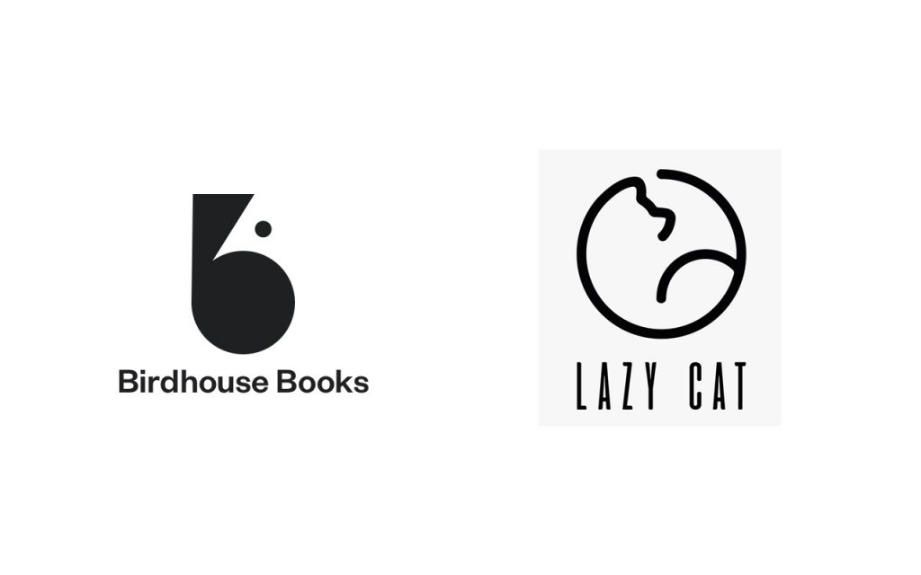
Minimalism has the practical benefit of reducing loading time and improves the visual effect on the small screens of mobile phones. Many brands have opted for minimalistic approach by removing extra elements from their logos and focusing on the written part. Many designers also focus on single stroke designs to create unique minimalistic logos.
Source:
2. Negative Spaces
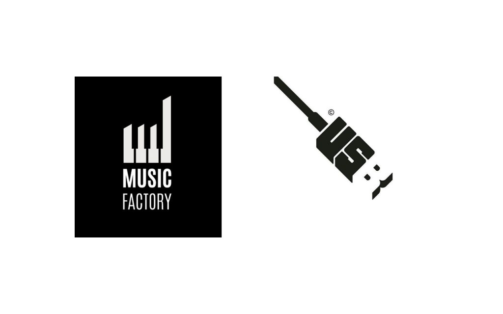
Source one – Source two
Negative spaces logos are one of the hottest trends of 2019. Creativity has reached a new level as white spaces between designs and words are used to create logos. Its an innovate way to make logos visually interesting. One of the most celebrated logos endorsing negative space is that of FedEx by Lindon Leader. The arrow between the letter E and X is not only ingenious but also a logical representation of the services that the company provides that is, delivering packages.
3. Detail Oriented
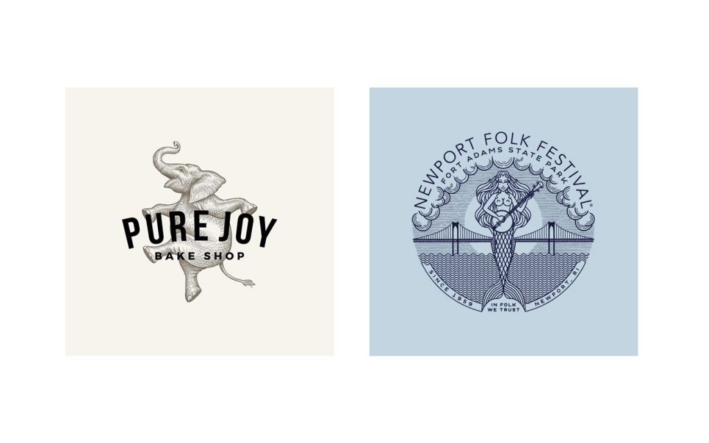
Source one – Source two
While minimalistic logos are on the rise, so are the logos with greater details. These are generally hand drawn and give attention to the smallest detail. Many classic baroque inspired designs are being used for such logos. These form of logos include vintage textures, detailed line work, artistic touches and exquisite crests.
4. Use of Geometric shapes
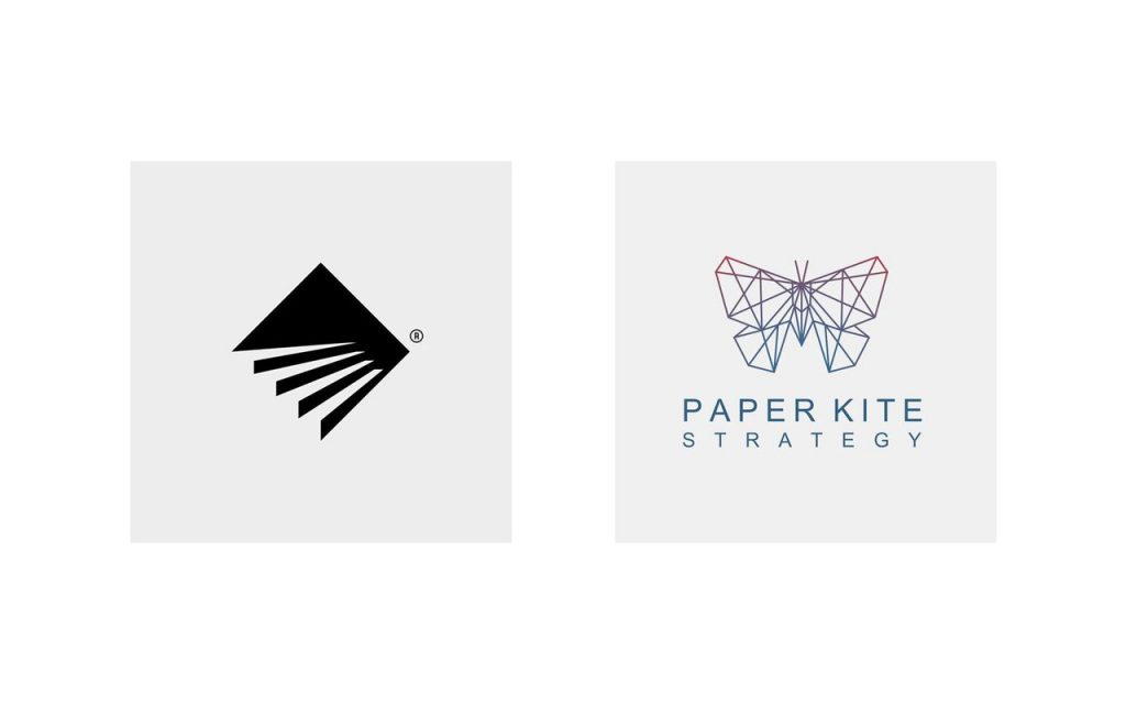
Source one – Source two
The use of geometric design tries to give the logo a warmer look. Using complex geometric shapes with warm colour palette can make the logo look minimal but give a strong message. One of the drawbacks of this is that the logos can come across as oppressive or cold. Softening the look using warm colour palettes and curves can help alleviate this issue.
5. Overlap of Elements
Source one – Source two
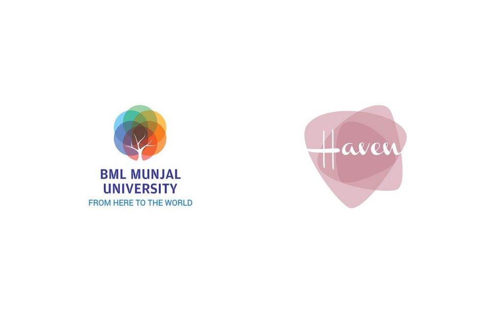
Designers use opacity and stimulating designs to create eye catching logos through the overlap of elements. Like the trend of using negative spaces, overlap of elements is another dynamic mode to add extra layers and duality to the logo. Creating two or three layers of an element in a logo give the opportunity to be creative and look at the unique blend of colours. PayPal had introduced this trend back in 2014 with the overlapping of the letter P.
6. Use of Optical Illusion
Source one – Source two
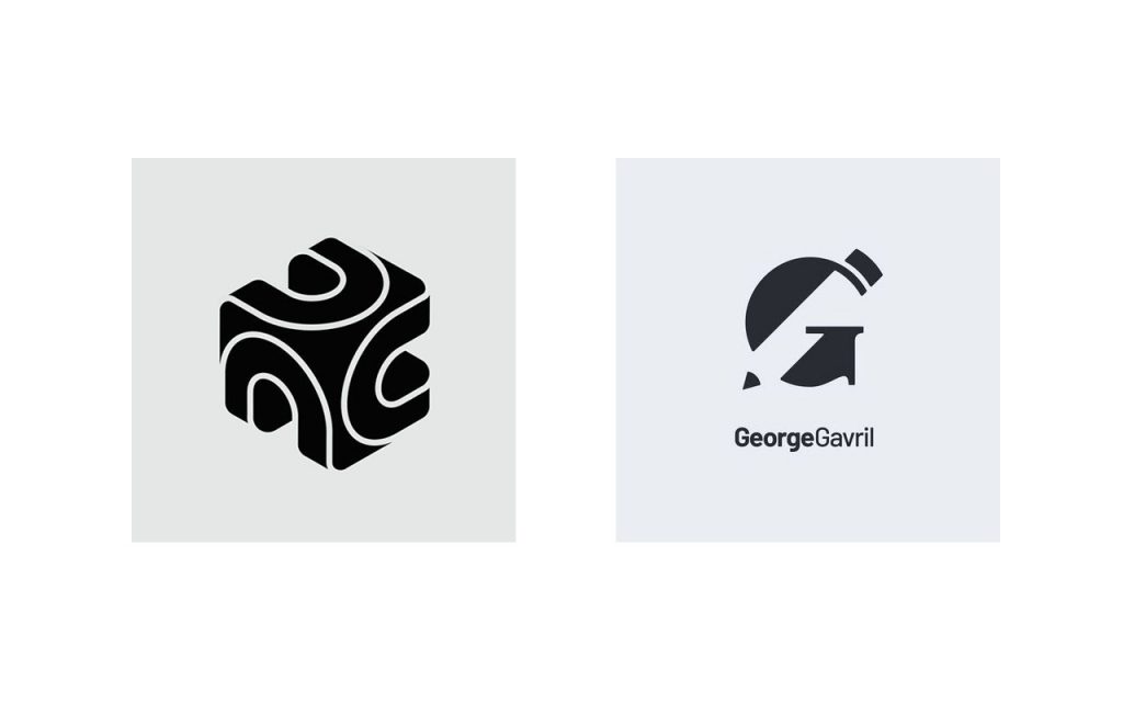
An engaging logo is the one that makes a person look at it twice. In order to make the logo memorable, designers manipulate perspective and colour combinations of the images. This form of design generally uses fragmented, bent or visually broken “illusions”.
7. Use of Gradient Colours
Source
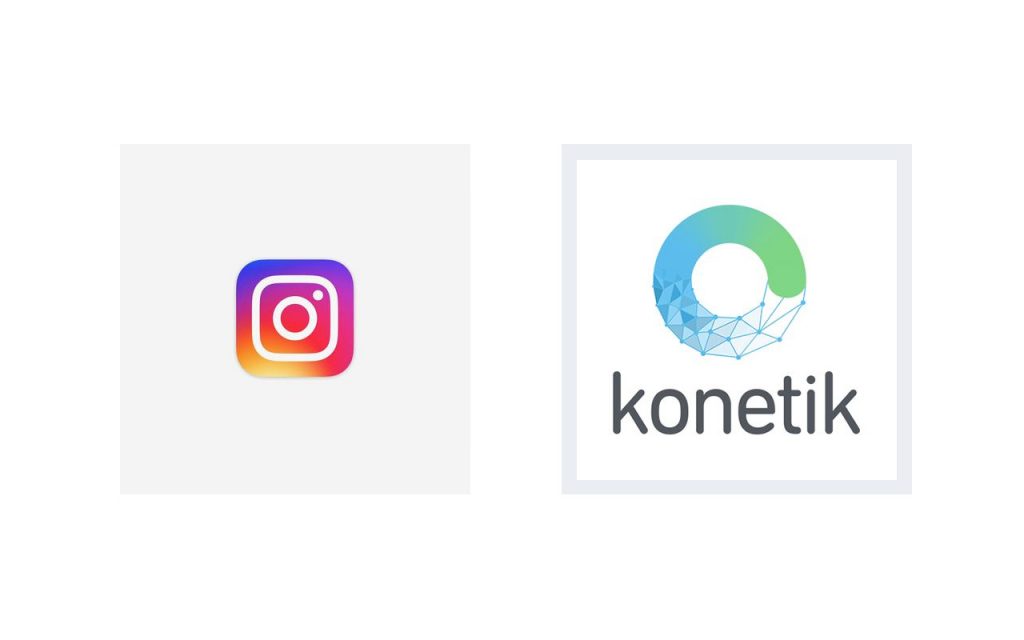
Designers use colours as a method to tell the story of a brand. Colours can be selected according to the message that needs to be sent. For example, red indicates passion. The brand’s colour selection is vital in this method. The colour that a brand selects can make or break the logo display. It is important to look at the meaning of the logo rather than picking a random colour. Hence, designers focus immensely on using colours with a purpose rather use colour randomly. Now a days gradient colors have reappeared in branding since use of logo in digital platforms there is more room to use gradients.
8. Hand Drawn Logo
Source one – Source two
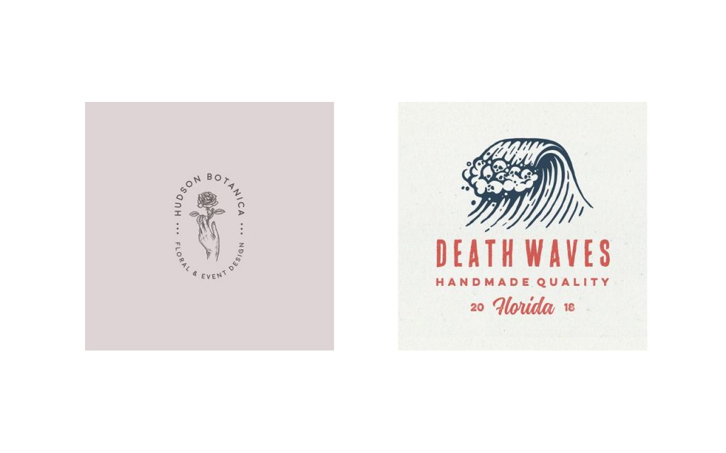
Hand drawn logos create a sense of authenticity. Simple use of colour and lines can attract customers. As consumers are becoming more conscious, they would appreciate the value of a service, a company or the logo itself. In a world of digitization, a hand drawn logo tends to stand out.
These are some of the trends of logos in 2019. A lot more can happen. These trends are not absolute. People are extremely innovative. Blending of these trends can happen to create new forms of logos. Designers find new ways to experiment with logos all the time!


