
Starting or bootstrapping a company is no cake walk. One of the challenges that every startup manager faces is in the communications department.
Here communication relates to designing and implementing strategies that mold how prospective clients and consumers view and interact with the company. This is where the need for effective branding originates from. Branding for startup is a key factor to reach the target market.
Towards the same, here are some tips about consistency in branding and communication, and how it can help a new brand, especially from a graphic designer’s point of view.
The logo
After you’ve decided the name for your company, the next step is to order a logo. There are probably millions of stock logos available out there, and are available at relatively affordable prices. But, if you can afford it, a custom logo design is a really good small investment.
The process of getting a custom logo results in a totally unique design, which is arrived at after many iterations and deliberations over your businesses’ image and communication requirements.
A logo is also a good starting place, and a major part of the branding as well, because it will feature on almost every piece of communication you publicise. It’s a starting place because it helps you define, a priori, the colours your communications will feature. This brings us to the main point- consistency.
Consistency in Branding
It is consistency that separates an amateur startup from a professional company. Consistency is sought after in advertising copies, sales presentations, how consumers are dealt with, and the overall language used for business communication. However, in terms of graphic design, consistency is defined by colours, illustrations, and overall design language.

Every document, physical or digital, that leaves your company, addressed either at consumers or business partners, should contain the same basic elements. Examples of these elements include typefaces, colours of borders, headlines, etc., logo sizes and positioning.
Another example could be of illustrations that are used on your website or product packages. You should try to avoid away from stock illustrations, and get illustrations designed professionally that follow the same look and feel, and are in line with the brand image.

A common area these days where many brands, even established ones, get consistency wrong, is explainer video. Many videos use characters and graphics that don’t follow the brand colours, and commit other branding faux-pas’.
A note about colours
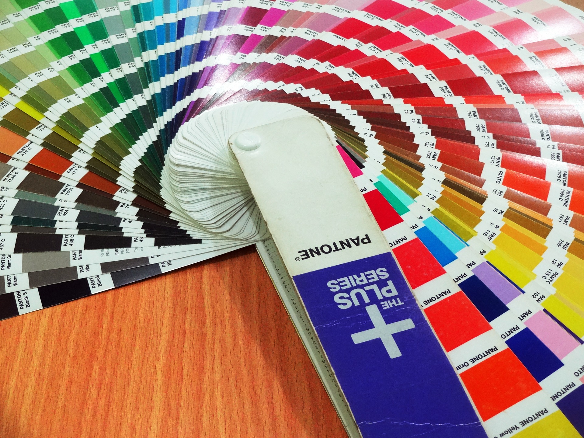
As colour are important for maintaining consistency, when getting a logo, the deliberations on the colours that will design the brand should be made.
As a client, from the graphic designer, you should obtain the colour hexadecimals, which will be used as reference in the website design, package designing, sales communication and advertising, and any rebranding that the brand engages in the future.
As a designer, I can confidently say that more than a over-sized branding budget, or a professional agency, what matters is that there is consistency in the brand. When you see a poor branding job, in most cases, it is bad because it lacks consistency, you just don’t realize it.