
Daily Minimal is a blog run by an artist whose principal work focuses on minimal iconography. But before we talk more about him, let’s have a word about minimalism.
‘Less is More’. The phrase that comes to mind when thinking about minimal designs, but it doesn’t do justice to the concept of minimalism. Minimalism is much more – using only those elements that are absolutely essential to fulfil the function and to communicate the meaning. So, it’s not exactly ‘less’ but ‘sufficient’.
Artists have been following minimalism in sculpture, music, and other arts for more than half a century, but in design, this has gained traction only in the past five years or so. These designs are characterized by generous use of white space, simpler colour palettes-often black and white, favouring flat icons, and more attention to typography.
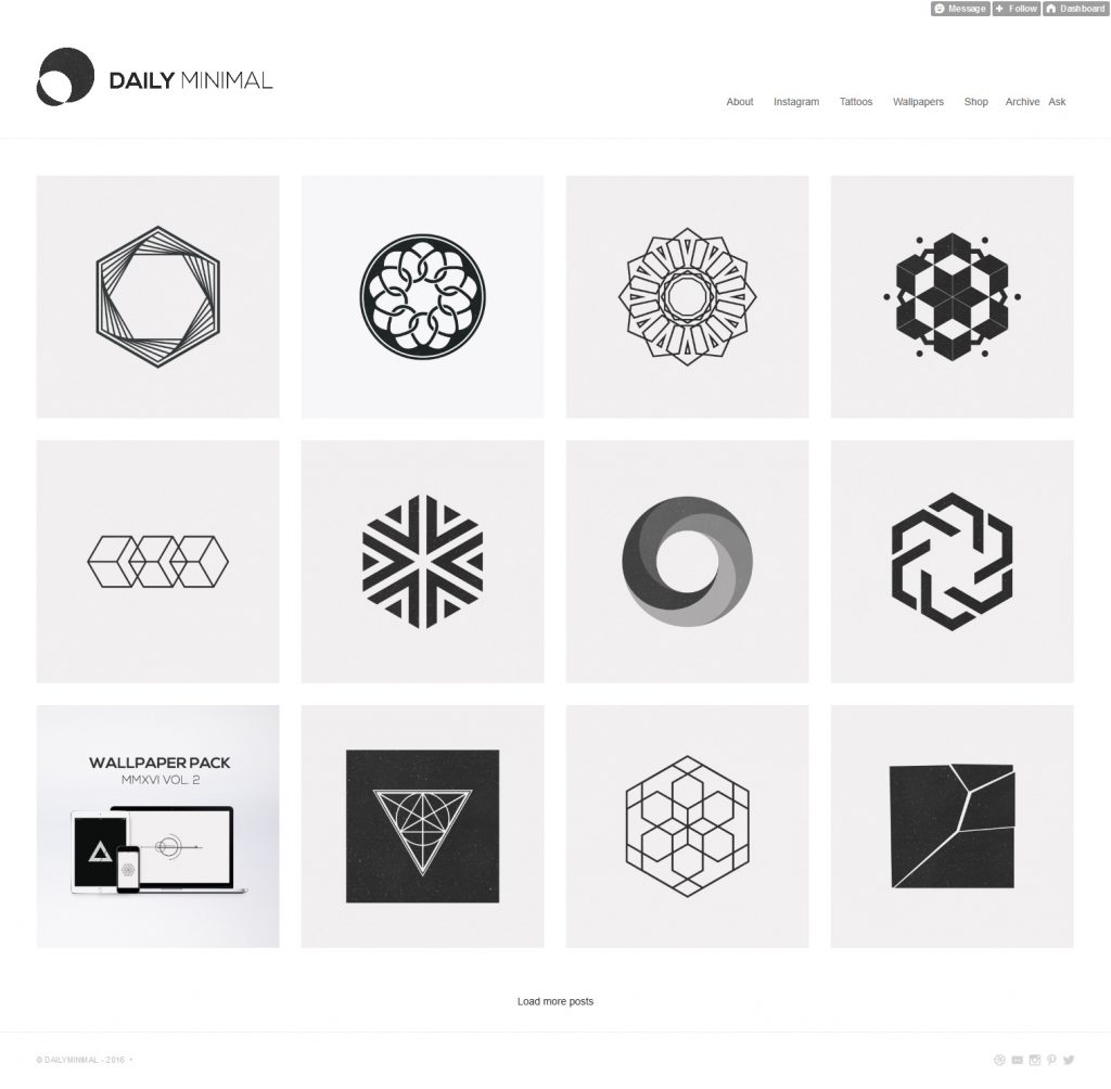
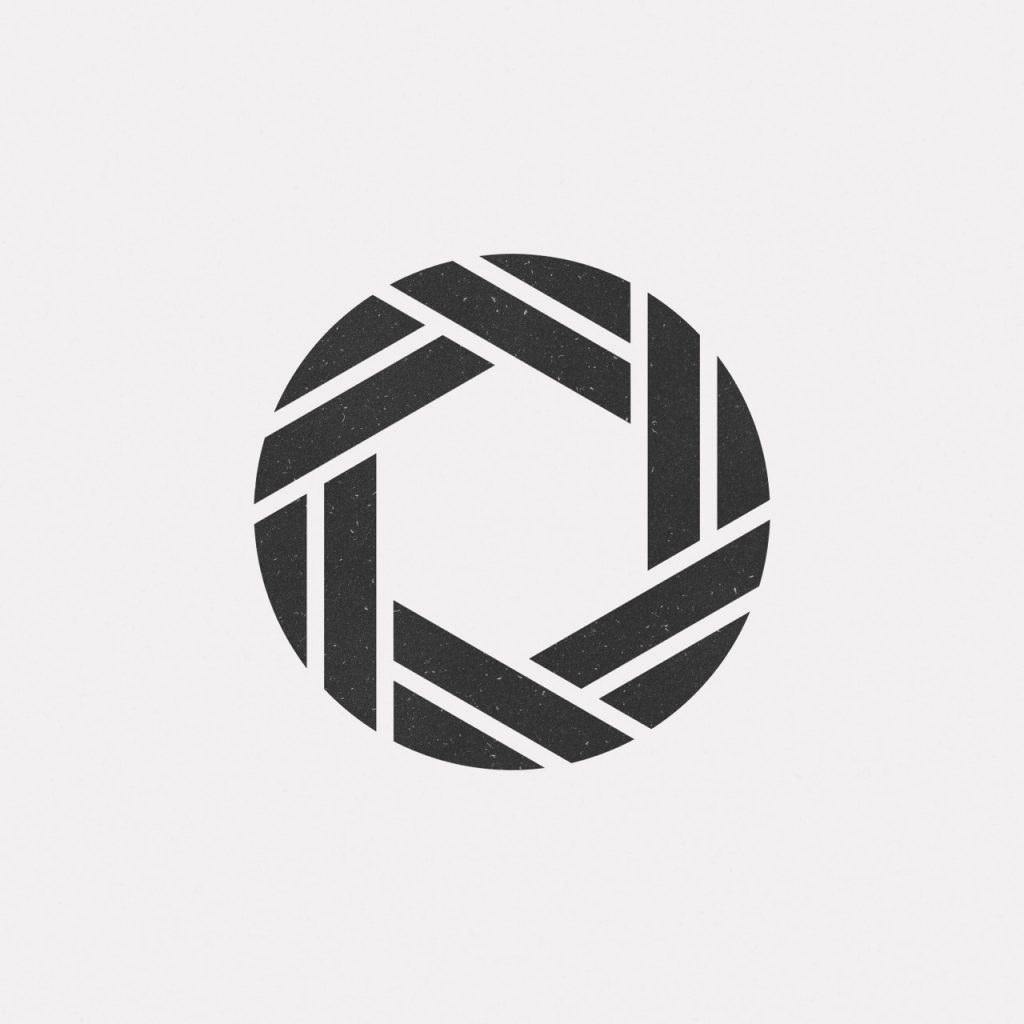
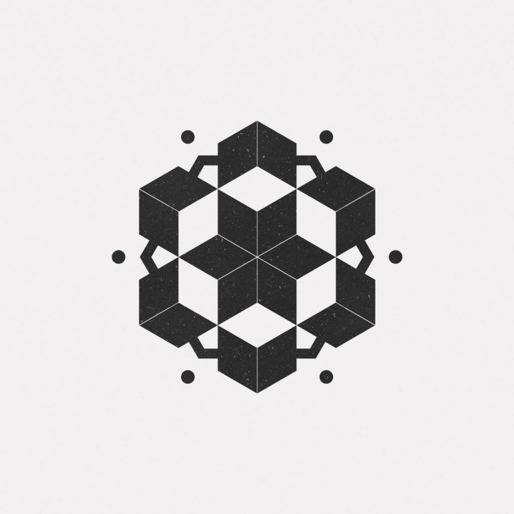
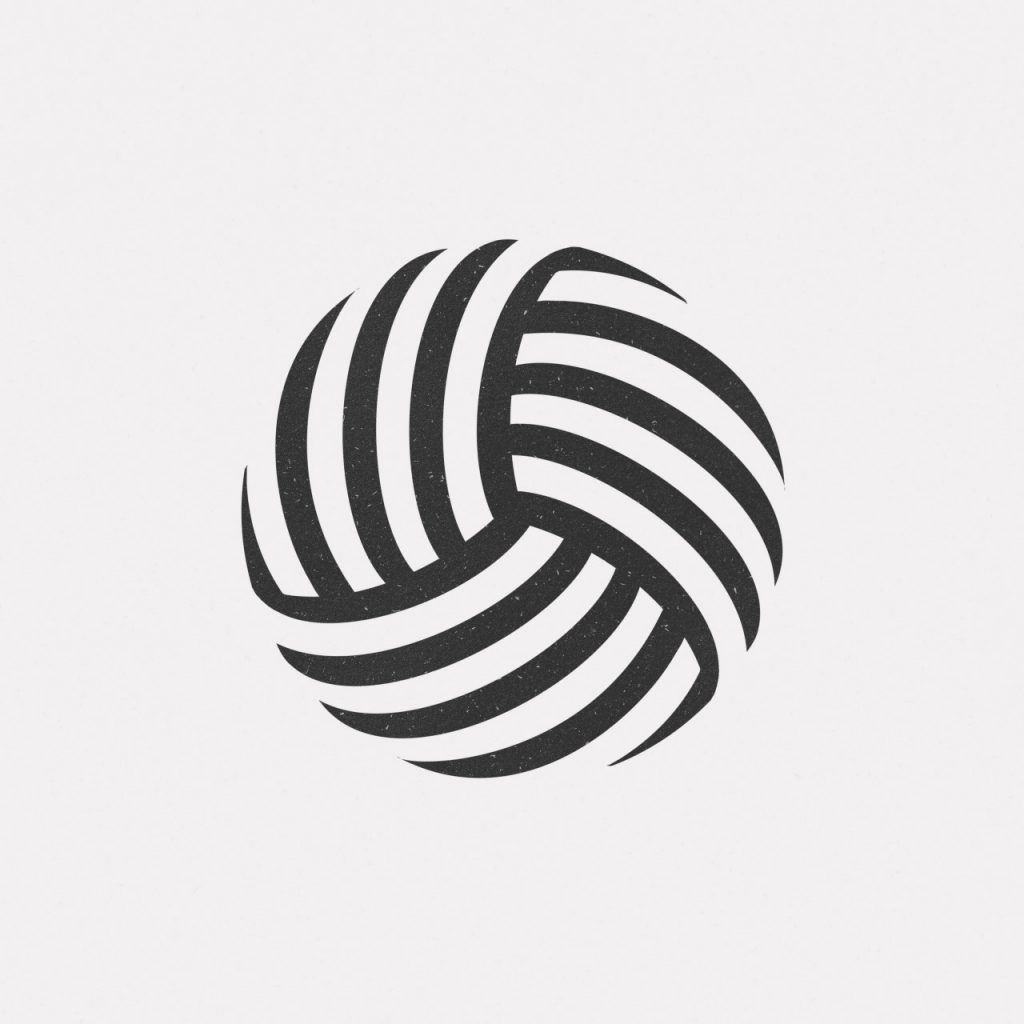
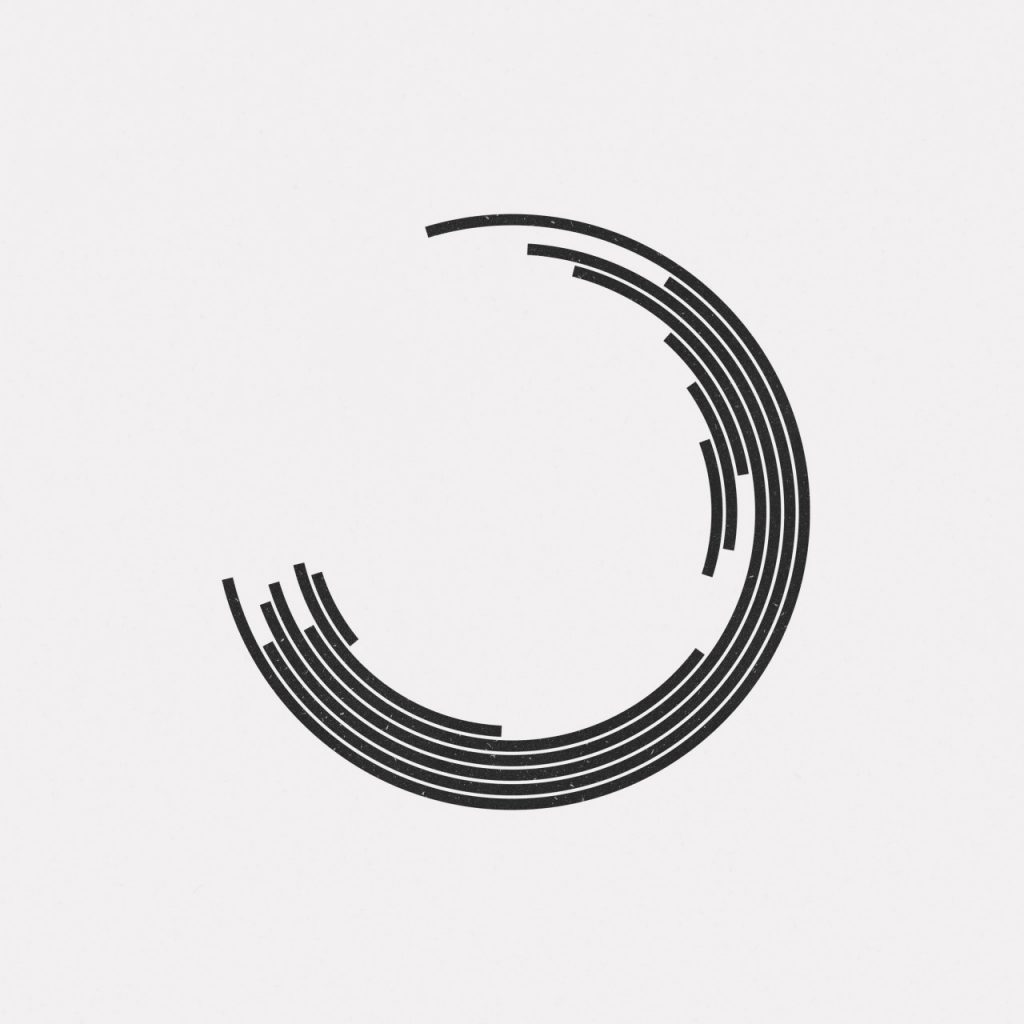
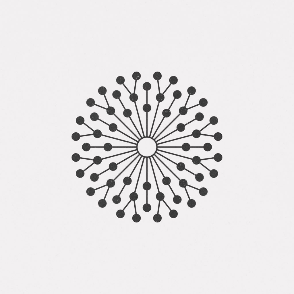
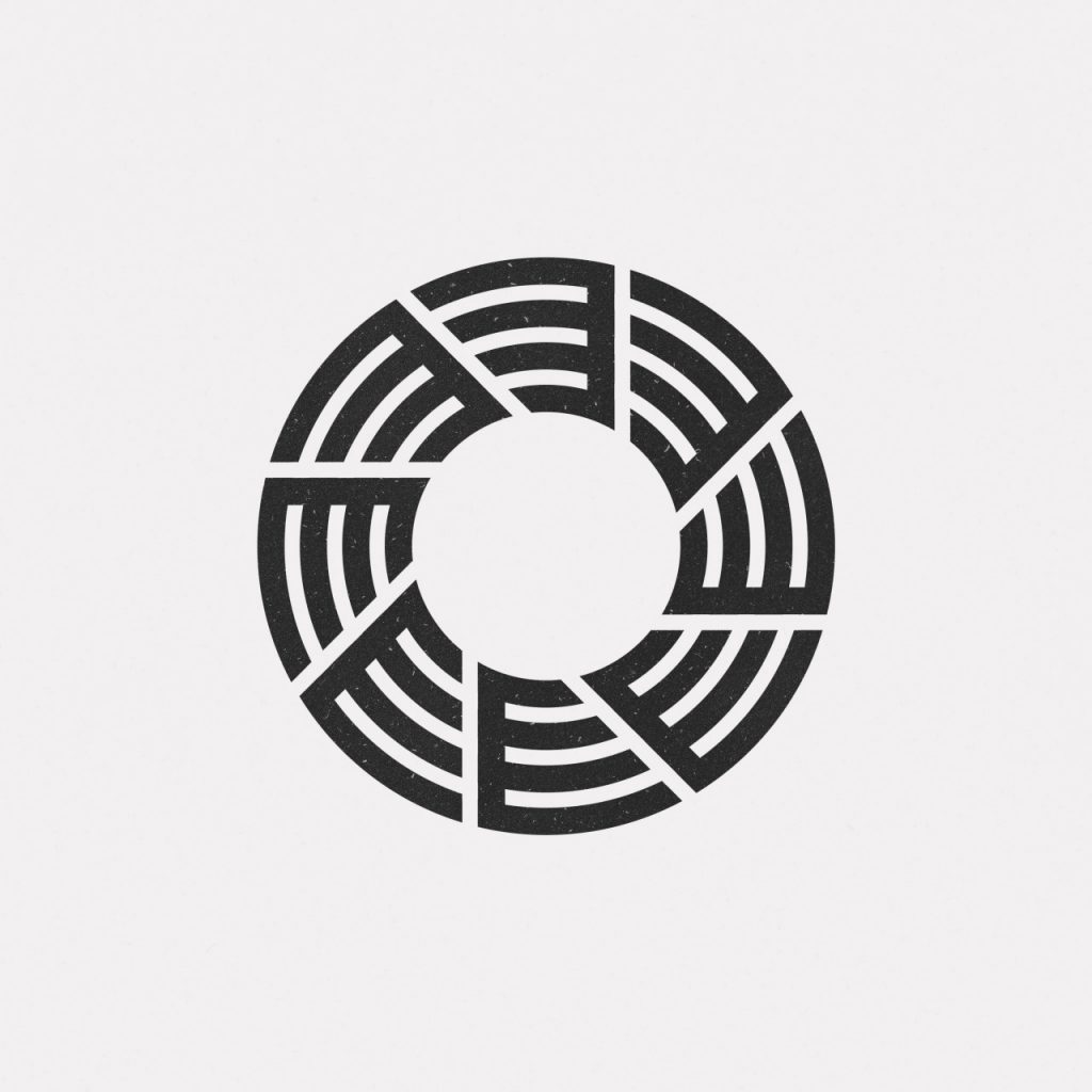
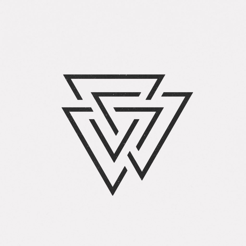
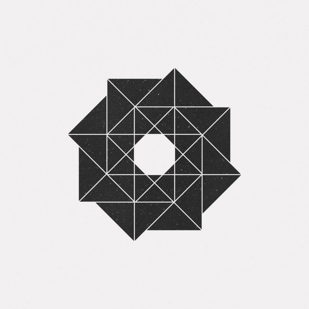
So, coming back to the artist at hand, he is working towards minimalistic design and he’s acing it. We don’t know the real name but we know he’s a very young and talented designer working out of Paris. His work is defined by the use of greyscales, symmetry and geometrical patterns. He has sacrificed the use of colours and unnecessary lines and shapes to achieve functional yet aesthetically appealing designs. These can be employed in a variety of works including logos, wallpapers, labels and tattoos.
We present you with some of his best works.


Designer: Pierre Voisin
Artist’s Site: www.dailyminimal.com
All the works displayed on this page are copyright to artist.