Case Study: The Microsoft Logo Evolution

We talked, in the previous article, about the importance of good case studies , for a logo designer, branding professional, or even a business owner. We have also talked about how good logo designers are like lawyers, who harness the power of design arguments given by the giants before them.
So, keeping that wisdom in mind, I have formulated another case study for the lawyers-cum-graphic-designers to study and build their cases upon.
I’ll be talking about the Microsoft logo, how it evolved over the years, and more importantly, why?
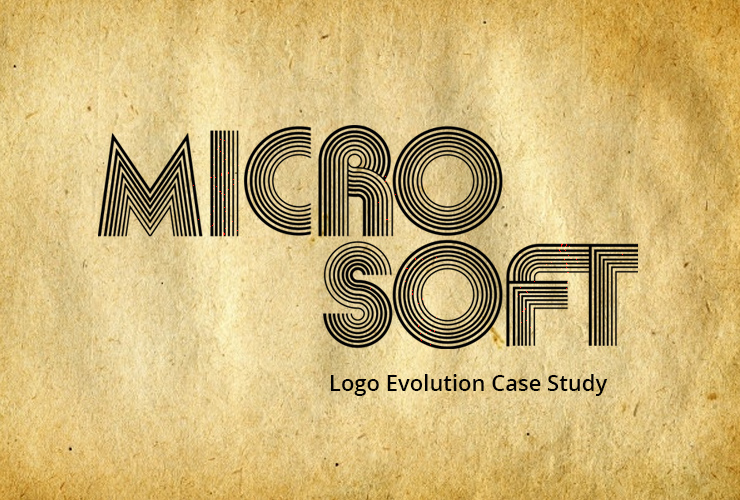
Let’s start with the first logo, that came into existence 42 years ago with the inception of the company. At that time, the company was called “Micro-soft”, so this two part wordmark made sense. It’s not clear as to who made the logo, probably Bill Gates and Paul Allen made this logo themselves, but what mattered was the good design. The designer(s) managed to capture the ‘technological vibe’ using the type body created with multiple strokes, giving an impression of wires.

This ‘80 iteration (Logo 2) clearly had some heavy metal muses. It did away with the industrial curves in favour of extended razor-edges. This was clearly meant to be a sign that the young “groovy” company was now ready for competition. But, the designers over-emphasized the sharpness, or the competitiveness. And perhaps the company’s image was not in sync with this fierce imagery. Hence, it lived a short life (and rightly so), in fact, the shortest one among all Microsoft logos.


Internally, the stylized ‘O’ (seen in ‘Logo 3’) was referred to as the “blibbet”. It was featured in a light yellow shade, on a soft-dark green background. This logo served at the company’s branding frontiers from ‘82 until ‘87, when it was killed in action. Apparently, there were some campaigns by employees to reinstate the logo, but Microsoft, the brand, had once again, evolved.

This is the logo (Logo 4) that most of the world remembers, because it came at a time when Microsoft truly went international. In the otherwise simple logo, italics were used to convey dynamism. The cut in the ‘o’ gave it the necessary sharpness, in terms of competitiveness and decisiveness expected from an international technology business.

The four colored squares (Logo 5) apparently represent the four verticals of microsoft’s business. Blue represents windows and the cloud, red is for office, green represents office, and the yellow, Bing. And being the only colored logo in microsoft’s history, it certainly refers to an openness, and an acceptance of diversities.
Note also that the current windows logo is just a monocolor perspective of the Microsoft logo. Now, does this actually mean anything or is this just another coincidence? In case I haven’t implied it explicitly before, there are no coincidences in graph design.
References:
Stampler, L. (2012, August 23). Microsoft Unveils New Logo-Here’s A History Of The Design’s Evolution. Retrieved from http://www.businessinsider.com


