
A logo is a company’s identity. Every brand has its own logo through which it tries to create its presence in the market. Brands have become a popular choice for the masses today. Every person swears by some or the other brand. Since everyone has a particular brand they prefer, it has become important for a company to have a unique logo for the customers to remember as well as identify them. While one can argue that the company’s logo is not the most significant part of branding, entrepreneur Paul Dummitt states that having a unique logo does add value to the brand. You know that your logo is doing well when people are able to recognize it instantly.
America is the home to many popular brands which have garnered fame internationally. People are able to recognize the logo for brands like McDonald’s, Starbucks, and Apple no matter where they stay. Some American brands have achieved world domination through their excellent marketing choices. We have created a list of American logos that changed the course of branding:
1. Coca-Cola
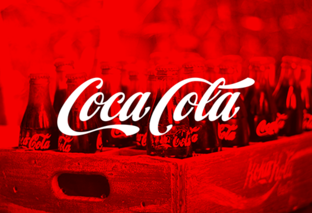
While John S Pemberton finalized the formula for this iconic drink, his partner Frank M Robinson suggested the name Coca-Cola. He believed that the two C’s would look great while advertising. He used the Spenserian Script, which was popular back in the 1880s. Over time, the company has launched various products, but they did not change the script of the text. There were modifications made to the logo over time, but the font remained untouched. The cursive writing defines the logo. It is unimaginable today to think of Coca-Cola without its iconic font. By sticking to its original font, the company has preserved its brand heritage while also creating a distinctive cursive script that defines the brand.
2. McDonald’s

Everyone knows the golden arches of McDonald’s. It is known internationally due to its popularity and simplicity. The golden arches are derived from the original architecture of the McDonald’s store. The arches were eventually incorporated into the branding of the fast food chain. It is the largest fast food chain in the world with an immense impact on popular culture as it has become a symbol for urban life.
Over time, McDonald’s has also experimented with their logo, but the iconic golden arches have always remained. The deep red background of the logo has been swapped to green in many European countries to promote an eco-friendly image. During the increase in the accusation for childhood obesity, the US Chain also switched its marketing focus from kids to eco-conscious professionals. The major takeaway from the history of McDonald’s marketing would be brand repositioning.
3. Apple
Yet another iconic brand is Apple. Its logo has always been prominent. Its popularity has also skyrocketed due to increasing consumption of their products. Apple is now associated with sleek, high-end products. People can love or hate their products but no one can deny recognizing the logo. Apple’s logo represents relentless commitment to innovation and quality. The company upholds this virtue by producing technology of unmatched quality.
4. Google

Google’s logo uses sans-serif font with bright playful colors. Over time the logo has changed with respect to the font, but the color scheme has always remained similar. Google, today is so much more than just a search engine. Yet, the simple wordmark has been able to capture the attention of people all over the world.
5. Nike
Nike has one of the simplest logos on this list. It is simple yet delivers the message about what the brand is all about. Its logo is popularly known as Swoosh. Nike has one of the most recognizable logos in the world and the most valuable having a worth of $26 Billion. Nike’s use of this simple logo proves what one can achieve with a simple symbol while also maintaining the brand’s integrity.
6. FedEx

FedEx is known to have one of the best logos of all time. It is known for its brilliant use of negative space. The space between the letter E and X forms an arrow which symbolizes speed and precision. The logo is simple yet effective. FedEx’s success teaches us that it is not important to have a smart logo. Sometimes, it’s enough to have a subtle but smart typography to achieve global brand equity.
7. Starbucks
The siren of Starbucks logo has been in use since 1971. The logo has evolved since to become the logo as we know it today. The company has done away with the name Starbucks from the logo, and yet we can recognize it anywhere. It is the world’s most popular café. Starbucks has a unique approach to its branding as it has used a logo which has nothing to do with its product that is, coffee. It is an inspired choice to create a brand with a logo, name and product to be completely unrelated to each other.
8. Amazon
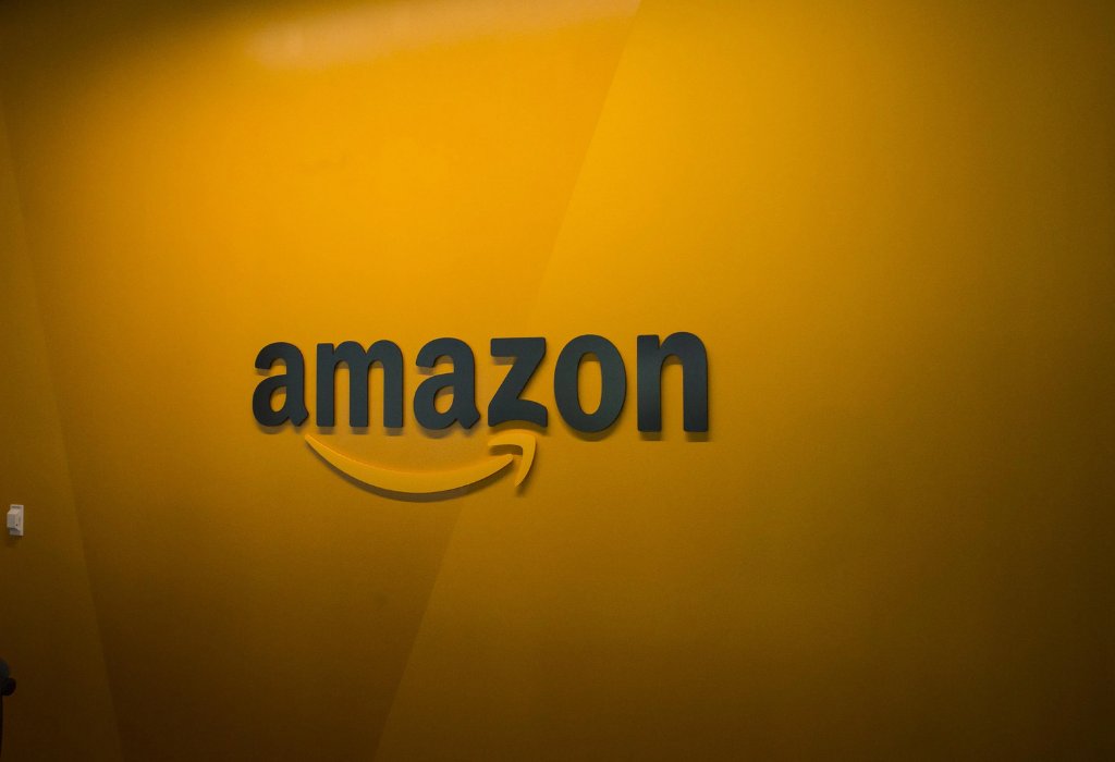
Amazon is one of the world’s most popular online retail stores. Originally, the online portal sold only books, but now it has diversified to sell a multitude of products. Its logo was created to represent the message that it sells everything from A to Z, as the arrow goes from A to Z. The arrow also represents the smile or the satisfaction of the customers after shopping from Amazon.
There you have it, 8 incredible logos. Next time you come across a logo you’re not incredibly familiar with, take a closer look — you never know what could be hiding right in front of your eyes.