
Red is one of the most powerful and visually striking colors in the design world. Associated with passion, energy, and urgency, red plays an important role in branding, fashion, advertising, and digital design. From deep burgundy tones to bright scarlet shades, the spectrum of red offers designers a wide range of emotional and visual possibilities. Its strong presence makes it a favorite for brands seeking attention, excitement, and emotional connection.
The Essence of Red
Red is one of the oldest colors used in art and culture. Throughout history, civilizations have attached deep symbolic meaning to it.
In many cultures, red represents power, vitality, and life. Ancient civilizations used red pigments in paintings, textiles, and ceremonial objects. In Chinese culture, red symbolizes prosperity and good fortune, which is why it is commonly used during festivals and weddings. In Western traditions, red often represents love, passion, and celebration.
In design and branding, red is considered a high-impact color. It immediately attracts attention and often stimulates strong emotional responses. Because of its visual intensity, red is widely used in advertising, warning signals, sports branding, and product packaging.
Meaning and Psychology of Red
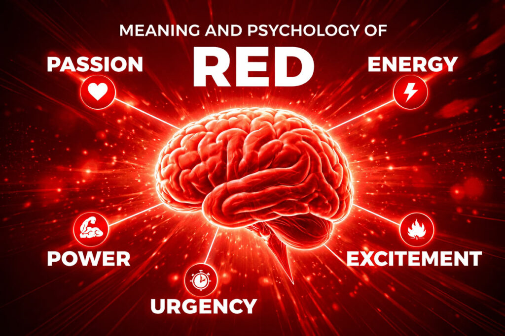
Red has one of the strongest psychological effects among all colors. It stimulates the senses and creates a sense of urgency and excitement.
From a psychological perspective, red is linked to:
- Energy and vitality
- Passion and romance
- Strength and power
- Danger and urgency
- Appetite and stimulation
This is why red is frequently used in food branding and restaurant marketing. Studies have shown that red can stimulate appetite and increase attention.
In digital interfaces, red is often used for notifications, alerts, or important actions. However, because it is visually intense, designers typically use it carefully to avoid overwhelming the user.
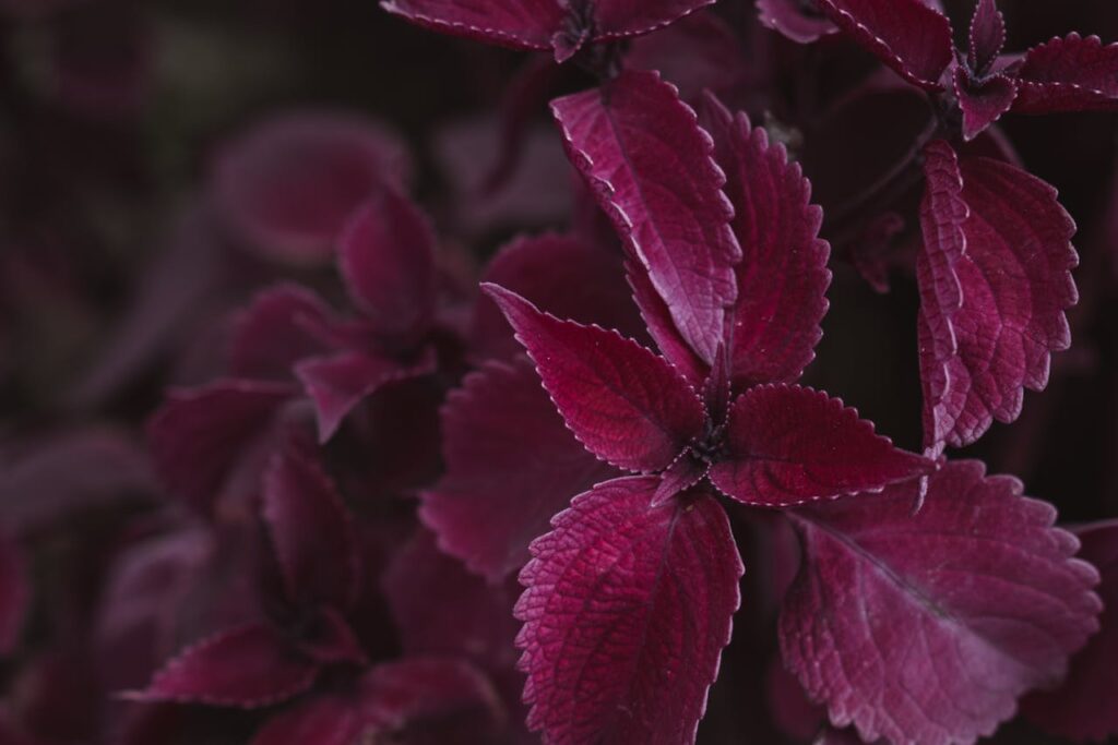
In interior design, deep reds such as burgundy or wine create a sense of warmth and luxury, while bright reds like scarlet or crimson add bold dramatic energy.
Popular Shades of Red with Names
Red exists in many variations, ranging from soft pinkish reds to deep dark crimson tones. Designers often choose specific shades depending on the mood they want to create.
Crimson
#DC143C
220,20,60
C0 M91 Y73 K14
Scarlet
#FF2400
255,36,0
C0 M86 Y100 K0
Fire Brick
#B22222
178,34,34
C0 M81 Y81 K30
Cherry Red
#DE3163
222,49,99
C0 M78 Y55 K13
Ruby
#E0115F
224,17,95
C0 M92 Y58 K12
Cardinal
#C41E3A
196,30,58
C0 M85 Y70 K23
Burgundy
#800020
128,0,32
C0 M100 Y75 K50
Rose Red
#C21E56
194,30,86
C0 M85 Y56 K24
Tomato
#FF6347
255,99,71
C0 M61 Y72 K0
Coral Red
#FF4040
255,64,64
C0 M75 Y75 K0
Indian Red
#CD5C5C
205,92,92
C0 M55 Y55 K20
Salmon
#FA8072
250,128,114
C0 M49 Y54 K2
Coca-Cola — Red
#F40009
244,0,9
C0 M100 Y96 K4
YouTube — Red
#FF0000
255,0,0
C0 M100 Y100 K0
Netflix — Red
#E50914
229,9,20
C0 M96 Y91 K10
Nintendo — Red
#E60012
230,0,18
C0 M100 Y92 K10
Target — Red
#CC0000
204,0,0
C0 M100 Y100 K20
CNN — Red
#CC0000
204,0,0
C0 M100 Y100 K20
Adobe — Red
#FF0000
255,0,0
C0 M100 Y100 K0
LEGO — Red
#D01012
208,16,18
C0 M92 Y91 K18
Pinterest — Red
#E60023
230,0,35
C0 M100 Y85 K10
Canon — Red
#BC0024
188,0,36
C0 M100 Y81 K26
KFC — Red
#C41230
196,18,48
C0 M91 Y76 K23
Toyota — Red
#EB0A1E
235,10,30
C0 M96 Y87 K8
Classic 100
#7F1C1C
127, 28, 28
C0 M78 Y78 K50
Classic 200
#942121
148, 33, 33
C0 M78 Y78 K42
Classic 300
#A92626
169, 38, 38
C0 M78 Y78 K34
Classic 400
#BE2A2A
190, 42, 42
C0 M78 Y78 K25
Classic 500
#D32F2F
211, 47, 47
C0 M78 Y78 K17
Classic 600
#D74444
215, 68, 68
C0 M68 Y68 K16
Classic 700
#DC5959
220, 89, 89
C0 M60 Y60 K14
Classic 800
#E06D6D
224, 109, 109
C0 M51 Y51 K12
Classic 900
#E58282
229, 130, 130
C0 M43 Y43 K10
Deep 100
#530000
83, 0, 0
C0 M100 Y100 K67
Deep 200
#610000
97, 0, 0
C0 M100 Y100 K62
Deep 300
#6F0000
111, 0, 0
C0 M100 Y100 K56
Deep 400
#7D0000
125, 0, 0
C0 M100 Y100 K51
Deep 500
#8B0000
139, 0, 0
C0 M100 Y100 K45
Deep 600
#971A1A
151, 26, 26
C0 M83 Y83 K41
Deep 700
#A23333
162, 51, 51
C0 M69 Y69 K36
Deep 800
#AE4D4D
174, 77, 77
C0 M56 Y56 K32
Deep 900
#B96666
185, 102, 102
C0 M45 Y45 K27
Vibrant 100
#FF1A1A
255, 26, 26
C0 M90 Y90 K0
Vibrant 200
#FF0000
255, 0, 0
C0 M100 Y100 K0
Vibrant 300
#E60000
230, 0, 0
C0 M100 Y100 K10
Vibrant 400
#CC0000
204, 0, 0
C0 M100 Y100 K20
Vibrant 500
#B30000
179, 0, 0
C0 M100 Y100 K30
Vibrant 600
#990000
153, 0, 0
C0 M100 Y100 K40
Vibrant 700
#800000
128, 0, 0
C0 M100 Y100 K50
Vibrant 800
#660000
102, 0, 0
C0 M100 Y100 K60
Vibrant 900
#4D0000
77, 0, 0
C0 M100 Y100 K70
Muted 100
#D9A3A3
217, 163, 163
C0 M25 Y25 K15
Muted 200
#C78F8F
199, 143, 143
C0 M28 Y28 K22
Muted 300
#B57A7A
181, 122, 122
C0 M33 Y33 K29
Muted 400
#A36666
163, 102, 102
C0 M37 Y37 K36
Muted 500
#915252
145, 82, 82
C0 M43 Y43 K43
Muted 600
#7F3E3E
127, 62, 62
C0 M51 Y51 K50
Muted 700
#6D2B2B
109, 43, 43
C0 M61 Y61 K57
Muted 800
#5B1A1A
91, 26, 26
C0 M71 Y71 K64
Muted 900
#490D0D
73, 13, 13
C0 M82 Y82 K71
Warm 100
#FFE5E5
255, 229, 229
C0 M10 Y10 K0
Warm 200
#FFCCCC
255, 204, 204
C0 M20 Y20 K0
Warm 300
#FFB3B3
255, 179, 179
C0 M30 Y30 K0
Warm 400
#FF9999
255, 153, 153
C0 M40 Y40 K0
Warm 500
#FF8080
255, 128, 128
C0 M50 Y50 K0
Warm 600
#FF6666
255, 102, 102
C0 M60 Y60 K0
Warm 700
#FF4D4D
255, 77, 77
C0 M70 Y70 K0
Warm 800
#FF3333
255, 51, 51
C0 M80 Y80 K0
Warm 900
#FF1A1A
255, 26, 26
C0 M90 Y90 K0
Earthy 100
#F2A7A7
242, 167, 167
C0 M31 Y31 K5
Earthy 200
#E68F8F
230, 143, 143
C0 M38 Y38 K10
Earthy 300
#D97777
217, 119, 119
C0 M45 Y45 K15
Earthy 400
#CC5F5F
204, 95, 95
C0 M53 Y53 K20
Earthy 500
#BF4747
191, 71, 71
C0 M63 Y63 K25
Earthy 600
#A63D3D
166, 61, 61
C0 M63 Y63 K35
Earthy 700
#8C3333
140, 51, 51
C0 M64 Y64 K45
Earthy 800
#732929
115, 41, 41
C0 M64 Y64 K55
Earthy 900
#591F1F
89, 31, 31
C0 M65 Y65 K65
Each shade carries its own character and visual impact, making red one of the most versatile colors in design.
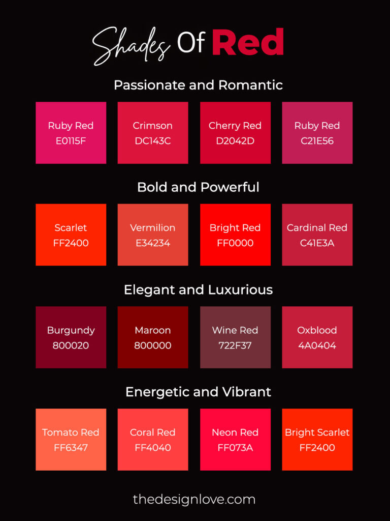
Moods of Red with Different Shades
Red is not a single emotion. Depending on its tone and intensity, it can express warmth, power, romance, or excitement.
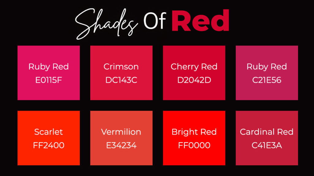
a. Passionate and Romantic
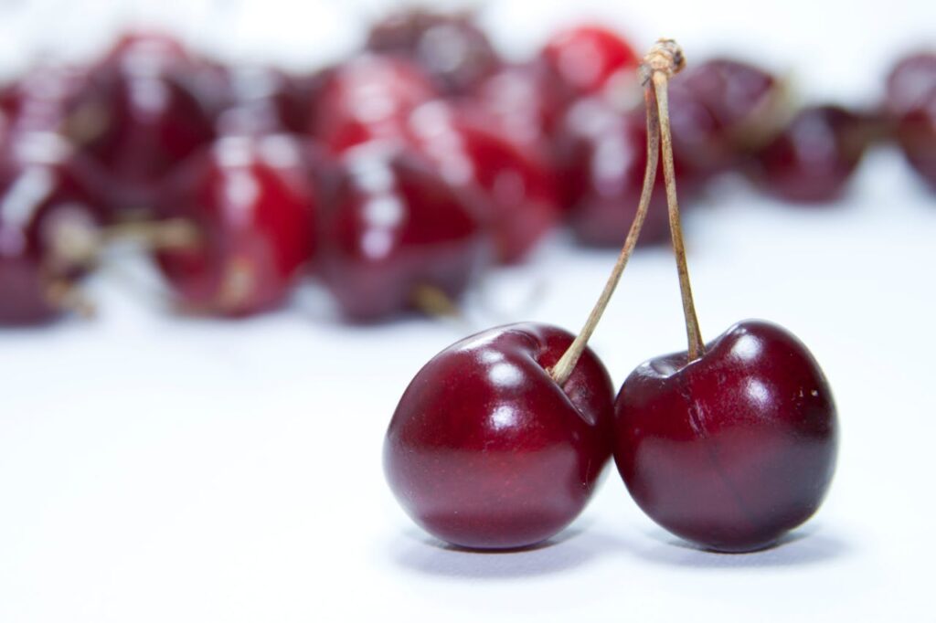
Colours: ruby red, crimson, cherry red, rose red
| Ruby Red | Crimson | Cherry Red | Rose Red |
|---|---|---|---|
|
#E0115F |
#DC143C |
#D2042D |
#C21E56 |
These shades are closely associated with love, romance, and emotional intensity. They are commonly used in fashion, beauty products, jewellery branding, and Valentine-themed campaigns. The richness of these tones makes them ideal for expressing affection and elegance.
b. Bold and Powerful
Colours: scarlet, vermilion, bright red, cardinal red
| Scarlet | Vermilion | Bright Red | Cardinal Red |
|---|---|---|---|
|
#FF2400 |
#E34234 |
#FF0000 |
#C41E3A |
These shades communicate strength, authority, and confidence. Because they immediately capture attention, they are widely used in advertising, sports branding, and corporate identities that want to appear dynamic and assertive.
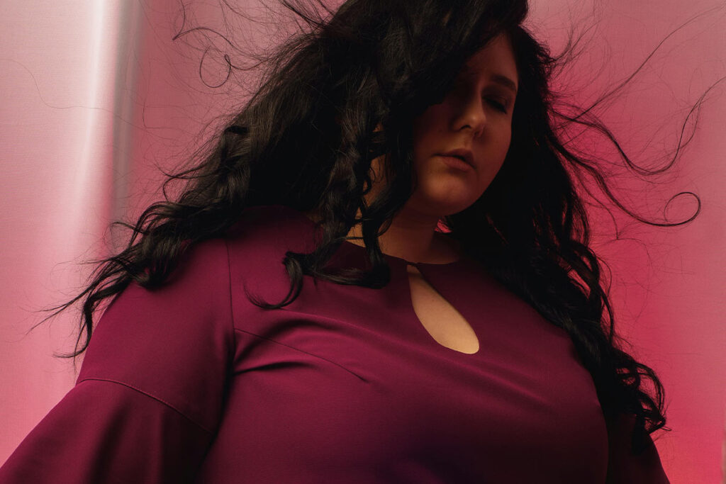
c. Elegant and Luxurious
Colours: burgundy, maroon, wine red, oxblood
| Burgundy | Maroon | Wine Red | Oxblood |
|---|---|---|---|
|
#800020 |
#800000 |
#722F37 |
#4A0404 |
Deep reds convey prestige, sophistication, and maturity. These tones often appear in luxury packaging, premium wine branding, fashion accessories, and interior design where a sense of refinement is required.
d. Energetic and Vibrant
Colours: tomato red, coral red, neon red, bright scarlet
| Tomato Red | Coral Red | Neon Red | Bright Scarlet |
|---|---|---|---|
|
#FF6347 |
#FF4040 |
#FF073A |
#FF2400 |
These lively shades bring excitement and energy to designs. They are popular in food branding, youth-oriented products, digital interfaces, and promotional graphics where vibrancy and enthusiasm are important.
Color Combinations That Work With Red
Color combinations with red create bold and memorable visual designs. When paired with colors like white, black, gold, gray, or navy blue, red can highlight contrast, elegance, or sophistication. Designers often use these pairings in branding, packaging, and digital design to create strong visual impact and clear hierarchy.
Red and White
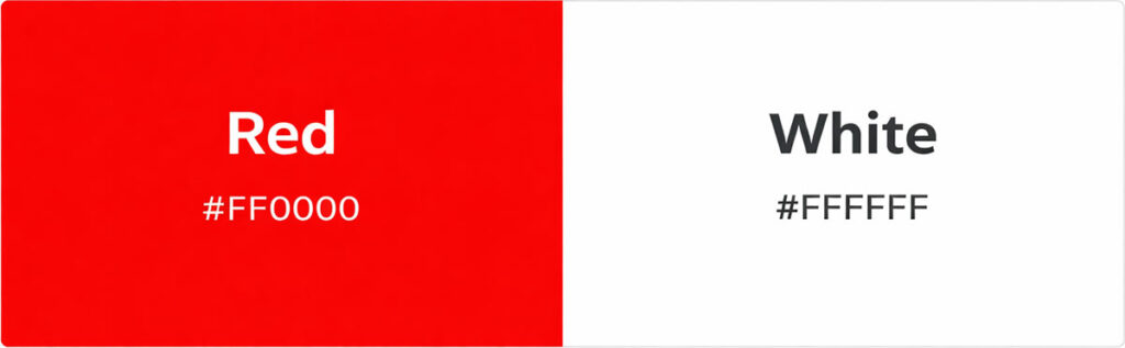
A classic combination that creates clarity and strong contrast. It is widely used in branding and packaging.
Red and Black
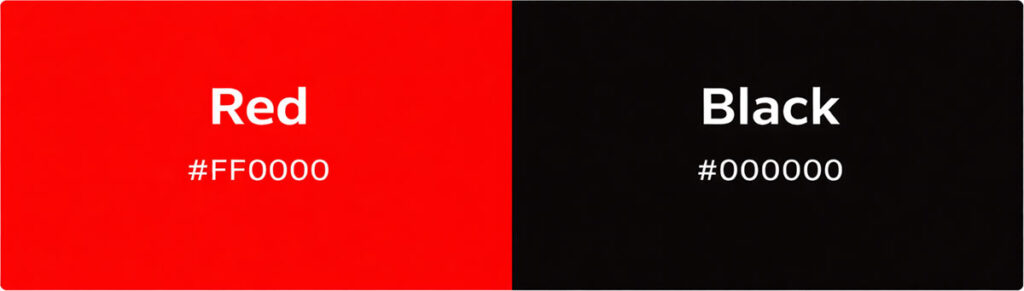
This combination produces a dramatic and powerful visual identity. Luxury brands and high-end products often use this pairing.
Red and Gold
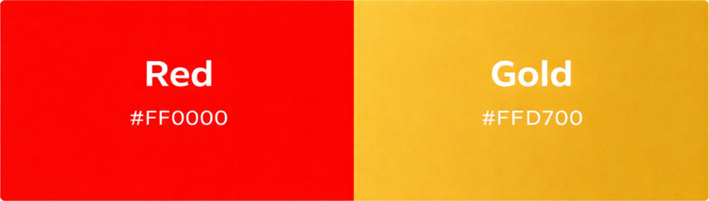
Red and gold symbolize luxury, celebration, and prestige. This palette appears frequently in festive and premium designs.
Red and Gray
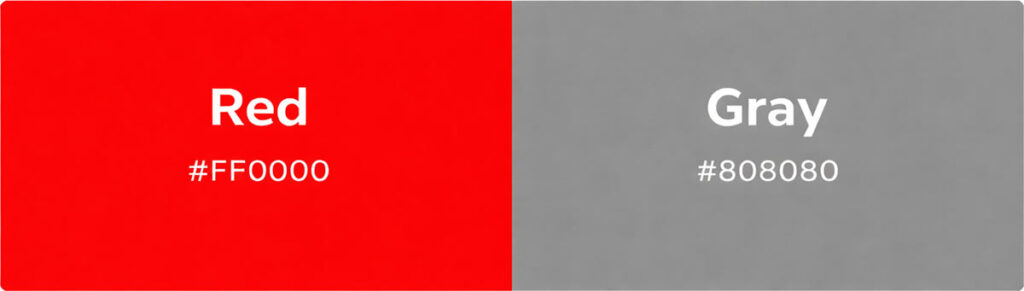
Gray tones soften the intensity of red while maintaining a modern and professional appearance.
Red and Navy Blue
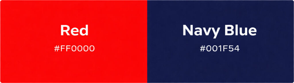
This pairing creates a balanced palette that combines energy with stability, commonly used in corporate design.
Red Shades and Emotional Associations
| Shade of Red | Mood/Emotion | Example Usage |
|---|---|---|
|
Scarlet#FF2400
|
Energy, Urgency | Advertising and sports branding |
|
Crimson#DC143C
|
Passion, Strength | Fashion and luxury branding |
|
Burgundy#800020
|
Elegance, Prestige | Wine branding and interiors |
|
Ruby#E0115F
|
Romance, Luxury | Jewelry and beauty brands |
|
Cherry Red#DE3163
|
Youthful Excitement | Cosmetics and fashion |
|
Vermilion#E34234
|
Warmth, Vitality | Art and cultural designs |
|
Brick Red#CB4154
|
Earthy Warmth | Architecture and interior palettes |
|
Maroon#800000
|
Authority, Seriousness | Academic and corporate branding |
|
Tomato Red#FF6347
|
Freshness, Vibrancy | Food packaging |
|
Blood Red#8A0303
|
Intensity, Drama | Film posters and dramatic graphics |
Famous Brands Using Red
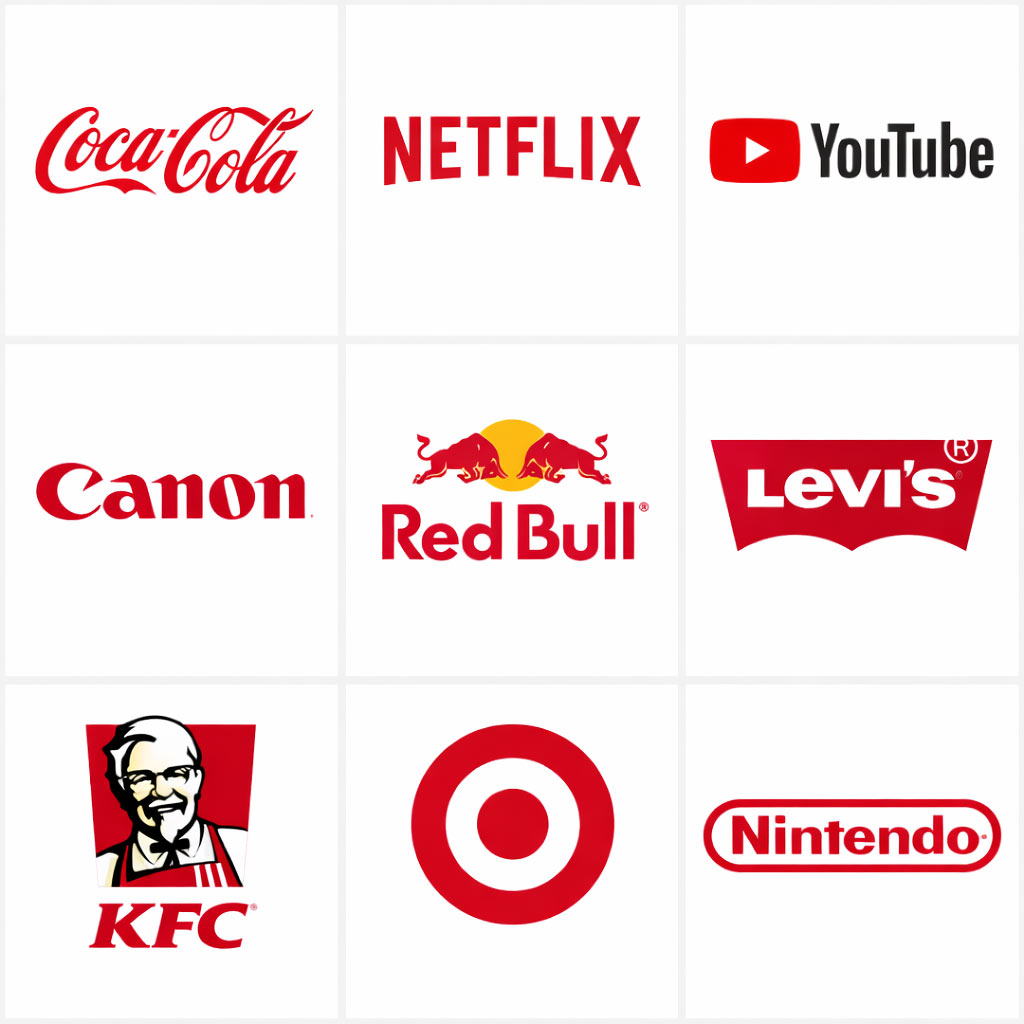
Red is widely used in branding because it captures attention and creates strong emotional responses such as excitement, energy, and urgency. Many global companies use red in their logos to build memorable brand identities and stand out in competitive markets.
| Famous Brands | Red Color Branding Significance |
|---|---|
 |
Coca-Cola: One of the most recognizable beverage brands in the world. The bright red color in its logo symbolizes excitement, happiness, and energy. It helps create a sense of fun and emotional connection with consumers. |
 |
Netflix: The bold red “N” used by Netflix reflects intensity and excitement. Red creates a dramatic visual identity that matches the thrill and emotional engagement of watching movies and series. |
 |
YouTube: The red play button icon is designed to immediately grab attention. Red stimulates action and engagement, encouraging viewers to click and start watching videos. |
 |
Canon: Canon uses a strong red logo to communicate precision and innovation. The color also conveys confidence and professionalism, which aligns with the brand’s reputation in imaging technology. |
 |
Red Bull: The red in the Red Bull logo symbolizes power, strength, and energy. It perfectly reflects the brand’s message of performance, stamina, and high energy associated with its energy drinks. |
 |
Levi’s: The classic red tab and logo highlight heritage and authenticity. Red reinforces the brand’s bold identity and timeless style in the global fashion industry. |
 |
KFC: Red is commonly used in food branding because it stimulates appetite and excitement. In KFC’s logo, the color enhances the feeling of comfort food and bold flavor. |
 |
Target: The bright red bullseye is simple yet highly recognizable. Red helps the brand stand out instantly while representing focus, clarity, and strong brand recall. |
 |
Nintendo: The red logo reflects fun, excitement, and playful energy. It aligns perfectly with Nintendo’s mission of delivering joyful gaming experiences to players of all ages. |
 |
H&M: The bold red lettering represents modern fashion and youthful energy. The color helps the brand appear dynamic, accessible, and trendy in the fast-fashion industry. |
Infographic on Popular Shades of Red Colour with Hex Code
Individual Shade Explanations
Each shade of red carries its own visual character and symbolic meaning. Colors like crimson, scarlet, and burgundy are used differently in design, branding, and art. Understanding these shades helps designers choose the right tone to convey specific emotions and messages.
Scarlet
Scarlet is a bright and energetic red with slight orange undertones. It is widely used in advertising and sports branding because of its bold and attention-grabbing quality.
Crimson
Crimson is a deep red associated with richness and passion. It is often used in luxury branding, fashion design, and academic institutions.
Ruby
Ruby is a rich jewel-toned red that symbolizes romance and elegance. Designers frequently use it in jewelry branding and luxury packaging.
Burgundy
Burgundy is a dark red shade with purple undertones. It communicates sophistication and is popular in wine branding, interior design, and premium products.
Cherry Red
Cherry red is bright, youthful, and playful. It appears frequently in cosmetics packaging, fashion items, and lifestyle brands.
Vermilion
Vermilion is a warm red with orange tones historically used in traditional art and cultural decorations. It remains popular in artistic and cultural design contexts.
Brick Red

Brick red has earthy brown undertones. It creates a grounded, natural feeling and is often used in architectural palettes and rustic branding.
Maroon
Maroon is a dark red associated with maturity and seriousness. Universities and heritage brands often use maroon for its timeless character.
Tomato Red
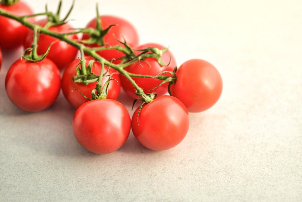
Tomato red is bright and fresh with a hint of orange. It is widely used in food branding because it stimulates appetite.
Blood Red
Blood red is a very dark, intense shade of red. It is frequently used in dramatic visual storytelling such as movie posters and gothic design styles.
Interesting Facts About Red
- Red was one of the first colors used in prehistoric cave paintings.
- The red pigment vermilion was historically made from the mineral cinnabar.
- Red light has the longest wavelength in the visible color spectrum.
- In many cultures, red is the color of celebration and good luck.
- Red is widely used in traffic signals because it is highly visible and quickly attracts attention.
- Studies suggest that athletes wearing red uniforms may appear more dominant in competition.
Conclusion
Red remains one of the most influential colors in visual communication. Its ability to evoke strong emotional responses makes it an essential tool in branding, design, fashion, and advertising. From bright energetic scarlet tones to deep luxurious burgundy shades, the versatility of red allows designers to create a wide range of moods and visual identities. When used thoughtfully, red can communicate passion, urgency, elegance, or excitement, making it a timeless color in the creative world.