Inspiring Trends of Logo Design in 2017
The visual identity, logos, imagotipos, isotypes and isologos, represent a fundamental aspect in the work of every graphic designer. Knowing about trends that predominate in the development of logos can give you an idea of what you can develop.
Let’s not forget that it is not a matter of executing all the tendencies in a single project, but of understanding them and knowing how to use them based on the type of request of the client and in your own scope as a professional in design. Below is a reflection of the design industry, with the main trends in logo design for 2017 which have their roots in the graphic design movements of the past mainly.
Minimalism in Logo Design
The famous and repetitive ‘less is more’. In a world where appearing more makes it relevant, sometimes the simpler draws more attention, think about it. In an industry where logos are increasingly strong, messy and complex, a good attempt to highlight is that often-simple designs are the ones that draw the most attention.
It is important, however, that a minimalist design is kept practical and does not lose its main purpose that is to tell customers what it represents instantly and with absolute clarity. Do not leave consumers with more questions than answers.
Hand Drawn Logo Design
Oh, this one’s going to get a lot, again. That’s right, in 2016 it was trend and is one of our favorite styles. This type of design conveys heat, credibility and charisma, attributes that sometimes a schematic logo cannot propose. Hand drawn graphics or designs have been popular in 2016 and this trend will gain even more ground in 2017. Particularly quite popular in the Brand for cafes and restaurants, where the owners of these businesses want to project their brand in an independent and exclusive way and differentiate themselves from the competition with handmade logos designs that give it quirkiness and elegance.
Hand-drawn logos emanate warmth, authenticity and personality, three attributes that are difficult to capture through 100% digital design. Looking ahead to 2017, an increase in the use of color and tone are the probable evolution of this trend.
Negative Space Logo Design
A trend that although it is being used already is still kept secretive and timid, but for the 2017 will explode of remarkable way. This style of logo is based around two images, in positive and negative where in each space compete for the attention of the viewer. Think of the NBC logo, where negative space is used to create the iconic image of the peacock.
This trend has come as a result of a number of social media websites have used it with great effectiveness, especially Pinterest. Such is its subtlety, although so far, few outside the industry would recognize the term. But this is going to change in 2017. Perhaps one of the most difficult styles to work, because of its cuts, but the result is fantastic. This style had a slight peak in 2016, however, comes with force now in the new logos.
Line Art Logo Design
This style of logo design began to take place in 2015 and has maintained its position in the industry being likely to reach its peak in 2017. A constant thickness of lines is used with a single solid color incorporated. We can see that it is quite used by brands that want to convey fun, or something modern and relaxed. In the future, there will be excellent opportunities for designers to find creative ways and incorporate negative spacing into their line art designs.
Vintage Logo Design
Nostalgic and vintage designs will always attract attention. Customers will always have strong emotions and memories related to the past, and a vintage emblem-type logo will often convey concepts in a way that a modern one does. This is something that many designers and clients are currently employing, and this is going to grow in 2017. One word of “warning”; A vintage logo can often inadvertently portray a brand as out of fashion or “anchored in the past.” This is something that must be taken into account very carefully when creating a brand as this perception is extremely harmful.
Breaking Word Logo Design
This style is used to use long texts as consistently as possible. The goal is to break the line in strategic places to keep the meaning and message that the brand wants to pass.
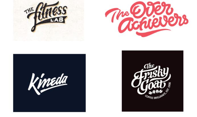
Lettering Logo Design
This style is widely used in restaurants and hotels in order to demonstrate sophistication and professionalism.
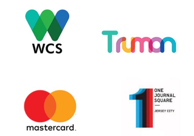
Overlay (Transparency Overlay) Logo Design
In a time not too distant, this style was used in logos of pet-shops or that had some animal like symbol, but today giant companies, like the Mastercard, adopted the style superimposed.
Line Icon Logo Design
2015 was the year of the ‘logo-in-line’, and in 2017 it comes back with a new specification, with the same thickness of the line being fixed between the meetings of the points. Logos like this bring fun, fun and modernity.
![]()
Gradients in Logo Design
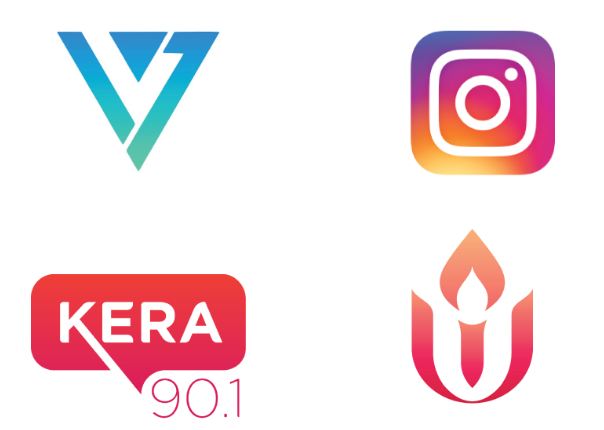
Hello and Instagram, who does not remember, right? So, we laughed at them at the beginning and we started to come across various gradients out there, so now it’s a trend for logos this year and let’s not lie, it’s very beautiful, when it’s well applied.
There are a large number of brands that compete for consumer attention, so it has never been more important for advertising or marketing to design a logo suitable for a business. For every designer whether working freelance or in an agency will always be necessary to keep abreast of trends that are in vogue, but not only that, it will also always be necessary to stay one step ahead of these to achieve a better realization of Their final work and keep customers satisfied. Do not forget that in order to build a brand that customers recognize, it must transmit the message instantly.
Author Bio:
Sarah Feldman is currently working as Blogger and front end developer in dubai base agency named as Digital Express.


