Case Study: The Microsoft Windows Logo Evolution
With more than ninety percent of the world’s computers being powered by a version of MS Windows OS, the windows logo is one of the most interacted with logos in the world.
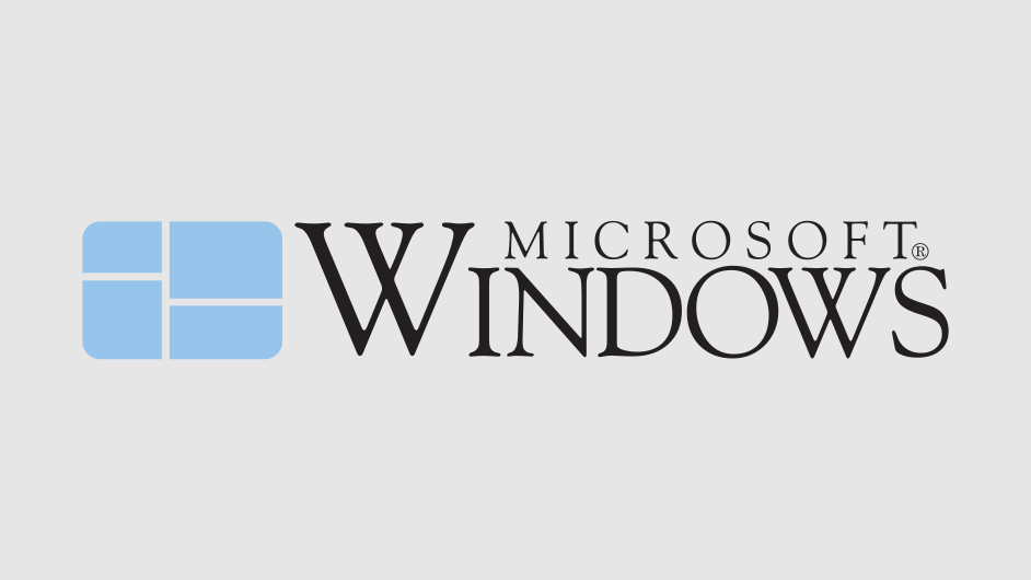
Microsoft started with a soft colored graphic which carried a suggestion to data structures. The ‘times’ family type carried a crossed ‘W’. This logo had a technical, sophisticated look.

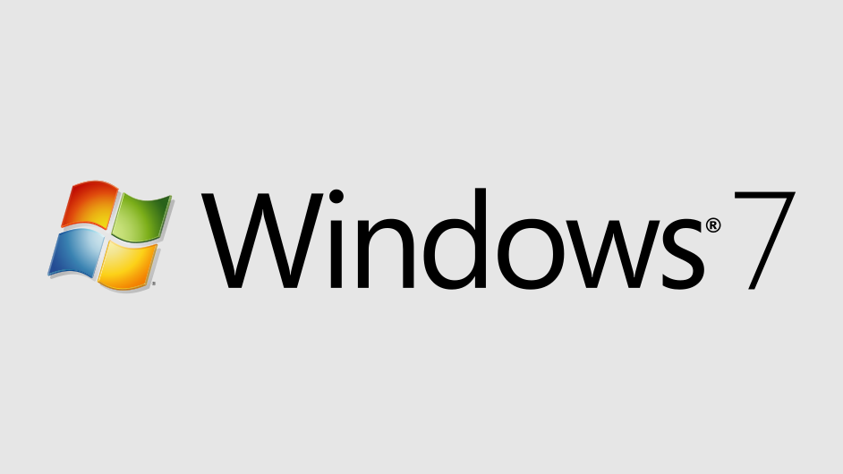
Over the next few iterations, more colors- red, green, blue, and yellow- were added. Also, a bolder sans type was adopted.

As Microsoft arrived in this century, the logo was overhauled again. It acquired a cleaner, 3D look. The graphic was now given equal weight as the type.

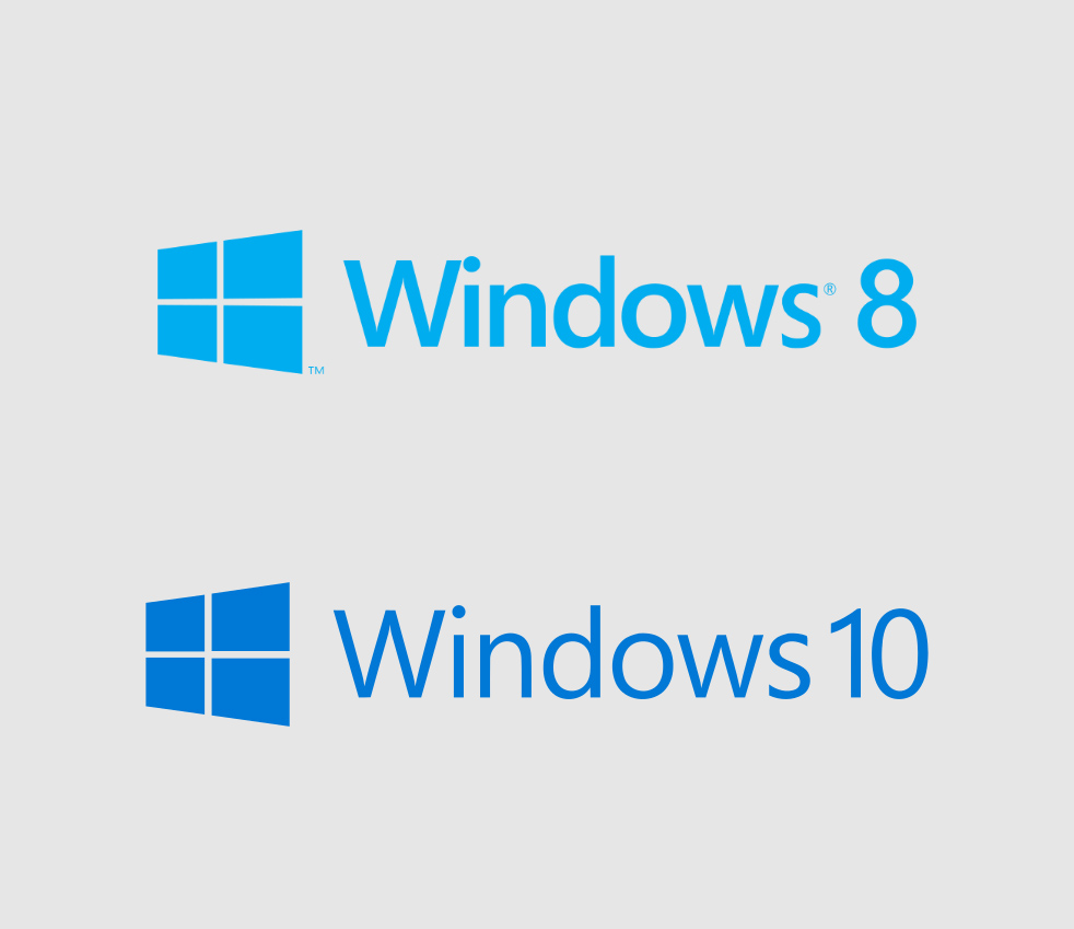
This change gave the logo a “plastic” look. Over the next two generations, the logo designers went for flatter and cleaner designs. These subtle changes were in line with the evolution of digital screens. As the resolutions got better, the type got thinner.

Finally, the present logo, which was introduced with the arrival of Windows 8. This was a time when the whole design philosophy of Microsoft products was changing- when the whole design world was realizing the utility of flatter designs.

Interestingly, the windows 8/10 logo shares a connection with the first one. The hue that the current logo carries, is just a darker value of the color used in the original, 1985 logo.


