
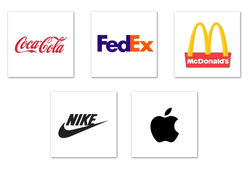
We all are very aware of the major contributions of logos in the branding of companies and deem them to be very significant. The primary functions of logos are to act as the head of communication, values and experiences your whole brand holds. We also know that logos can be of different types, such as word marks, letter marks or symbolic ones. But in this article we are specifically focusing on those factors which make a logo irrepressible and resilient. Most brands with massive brand identities like McDonald’s, FedEx, and Ferrari etc have been using the same logo as its brand identity for ages while some other companies have gone back and forth with their logo. The changing of a brand logo is not something unheard of but it is definitely not something recommendable as it hunts at the total brand impression as a whole of the brand in the market. So let us jump right in to elaborately investigate the ingredients necessary according to branding specialists for a logo to not only be appropriate but also enduring.
Some Factors Which Make a Logo Enduring
Memorability
First up we have one of the well anticipated factors for this list, memorability. Everybody if given an option would definitely want to make their logos catchy but what will exactly make them catchy is the tricky part here. The sure shot way of making your logo memorable or catchy in better understanding would be to focus and elaborate on a single idea and a bonus to this situation would be a catchy slogan which portrays the same idea.
For example, Baskin Robbins logo is quite following by this rules of focusing on a single special idea, in their case “31 Flavours” and a catchy slogan which ties the conceptual branding neatly.
Minimalism
With a lot of brands being inspired by 2000’s maximalist, they are definitely losing out on the edge they would get out of a neat and minimalistic logo. But that makes it more challenging for graphic designers since culminating the visions and aspirations of a brand and reducing it into a simple emblem or a letter mark, word mark definitely needs a lot of creative upper hand. One of the most witty yet simple and appropriate logo to suffice my statement would be Coca Cola’s, which is a word mark with simply its rand in beautiful cursive.
Relevant
This factor is considered to be the most important one whenever the question of a successful logo comes up. Whether you are going more to the quirky side and overriding conventions of legibility or borders, or you are more of a conformist and choose a more secure, legible and neat looking logo representing your brand, the fact that whether or not is the logo relevant or appropriate is surely to come first to you.
Usually brands with word marks are more likely to fall in this category like “FedEx” but emblem like logos such as the logo of “Apple” is also quite making a relevant mark.
Some Brands with durable Logos
Nike
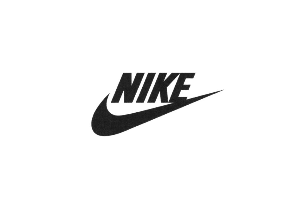
The first brand adorning this list is Nike’s simple, relevant and unbearably catchy emblem type logo better known as the “Nike Swoosh”. It was created first in the year 1971, by Carolyn Davidson as a graphic design student. This logo definitely carries all the elements of a successful logo, minimalism, memorability and lastly relevance tied to complimentary slogan, “Just Do It”.
Coca-Cola
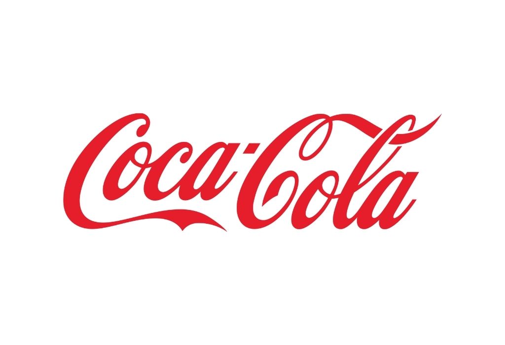
Internationally known as the brad of brands, as previously stated has a word mark which is appropriately its brand name written in red on Spenserian script that was common in the USA at the time., a prime appetising colour which is used in most food brands logo. Coca-Cola has been using this logo remarkably well from 1886 till present. Instead of a cohesive logo which adds on to their branding they had their memorable glass bottles to add.
McDonald’s
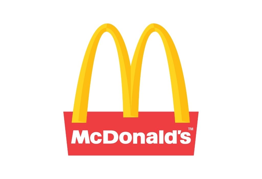
McDonald’s is one of the largest international restaurant chains, serving near more approximately 60 million customers or more every day. McDonald’s, previously known as “The Airdrome”, got its resilient name in 1953. The logo is famously known as the “Golden-Arches” which symbolizes the letter “m” in capital. This iconic logo was designed in the 1960’s. The “golden-Arches’ perfectly embodies the qualities which makes it simple, appropriate and thus very memorable.
FedEx
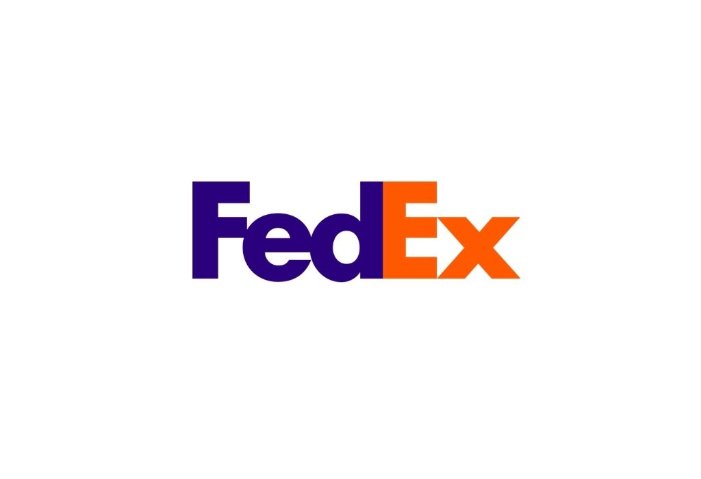
Next up we have the award winning logo of “FedEx”, the graphic designers with this logo has struck on their creativity and decided to incorporate the aspects of optical illusion to make the logo more interesting. The company was a packaging delivery start up and now has gone through an evolution and emerged as a logistics trend setting brand. It is an all bold word mark in the font Futura, but upon looking more attentively onlookers notice a white arrow which stands for speed and accuracy between the letters “e” and “x”, portraying a witty usage of even the white spaces in between to make a logo extraordinary.
Apple
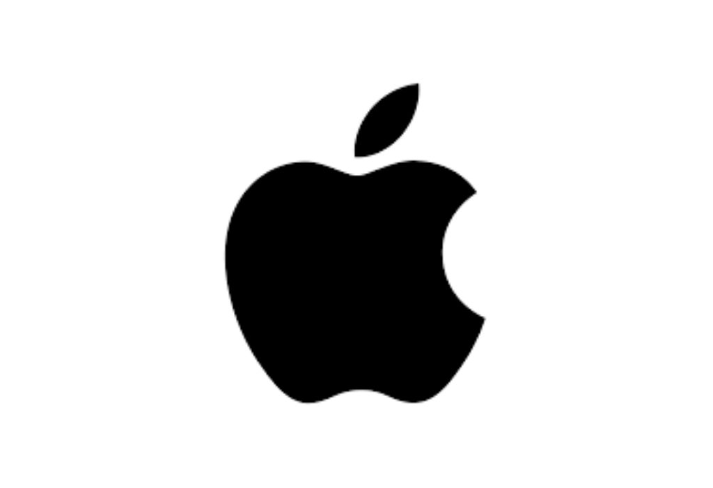
Apple has emerged as a tycoon company in both the eastern and western worlds. The apple logo has been the centre of discussion across many portals, but with its fame it also had to sustain the many changes in the company.
The logo originally was a quite complex one with Isaac Newtown but throughout the years it underwent an evolution and settled with a single minimalistic apple, with a cheeky bite, but the idea behind it is quite out of the box. Mainly the logo stands for knowledge and imperfections adding onto its extraordinaire.