
Colours are one such enchanting tool which helps in psychologically influencing people in an obscurely pristine way. And marketers have rightfully discovered the efficiency they can extract out of this concept. Brands have started adding this concept when it comes to choosing the most pivotal and essential aspect of their branding, their logos.
Top 10 Famous logos designed in Pink
In this article, we are exploring the influence of the colour pink when it comes to branding. We are specifically investigating the psychological symbolisms which the colour upholds and the different brands which have rightfully used what the colour “pink” offers aesthetically and metaphorically to their own benefit.
The Symbolical Interpretation Of The Colour “ Pink”
From a very broad and outright point of view, the colour pink is majorly tied with feminine concepts and in certain cases tied to a single gender identity and as a result of such a social interpretation this colour is proven to be quite engaging to the female audiences more than the gender audiences. But the colour pink stands for much more pertinent and extensive concepts and values such as moods, feelings and behaviors.
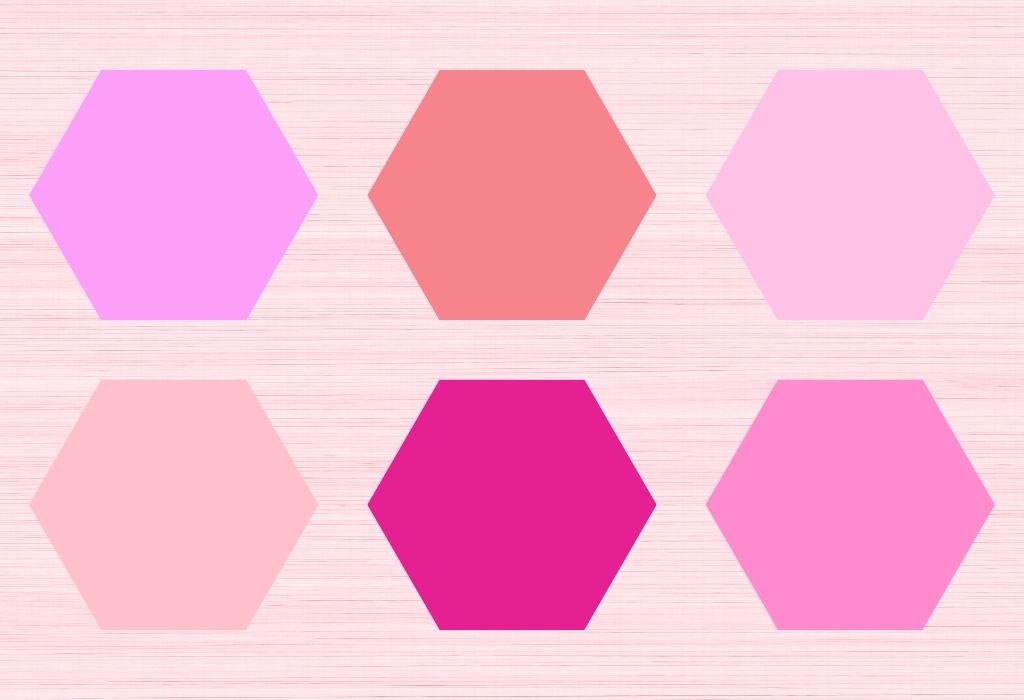
To name a few feelings such as love, compassion, peace and harmony are crucially represented by the shade pink. But the different hues of the same shade pink can be interpreted in varied ways, and this is what makes it more favorable for companies for companies to work with these colour, since when it comes to choosing the shade of pink for their brands they have a huge colour palette to choose from which will help in adding quirkiness to their brand emblem and make it distinctive from the rest.
Industries Where The Colour Pink Is Mainly Used
As mentioned earlier, the social construct of tying pink with the female gender has consequently resulted in the female section of the consumers having a higher interaction rate with this colour in comparison to their male counterparts, of the available consumers in the market. But other than that this shade is used in several other industries which will appropriately use the symbolisms of this shade to their advantage, so let us right away dive in to find out more about such industries!
Beauty and Cosmetics Industry
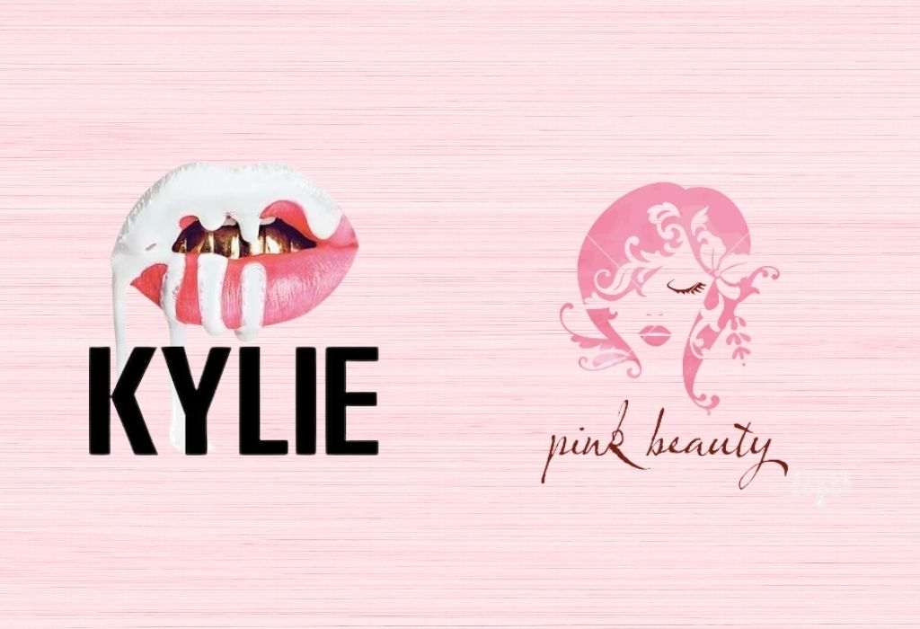
First up we have the beauty and cosmetics industry extensively feeding of the psychologically influencing shade of pink. The leading factor which makes the shade pink a model candidate for this industry is the fact that the products of this industry initially was tending more towards the female demographics although the scenario is definitely undergoing a change.
Two million dollar brands like “Kylie Cosmetics” and “Pink Beauty” have chosen this shade to be a part of their packaging. “Kylie Cosmetics” have used their knowledge about how the different shades of the same colour have different psychological interpretations to their favor by using pale pink which stands for youthfulness in the packaging of their skincare line and more vibrant shades of it in their cosmetics line.
Pink Color in Food Industry
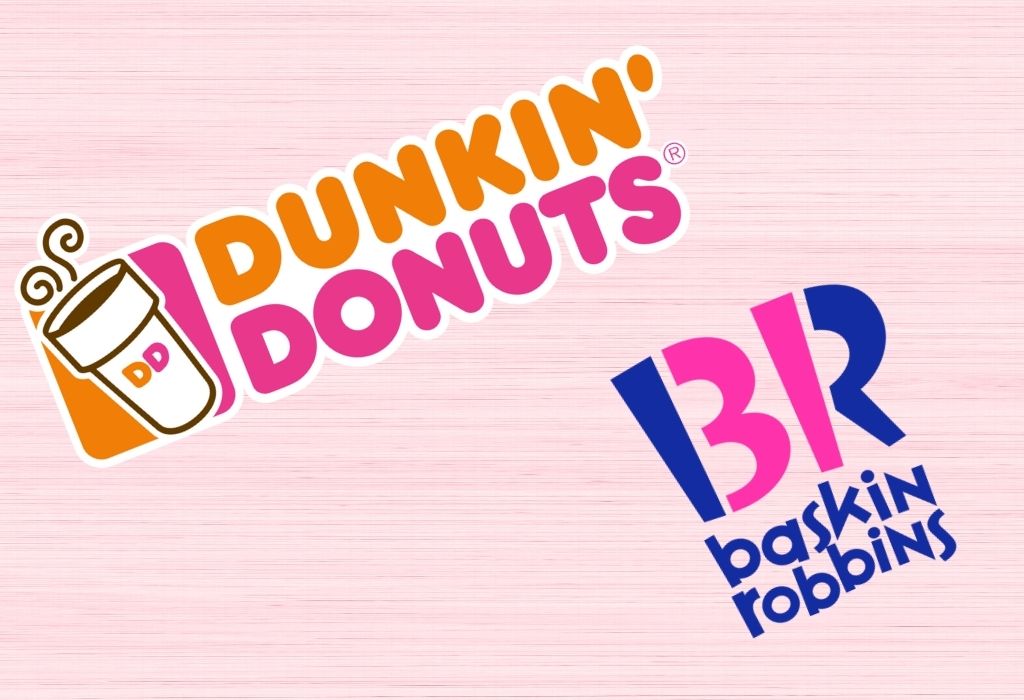
Mainly brand houses specifically selling desserts have incorporated this shade into their packaging. Even though it is not considered to be a highly appetizing colour like red and yellow, but it also resembles and embodies sweetness and all that is nice.
Two enormous dessert brand houses namely, “Dunkin Donuts” and “Baskin Robins” have similarly incorporated this shade in their packaging design.
“Dunkin Donuts” have gone a further step by adding cohesiveness to their branding strategy by tying their slogan “America Runs on Dunkin.” And the concepts of harmony and unity resembled by their brand shade, pink.
Pink Color in Fashion and Apparel Industry
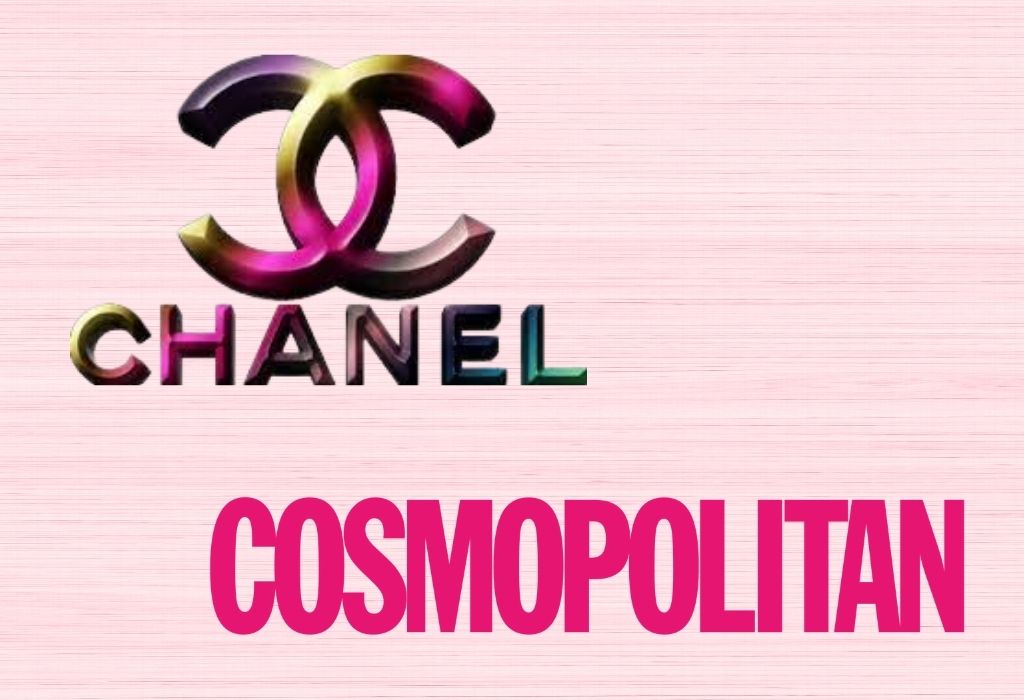
Another industry, which has appropriately used the different shades in their logos and packaging, is the fashion and Apparel industry. The colour which also upholds concepts of elegance and sophistication has rightfully been the model candidate for luxury fashion brands like “Chanel” and million dollar lifestyle magazine “Cosmopolitan”.
Cosmopolitan again being the largest magazine catering to the female gender of consumers in the market, has a word mark as its logo completely in pink.
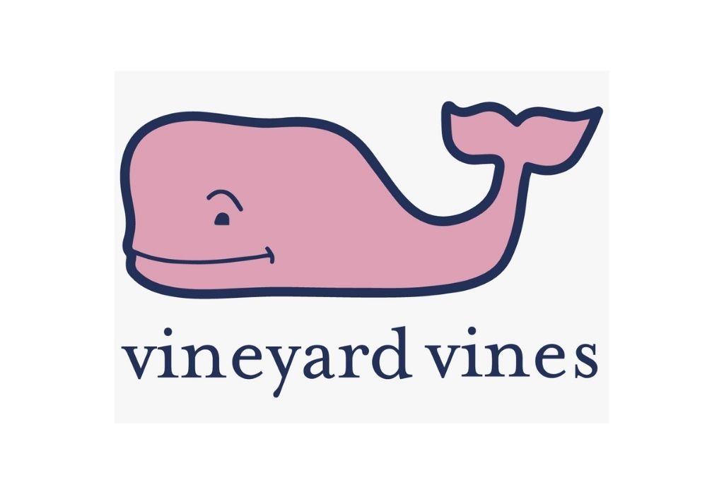
There are very few companies that are not female-focused that have chosen pink. Lyft has developed a quirky and approachable image that has helped itself stand out from Uber and a huge list of very masculine tech brands by choosing pink for its primary brand color. Vineyard Vines has also successfully used pink even though they sell clothing to both men and women; this seems to work with their preppy style which general uses more pink than other styles of clothing.