The Evolution and History of the UFC Logo
The UFC logo stands for intense competition. It represents thrilling battles between equally matched opponents. Beneath these symbols are hard work, relentless pressure, and a strong desire to achieve victory. Each step forward is a climb toward new achievements, guided by the support of a promoter.
A Few Words About UFC
The UFC stands as a premier sports promoter in the realm of mixed martial arts. They run contests across a dozen weight divisions; there are options for both men (eight classes) and women (four classes). Back in 1993, Art Davie, Bob Meyrowitz, and Campbell McLaren came together to launch the organization. Today, Endeavor Group Holdings along with Zuffa manages the UFC, backed by a trio of keen investment firms. Calling Las Vegas home means bright lights and big fights for the UFC! As leaders within their space they have managed to put on over five hundred crowd-pleasers while pocketing billions along the way.
UFC Logo History
The emblem of the UFC was introduced in its founding year to provide the advertising firm with a straightforward and easily recognizable symbol for the immediate organization of events. UFC stands for “Ultimate Fighting Championship,” clearly denoting the nature of the activity. Throughout its history, the company has revamped its logo three times: twice with significant changes and once with minor adjustments.
Before 1999
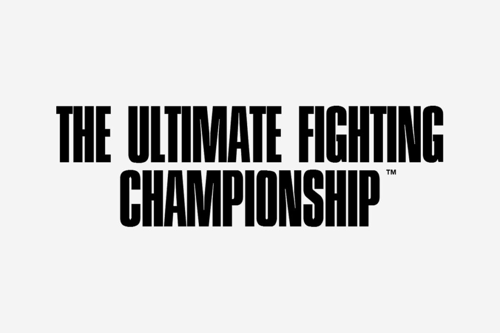
The inaugural emblem features a minimalist design. The full phrase “The Ultimate Fighting Championship” is arranged horizontally across two rows. The top row displays the first three words, while the bottom row showcases the final word. This last word is distinctly isolated, highlighting the nature of the sporting event. The typography is clean, straightforward, and black, with a slight elongation to the characters. The letters are crafted with straight lines in a sober style, underscoring the organization’s gravitas.
1999 – 2001

Once the adjustments were made, the logo adopted a more varied appearance. It incorporated graphic elements, intricate details, and vibrant colors. During this time, it was seen as a dynamic and colorful icon. The designers used the abbreviated form of the company name as the foundation, placing it prominently in the center. Behind it stood a figure of a combatant, an image previously used in an alternative logo. This muscular athlete, adorned with a premium belt, exudes confidence and readiness for battle. The background features a map of one of Earth’s hemispheres. All the elements are enclosed in a semicircle, bordered by a thin red line.
2001 – 2015
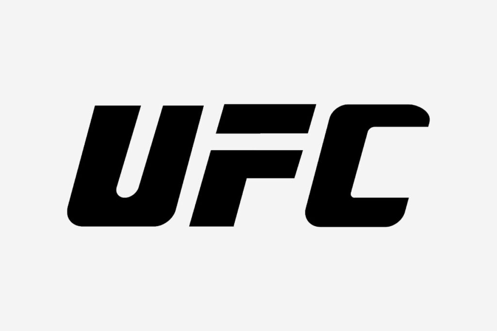
In 2001, management approved an incredibly minimalist new logo. The design distilled the previous elements down to just one: the abbreviation. This abbreviation was transformed into an emblem, seamlessly blending text and imagery. Each letter exhibits a clear and precise structure, characterized by straight lines reminiscent of geometric shapes. The serifs were removed, and the spacing between letters matches the width of the characters’ internal gaps. Notably, the “F” lacks a connecting leg, causing the upper part to appear as if it’s suspended, creating a distinct rectangular form.
During this period, much more has changed than just the logo. UFC has gained enormous popularity, helped by the development of UFC streaming around the world. But over time, the UFC fight stream began to become more difficult again. If you are in one of the countries where access to live streaming is not provided, you can install VeePN and bypass this restriction. This tool can change your IP address, posing as a resident of a country where broadcasting is allowed.
Many of the most legendary fighters in MMA history competed during this period, such as the Diaz brothers, Georges St-Pierre, BJ Penn, Anderson Silva, Frankie Edgar, Jon Jones, and numerous Hall of Famers. From 2009 to 2015, the UFC sported a 3D logo featuring silver initials accented with gold linings against a white backdrop.
Today
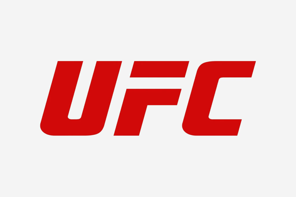
After 14 years of sporting their iconic black and white logo, the company unveiled its third major redesign. Redefining its classic look, the updated logo showcases vibrant red set strikingly upon stark white. Now featuring streamlined sharpness in its contours, our latest logo ditches those broad-form designs of old for something sleeker.
By this point, the brand’s fame was clear; lengthy explanations were a thing of the past.
Back in ’18, to celebrate turning twenty-five years old as an organization they released an iconic new emblem The silver jubilee emblem was designed with a single color gradient transitioning between gray and silver.
A redesigned logo heralds big changes at our beloved firm — it’s more than just aesthetics; we’re entering uncharted territory together with you! The UFC world continues to change and not only the sign has changed. The game changed recently when they introduced a new set of tests and rulebooks for the octagonal ring.
This new chapter began with the emergence of the Rousey/McGregor era and was further defined by world-class fighters such as Khabib Nurmagomedov, Max Holloway, Stipe Miocic, Henry Cejudo, Amanda Nunes, Dustin Poirier, Justin Gaethje, and Charles Oliveira, among others.
Final Words
The UFC logo has predominantly stood for the “Ultimate Fighting Championship,” with the exception of its initial design. Over time, the logo has undergone a series of subtle changes, primarily focusing on the typography. Initially, the term was fully spelled out, but it was eventually abbreviated. The final design embraced simplicity, aligning well with the sport it represents. The letters are bold, uppercase, and slightly tilted to the right.
This logo features a custom-designed typeface created specifically for the UFC. It strikes a balance between being informative and visually distinctive. The acronym “UFC” is presented in a Sans Serif font, characterized by clean lines, sharp edges, and smooth transitions, devoid of any serifs. The color scheme is straightforward, utilizing a monochromatic palette with classic combinations of white and red or black.


