
When I started in graphic design, more than a decade has passed since, I came to know that the use of colour can be governed by something known as the “Colour Theory”. As long as I could ignore it, I did.
Using the theory in my initial designs felt like putting a barrier on the intuition, which was pretty much the source of my designs at that time. My argument against it was- just as you don’t need to know the laws of physics to ride a bike, you don’t need the colour theory to make good designs. My definition of what makes a good design has also come miles forward since then.
Growing as a designer, and finding grounding in design thought, my intuition gave way to rational decision-making and problem solving. Without knowing it, as I realized much later, I was only utilizing what earlier I had snubbed for being too strict, counter-intuitive, and unnecessary.
If you’re not a formally educated graphic designer, or are someone who has every commissioned a design work, you may have made statements like “this colour goes with that” and “this will look better in blue”.
As you will realize in this series of posts, just like I did after the initial skepticism, that although the colour theory is a formally defined (and formally studied) subject, it is something that is internal to humans. Artists, designers, and even people who can’t paint to save their lives refer to it all the time without knowing.
Since almost all of graphic design today is created and published on digital screens, we’ll limit ourselves to the realm of digital screens only, and some detours into print when absolutely necessary.
HSV, HSB, and HSL
Every colour that you see, or more precisely, that your eyes are capable of every seeing, can be described by three properties- hue, saturation, and value. Value is often also called brightness (HSB) or lightness (HSL). If you’ve ever interacted with a graphics software, you may be familiar with a triangular HSV colour wheel.
Hue is the actual colour. It is what you mean when you say “yellow”, or blue, or red, or any other “hue”. It may be more technically sound to say “blue hue”, instead of “blue colour”.
Saturation is the “purity” of the hue. You may know that colours are made by mixing Red, Green, and Blue lights (we’ll go into the details later). So a pure blue hue, or any pure hue, is one that is made of the lights of the highest intensity. As you decrease the intensity, the hue starts losing colour, becoming achromatic.
Value is the darkness or lightness of the hue at the given saturation. Dark value means that more black, that is, no light, will be mixed with the colour. A high or full (100%) value means that the colour will be visible in full. There’s a subtle difference here between the terms, lightness and value. As you increase lightness, more white light gets mixed with the hue, giving a washed out colour.
How Newton saw colour?
Isaac Newton’s famous experiment revealed the constituent seven colours of white light, when he passed it through a prism. Thence proved fact that colour was made of light was a revelation for artists and printers. Following the experiment, Newton arranged the colours of light into a circular diagram, a practice continues even today as “colour wheels”. We’ll deal with the concept of colour theory in the follow-up posts.
The primaries
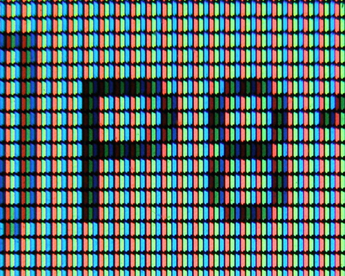
In digital screens, since colour is rendered with the help of light pockets, known as pixels, the Red-Green-Blue system of primary colours is used.
As you may know from the prism experiment, that white light is made up of seven colours. Out of those seven, the three primaries are capable of producing nd almost every colour that the human eye is capable of capturing.
It’s important to note that we’re talking about light, or the electromagnetic radiation. So, the seven colours of the rainbow are composed of electromagnetic radiation of different frequencies.
Combining light or additive mixing
When these frequencies are combined together, we get white light. Since the primaries can account for every other colour, they are also capable of producing, or emitting, white light.
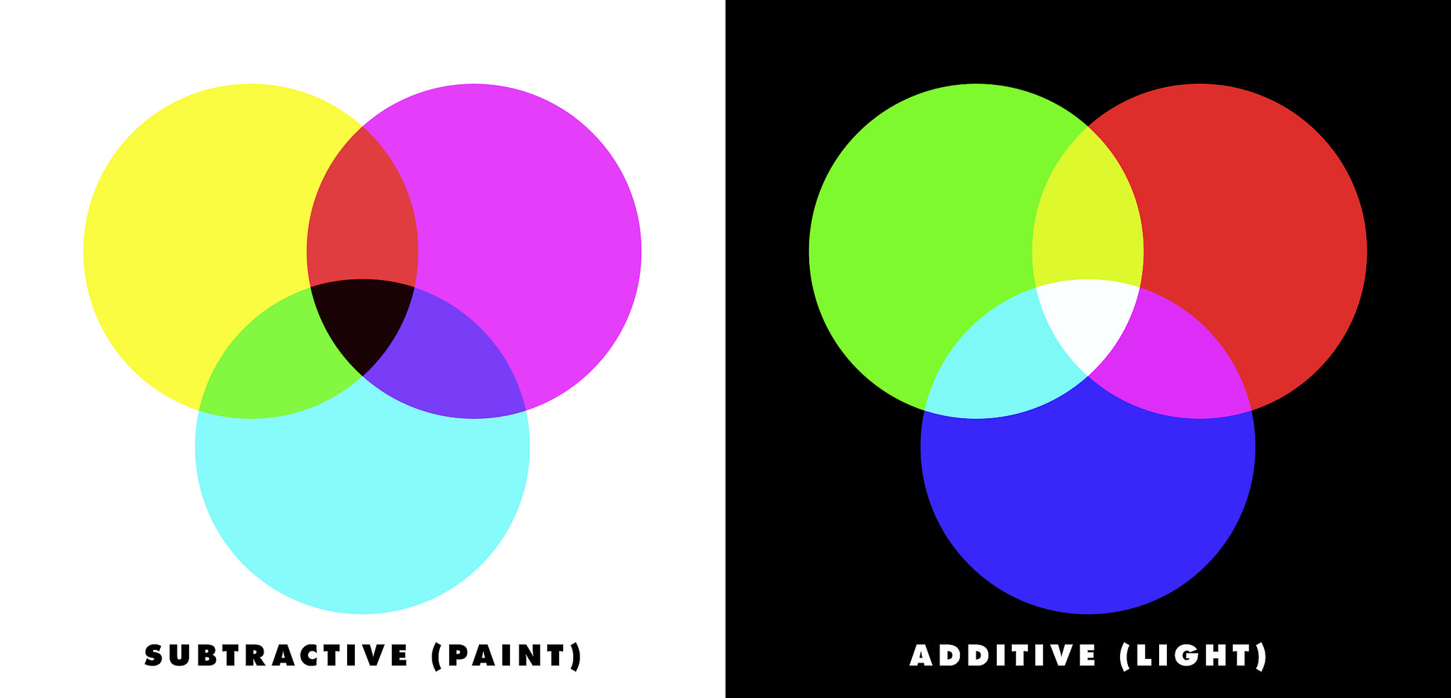
This brings us to the concept of additive mixing. As I said, in digital screens, each pixel is like a pocket that emits light. Each of these pixels is capable of emitting red, blue, and green light, together and separately.
When all three emit together with full capacities, we get white colour on the screen. When blue and green ones emit at full capacities, we get cyan. Similarly, we get yellow when the red and green ones emit light at full capacity. As you may guess, different ratios of these light emission produce different colours. In fact, LCD screens can produce more than 16 million colours.
As you take from above, to make new colours light is emitted, and two or more primaries are always “added”. This is additive mixing. Adding more light of the three colours (frequencies) takes us closer to white, resulting in lighter values, or whiter colours.
Subtractive Mixing
If you take the seven colours of the rainbow in paint, and mix them together in equal quantities, you’ll get a mixture that’s really close to absolute black.
This is the difference between mixing light and mixing physical pigments. In additive mixing, removing all light gives black, and adding all light gives white. On the other hand, in physical mixing, adding all, or the primary, pigments gives black, and not using any pigment gives white.
Why are roses red and violets blue?
We see rose as red because when white light falls on it, its petals absorb the lights of the other six colours but reflects the wavelengths that comprise red in the colour spectrum.
We’ll cover this topic more extensively, when we talk about print colours in a follow-up post.

That’s it for this post. In the next post, we talk about “How do we receive colour, biologically?”
This series of posts on “colour theory” was written to help self-taught artists, designers, and people who may commission their work, to better utilize the science behind how the human eye interpret colours and how colour interact with light, helping them move from ‘instinct’ to ‘intellect’, ultimately making and using better visual designs.
Understanding the Colour Theory, Part 2
Understanding the Colour Theory, Part 3
Understanding the Colour Theory, Part 4