

In September last year, Google was restructured and the new logo was unveiled. People around the world, in a single tone, said “meh!” and cried “why?” A year has passed, and now when we reflect at the older one: “Why? Why was it ever like that?”
Companies change their logos for a lot of reasons. A change in vision; change in business; or sometimes simply, for the sake of change itself.
During this last decade, the steep rise in the use of smaller screens forced a lot of changes in the design world. We witnessed a general shift towards flatter designs and simpler colour palettes. A lot of big brands had to modify their logos to satisfy the needs of the Internet age.
But! There were some designs which passed on, unchanged. Credit is to be given to the minimal designs and farsightedness of the designers. We take a look at some of these designs.
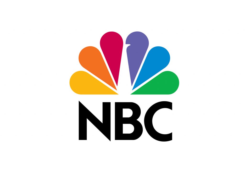
NBC Logo
NBC’s present logo has been there since 1986. This logo has a flattened look and a worthy use of negative space. The peacock is looking to the right to signify the company’s vision for the future. It was unveiled at the 50th anniversary of NBC.
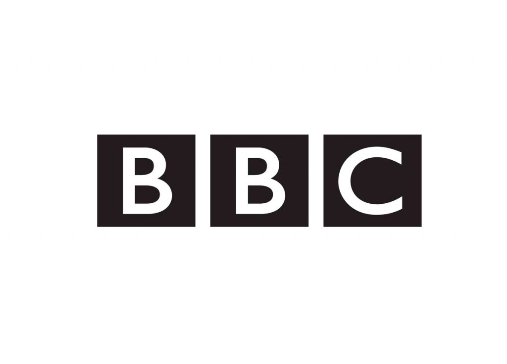
BBC Logo
BBC’s current logo, ‘BBC blocks’ has been there since 1997. When most of the companies of the time were using protruding motifs, using a simple logo was a brave decision. But it is the minimalist approach of the designer, Martin Lambie-Nairn, that is to be credited here.
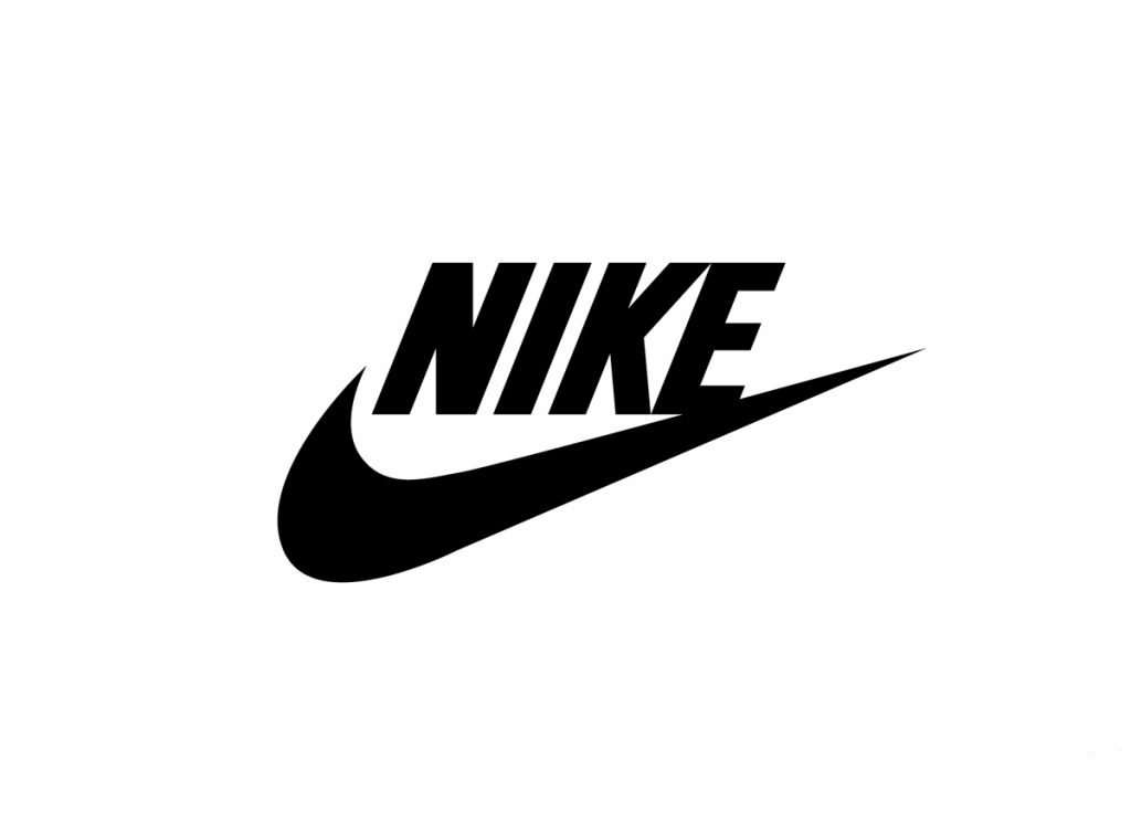
Nike Logo
The iconic swoosh has been there since the 1971. Carolyn Davidson, the designer, wanted to convey a sense of motion and speed. When she created the logo, it was one of those “we’ll change it later” things. Today it is one of the most recognised logos, and the most valuable as well.
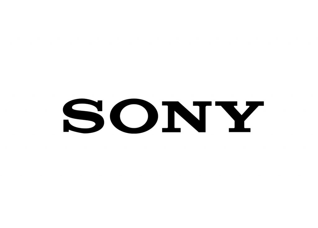
Sony Logo
Sony has used this type based logo since its dawn. We don’t even remember if Sony ever had a different logo. It does everything that a logo is supposed to do, to help identify the brand. It might seem too simple at times. Sony even decided to replace this logo by crowd-sourcing a new one, but they couldn’t get themselves to like the new ideas.
Samsung Logo
The Korean giant’s logo is another time tested example. Since its inception in 1993, it hasn’t changed a bit. The elliptical blue is almost instantly recognizable. Once again, the effectiveness lies in its plainness.
Nintendo Logo
Nintendo’s type-based logo is fun and exciting. The present logo was adopted when Nintendo entered the video game business in 1975. Although in 2006, a grey variant was introduced, this classic fun logo still remains and keeps on reminding us of ‘Mario’.
FedEx Logo
This famous purple and orange design was unveiled in 1994. The right-pointing arrow built up of negative space between the E and X becomes omnipresent once noticed.
Canon Logo
Unveiled in 1956, Canon’s stylized name is surely one the oldest logos currently in use. This logo was preceded by a very intricate design including a Japanese Goddess, ‘Kwanon’. When the company decided to go international, the name was changed to Canon and the logo to this.
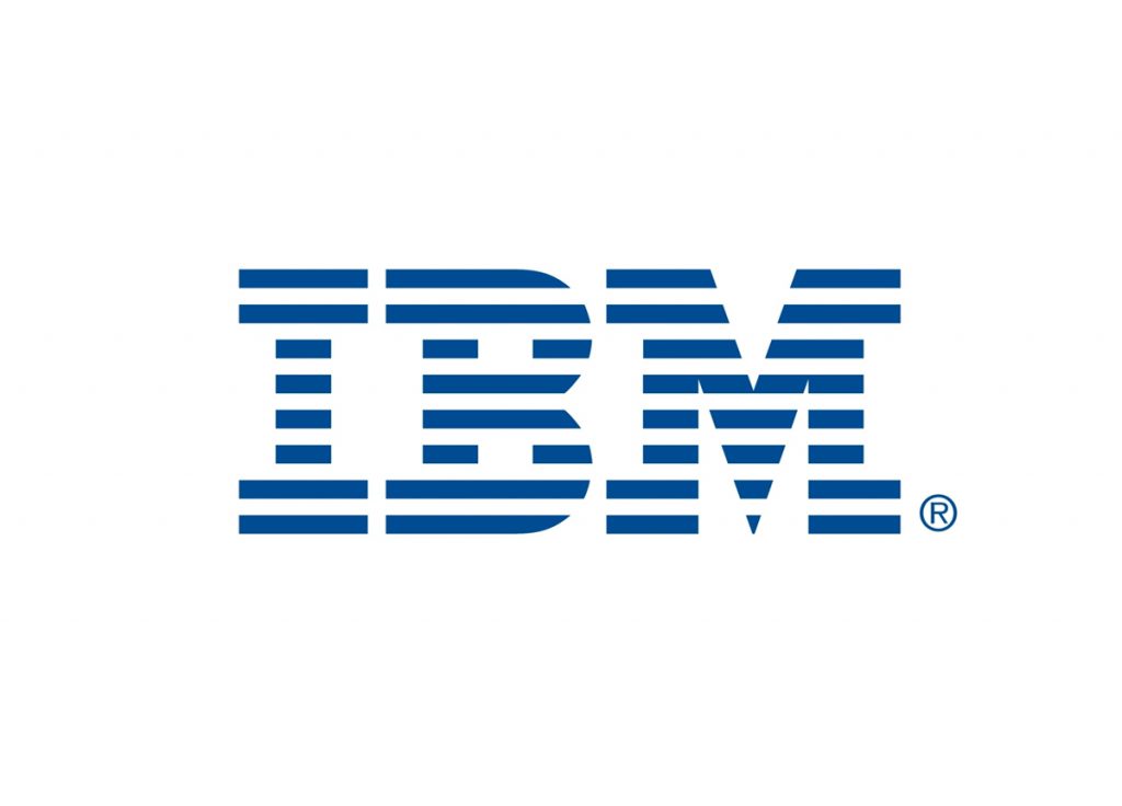
IBM
Once a name synonymous with computers, IBM has vanished from the computers mass market. But anyone born in or before the nineties would remember the name IBM stylized with horizontal lines. The logo, designed by Paul Rand in 1972, suggests “speed and dynamism”.
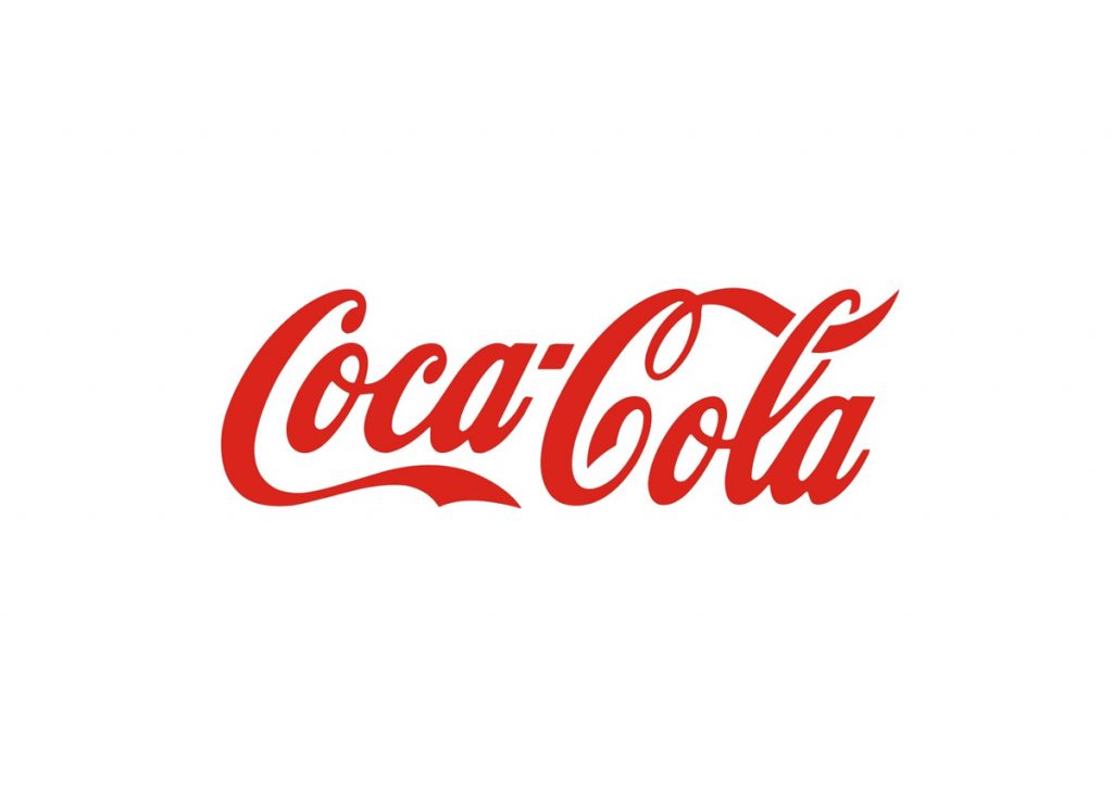
Coca-Cola Logo
The iconic Coca-Cola logo has more or less stayed the same since the 1940s. The iconic cursive font, the distinctive swirls, and the extended C result in one elegant and classic logo. Surprisingly, the original logo- which later formed the basis for the present design- was created by a bookmaker, Frank Mason Robinson, in 1886. In case you are wondering, the script used is Spencerian, which was popular at the time.
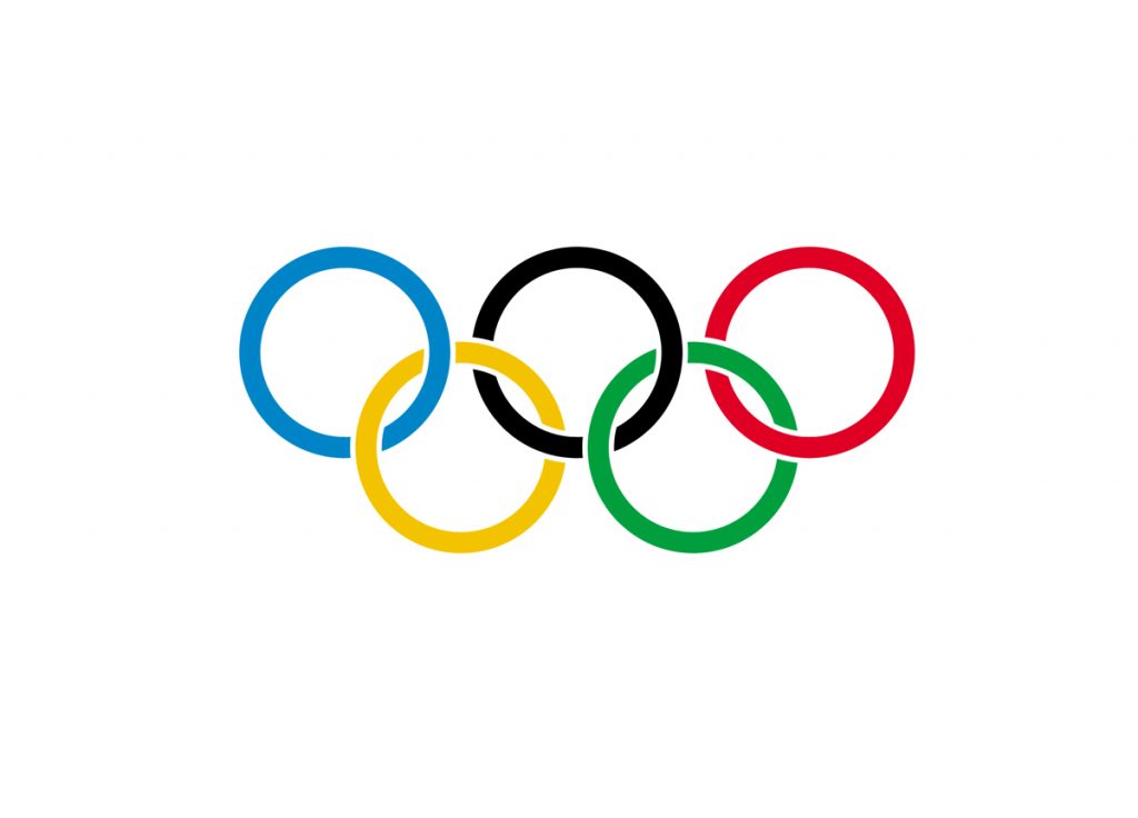
The Olympic Rings Logo
The Olympic rings were designed by Baron Pierre De Coubertin, the co-founder of the modern Olympic Games. The five rings represent the continents. At the time it was created, the six colours of the logo could be used to reproduce the flags of every country. For over 100 years, this symbol has stood proof that a message so profound can be communicated with such simple elements; to bring the world together.
If you feel there is a logo that ought to be on this list, feel free to let us know in the comments section below.