
Majority of the American Population has grown up knowing by heart, the trademark three notes of NBC broadcasts.
For those living in the pre-television era, the National Broadcasting Company’s chimes were heard over the shortwave, and for those who witnessed the golden age of television, they were accompanied with the logo. NBC has been around for a long time.
When a company has been in the business for over ninety years, it generally means a lot of logo generations.
The first major logo from the broadcaster was publicized in 1943, and was a stylized illustration of the radio and television broadcasting process.
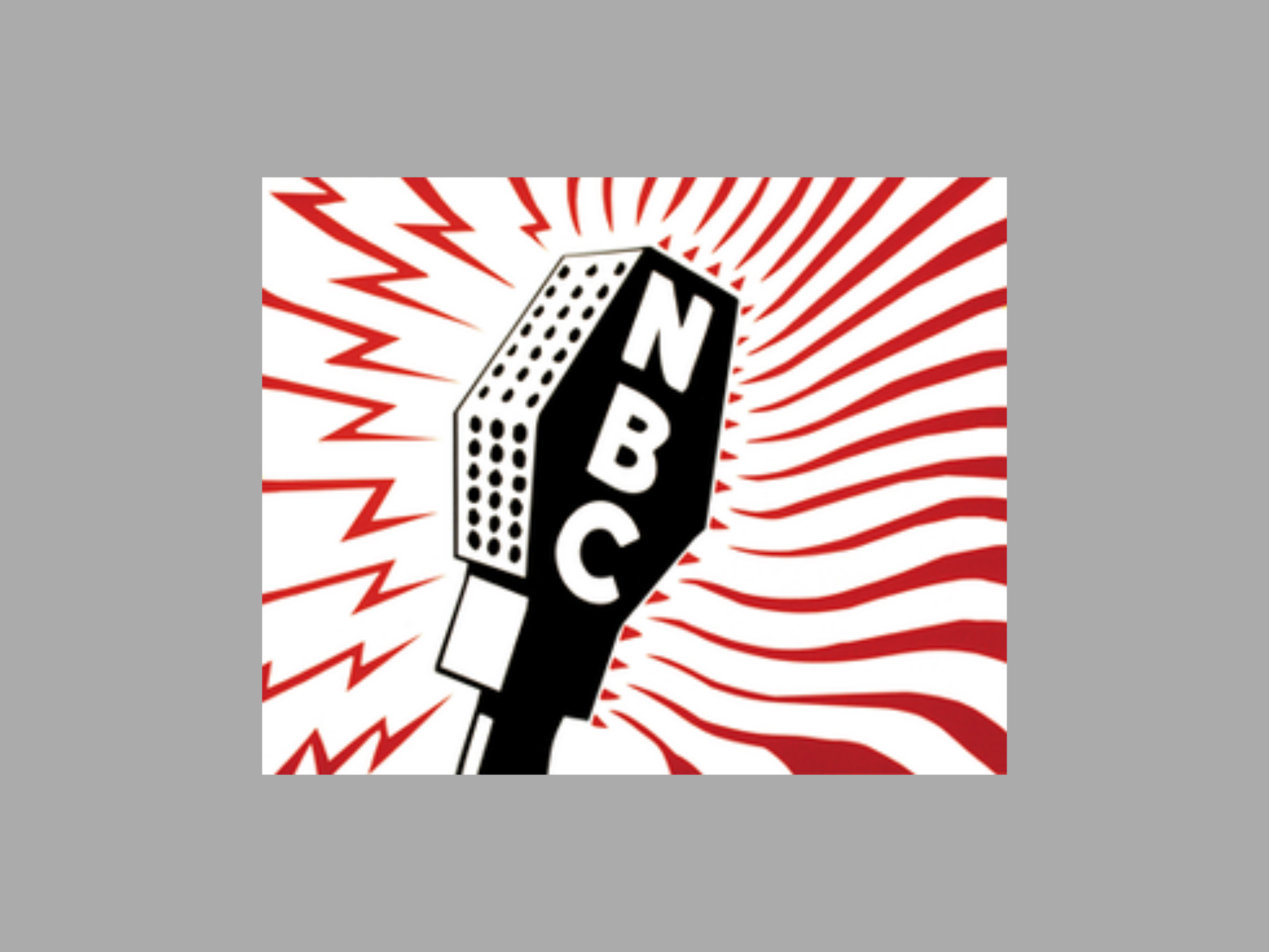
The logo successfully transposed two business identities in one illustration. The lightning rods on the left apparently represented radio broadcasting whereas the smooth curves on the right, the television transmission.

It is important to note that this kind of meaning attachment to the design is very rarely conveyed to the consumer, at least not using using the design itself. However, it does carry significance as it becomes an internal story for the employees and the graphic design industry. Sometimes, it may also seep into the pop culture, making that logo timeless.
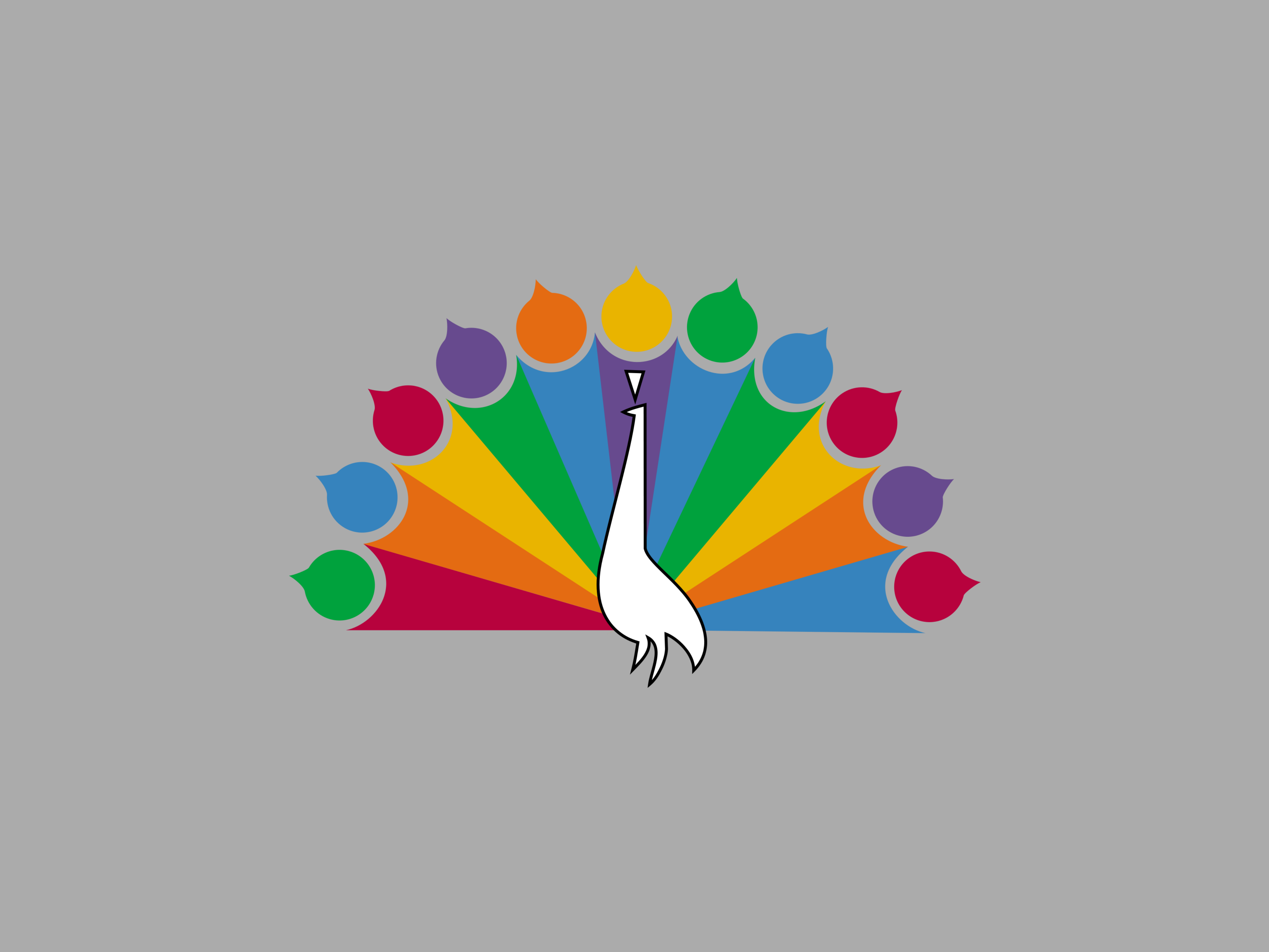
After one more generation, the peacock became a part of the NBC brand identity. This was the use of a peacock for the first time and was often accompanied by a type-based logo, which is often called the “Snake Logo” of 1959. The peacock logo in opening cards was now animated and spanned its feathers over a few seconds.


After a few more iterations of peacock logos, we arrive in 1986, where a new logo was presented on the broadcaster’s 60th anniversary.
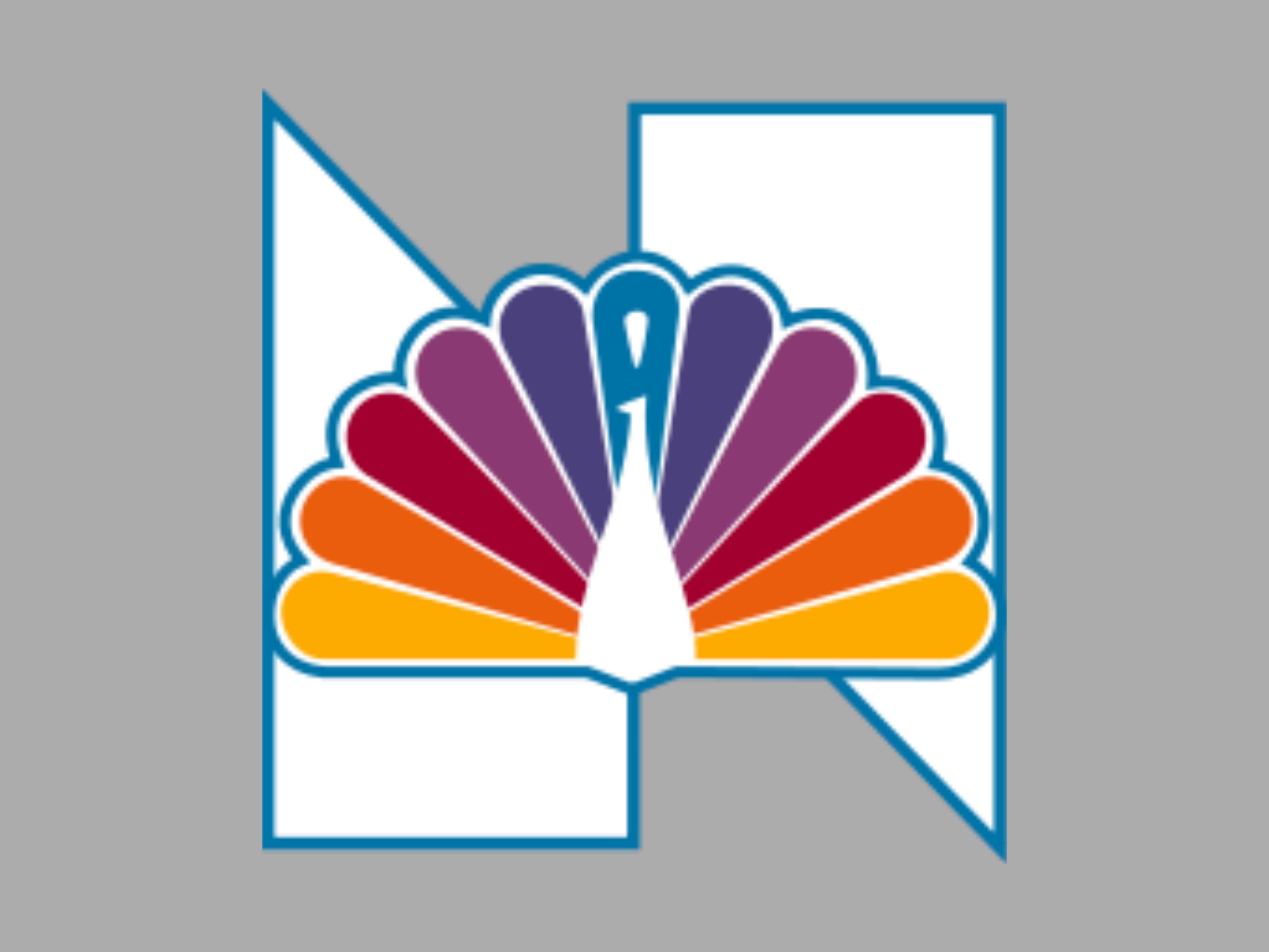
In its final generation, the peacock was here to stay, making the logo that we still see today. The pheasant illustration had lost the headpiece, which was a good decision as the headpiece wasn’t necessary to get the peacock look. There were now six feathers, as opposed to the original eleven. Six apparently represented the six divisions of NBC.


Another, and more significant change was that the peacock now looked to the right. It represented an outlook to the future.
This is not an instance of meaning attachment but rather a fact based decision. Human mind attaches the right direction on a two dimensional plane with the act of going forward, or the forward direction.

So, there we have the story of the evolution of television’s greatest logo. As we can see, the masterful graphic designer, Steff Geissbuhler, progressed from an artsy meaning attachment, to a practical, fact-based design approach, which has kept the design relevant even in its fourth decade.