Case Study: The IBM Logo Evolution
If you’ve ever forced yourself to study law practices, you would know how dealings of cases become basis for future judgements. This is called common law.
Lawyers use the extensive collection of arguments and counterarguments, presented by counsels in prior cases, to form grounds for cases at hand.

Logo designing is like practicing law
By this point, you might be wondering as to why, am I talking about the practice of law in an article which is supposed to be related to branding and logo design.
The reason being my opinion that the field of branding is very much like the practice of common law. There are some principles which are accepted and adhered to by every logo designer and branding expert. But there are also those unconventional ideas which are presented and argued for so profoundly and successfully that they become precedents for future design decisions in the industry. Therefore, just as a lawyer depends heavily on case studies so can a designer. And as a logo designer, I don’t think there would be any better case to study then the evolution of the IBM logo.
So, without further ado let’s start looking at the decisions taken by the prolific designers that took charge of the branding job at IBM.
CTR
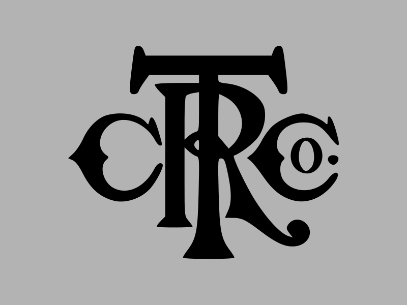
Before the CTR (Computing Tabulating Recording Company) became the brand IBM in 1924, it had a pretty conventional contemporary type based logo.
Going Global
When the new brand IBM was introduced, which stands for International Business Machines, the new logo reflected a vision for futuristic, ahead-of-their-time designs. The curvy elongated type was dropped and a global theme was made explicit.

Simple is for the Masses
Next logo was unveiled when IBM transitioned from punched-cards to computers. The type based logo got even more simplified with a white body. As simple as it could have been, this logo did what a logo should.

A Bolder Approach
Few years later, in the next iteration, the type was modified by making the serifs bolder. The valley in ‘M’ was also made sharp. This new logo had a more definite and intense appearance and a gave a vague sense of competitiveness. A right move in the time when IBM was starting to invite hard competition.

Slits
The final genesis, to the credit of Paul Rand, resulted in one of the most widely recognized logos in the world. Amazing is the fact that this logo, which fits so well in today’s design scenario, was designed five decades ago. The eight horizontal stripes make it fit snugly in the digital world, and at the same time add speed and dynamism. A laud is owed to the great Paul Rand’s ingenuity and far-sightedness.

The IBM logo evolution story tells us how great logos are not created but evolved, made better until they reach a point when there’s no improvement to be made.
I do not however, by any thought, imply that the earlier iterations of the logo were bad by any standard. On the contrary, they were quite efficacious designs which fit well in their respective time periods. But as time passed, their relevance took a beating and the wise designers justly mutated them in the right direction.
The difference between good and great logos is that great logos just last longer. Maybe the IBM that we are so fond of today will be just another step in the evolution tomorrow.
And you can do CompTIA Certification Exam Dumps course for upgrading your skill sets.


