

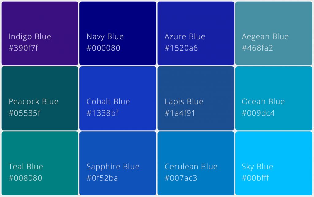
The color of sky; the color of sailors; the color of starlight. Blue is a cool color. It’s not just cold as ice, it’s also tranquil and melancholic- like the blues. Let’s take some time to learn a little more about the shades of this multi-faceted, multi-value color.
Blue is one of the most universally loved colors in design, symbolizing trust, calmness, and depth. From digital interfaces to global branding, blue plays a vital role in shaping visual communication. Its wide spectrum of shades allows designers to create moods ranging from serene and minimal to bold and authoritative. Whether used in fashion, interiors, or user interfaces, blue remains a foundational color that balances aesthetics and functionality across creative disciplines.
The Essence of Blue
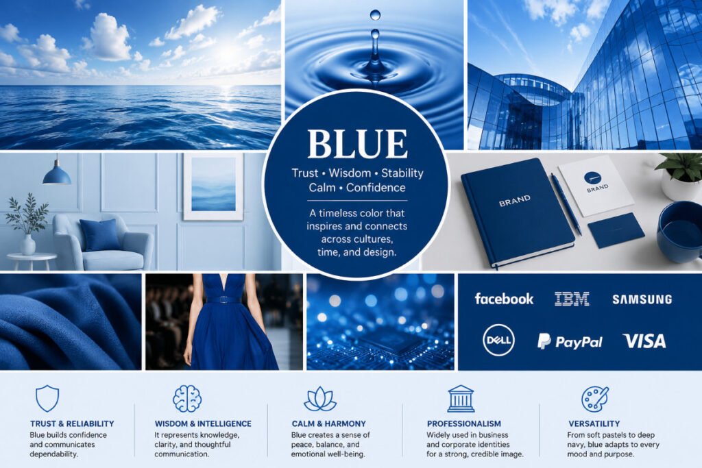
Blue is one of the most widely admired colors in the world, inspired by the sky, oceans, and flowing water. It is often associated with calmness, stability, trust, and openness, making it a color that resonates across cultures and generations.
Throughout history, blue has symbolized wisdom, protection, harmony, and reliability. Today, it remains a dominant choice in branding, fashion, architecture, and digital design because it communicates confidence and professionalism.
Its versatility is one of its greatest strengths. Light blue shades create a sense of peace and relaxation, while darker blues convey authority, sophistication, and strength, making blue an enduring favorite in visual communication.
Meaning and Psychology of Blue
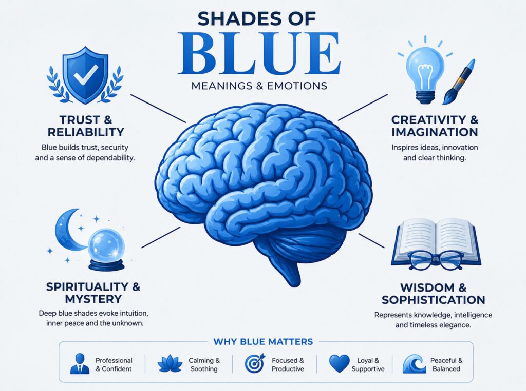
Blue has a powerful psychological impact because it is often perceived as calming and dependable. Research in color psychology frequently links blue with feelings of security and competence.
In Branding
Blue is extensively used by technology, finance, healthcare, and social media brands because it inspires confidence and professionalism.
In Interior Design
Lighter blues create tranquil and spacious environments, while darker blues add sophistication and depth.
In UI and Digital Design
Blue is frequently used for navigation, buttons, and interactive elements because users generally perceive it as trustworthy and intuitive.
In Advertising
Blue helps communicate reliability, expertise, cleanliness, and innovation.
Popular Shades of Blue with Names
Shades of blue have some amazing names in the array, some have become household names. Here is the list of wonderful blue shades which not just please our eyes but also good to hear as well. The list contain popular names, great brands using blue color and some of the handpicked colors for different moods. For your convenience all the colors are presented with Hex code, RGB and CMYK values, you can just click on the code to copy. Hope you like the colors, if you have any query, please leave it in the comment.
Indigo Blue
#390F7F
57, 15, 127
C55 M88 Y0 K50
Peacock Blue
#05535F
5, 83, 95
C95 M13 Y0 K63
Teal Blue
#008080
0, 128, 128
C100 M0 Y0 K50
Navy Blue
#000080
0, 0, 128
C100 M100 Y0 K50
Cobalt Blue
#1338BF
19, 56, 191
C90 M71 Y0 K25
Sapphire Blue
#0F52BA
15, 82, 186
C92 M56 Y0 K27
Azure Blue
#1520A6
21, 32, 166
C87 M81 Y0 K35
Lapis Blue
#1A4F91
26, 79, 145
C82 M46 Y0 K43
Cerulean Blue
#007AC3
0, 122, 195
C100 M37 Y0 K24
Aegean Blue
#468FA2
70, 143, 162
C57 M12 Y0 K36
Ocean Blue
#009DC4
0, 157, 196
C100 M20 Y0 K23
Sky Blue
#00BFFF
0, 191, 255
C100 M25 Y0 K0
Facebook — Blue
#1877F2
24, 119, 242
C90 M51 Y0 K5
LinkedIn — Blue
#0077B5
0, 119, 181
C100 M34 Y0 K29
Skype — Blue
#00AFF0
0, 175, 240
C100 M27 Y0 K6
IBM — Blue
#0F62FE
15, 98, 254
C94 M61 Y0 K0
Dropbox — Blue
#0061FF
0, 97, 255
C100 M62 Y0 K0
PayPal — Blue
#003087
0, 48, 135
C100 M64 Y0 K47
Intel — Blue
#0071C5
0, 113, 197
C100 M43 Y0 K23
Salesforce — Blue
#00A1E0
0, 161, 224
C100 M28 Y0 K12
Twitter (legacy) — Blue
#1DA1F2
29, 161, 242
C88 M33 Y0 K5
Calm 100
#234A80
35, 74, 128
C73 M42 Y0 K50
Calm 200
#295695
41, 86, 149
C72 M42 Y0 K42
Calm 300
#2E62AA
46, 98, 170
C73 M42 Y0 K33
Calm 400
#346FC0
52, 111, 192
C73 M42 Y0 K25
Calm 500
#3A7BD5
58, 123, 213
C73 M42 Y0 K16
Calm 600
#4E88D9
78, 136, 217
C64 M37 Y0 K15
Calm 700
#6195DD
97, 149, 221
C56 M33 Y0 K13
Calm 800
#75A3E2
117, 163, 226
C48 M28 Y0 K11
Calm 900
#89B0E6
137, 176, 230
C40 M23 Y0 K10
Professional 100
#132F49
19, 47, 73
C74 M36 Y0 K71
Professional 200
#163755
22, 55, 85
C74 M35 Y0 K67
Professional 300
#193E61
25, 62, 97
C74 M36 Y0 K62
Professional 400
#1C466D
28, 70, 109
C74 M36 Y0 K57
Professional 500
#1F4E79
31, 78, 121
C74 M36 Y0 K53
Professional 600
#356086
53, 96, 134
C60 M28 Y0 K47
Professional 700
#4C7194
76, 113, 148
C49 M24 Y0 K42
Professional 800
#6283A1
98, 131, 161
C39 M19 Y0 K37
Professional 900
#7995AF
121, 149, 175
C31 M15 Y0 K31
Vibrant 100
#006299
0, 98, 153
C100 M36 Y0 K40
Vibrant 200
#0072B3
0, 114, 179
C100 M36 Y0 K30
Vibrant 300
#0082CC
0, 130, 204
C100 M36 Y0 K20
Vibrant 400
#0093E6
0, 147, 230
C100 M36 Y0 K10
Vibrant 500
#00A3FF
0, 163, 255
C100 M36 Y0 K0
Vibrant 600
#1AACFF
26, 172, 255
C90 M33 Y0 K0
Vibrant 700
#33B5FF
51, 181, 255
C80 M29 Y0 K0
Vibrant 800
#4DBFFF
77, 191, 255
C70 M25 Y0 K0
Vibrant 900
#66C8FF
102, 200, 255
C60 M22 Y0 K0
Muted 100
#496577
73, 101, 119
C39 M15 Y0 K53
Muted 200
#55768B
85, 118, 139
C39 M15 Y0 K45
Muted 300
#62879F
98, 135, 159
C38 M15 Y0 K38
Muted 400
#6E98B3
110, 152, 179
C39 M15 Y0 K30
Muted 500
#7AA9C7
122, 169, 199
C39 M15 Y0 K22
Muted 600
#87B2CD
135, 178, 205
C34 M13 Y0 K20
Muted 700
#95BAD2
149, 186, 210
C29 M11 Y0 K18
Muted 800
#A2C3D8
162, 195, 216
C25 M10 Y0 K15
Muted 900
#AFCBDD
175, 203, 221
C21 M8 Y0 K13
Moods of Blue With Shades
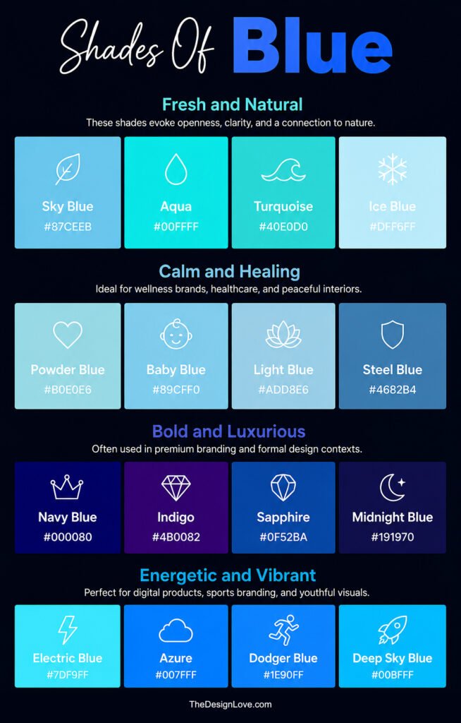
Blue can evoke different emotions depending on its shade. Light blues create feelings of freshness and calm, deeper blues convey luxury and trust, while vibrant blues express energy, creativity, and innovation. This versatility makes blue one of the most widely used colors in design and branding.
a. Fresh and Natural
| Sky Blue | Aqua | Turquoise | Ice Blue |
|---|---|---|---|
|
#87CEEB |
#00FFFF |
#40E0D0 |
#DFF6FF |
These shades evoke openness, clarity, freshness, and a strong connection to nature. They are commonly used in travel, wellness, sustainability, and lifestyle design.
b. Calm and Healing
| Powder Blue | Baby Blue | Light Blue | Steel Blue |
|---|---|---|---|
|
#B0E0E6 |
#89CFF0 |
#ADD8E6 |
#4682B4 |
These soothing blue shades are associated with relaxation, comfort, emotional balance, and wellness. They are frequently used in healthcare branding, spa environments, meditation spaces, and peaceful interior design.
c. Bold and Luxurious
| Navy Blue | Indigo | Sapphire | Midnight Blue |
|---|---|---|---|
|
#000080 |
#4B0082 |
#0F52BA |
#191970 |
These deep and sophisticated blue shades symbolize prestige, authority, confidence, and elegance. They are commonly used in luxury branding, premium packaging, corporate identities, formal fashion, and high-end interior design.
d. Energetic and Vibrant
| Electric Blue | Azure | Dodger Blue | Deep Sky Blue |
|---|---|---|---|
|
#7DF9FF |
#007FFF |
#1E90FF |
#00BFFF |
These bright and dynamic blue shades convey excitement, innovation, energy, and forward-thinking creativity. They are widely used in technology products, digital platforms, sports branding, gaming interfaces, and modern advertising campaigns that aim to capture attention and inspire action.
Infographic – Popular Shades of Blue Colour with Hex Code
Blue Shades and Emotional Associations
Different shades of blue evoke different emotions and perceptions. While lighter blues communicate calmness and freshness, darker blues symbolize authority and sophistication, making blue one of the most versatile colors in design and branding.
| Shade of Blue | Mood/Emotion | Example Usage |
|---|---|---|
|
Navy Blue#000080
|
Trust, Authority | Corporate branding and business identities |
|
Royal Blue#4169E1
|
Confidence, Power | Premium products and luxury packaging |
|
Sky Blue#87CEEB
|
Freedom, Openness | Travel brands and lifestyle websites |
|
Baby Blue#89CFF0
|
Comfort, Softness | Healthcare and children’s products |
|
Sapphire Blue#0F52BA
|
Prestige, Sophistication | Luxury branding and jewelry marketing |
|
Cobalt Blue#0047AB
|
Energy, Focus | Sports branding and modern advertising |
|
Cerulean#2A52BE
|
Calmness, Serenity | Wellness brands and spa design |
|
Midnight Blue#191970
|
Elegance, Depth | Luxury interiors and formal branding |
|
Electric Blue#7DF9FF
|
Innovation, Excitement | Technology companies and gaming platforms |
|
Powder Blue#B0E0E6
|
Peacefulness, Relaxation | Interior design and wellness branding |
Color Combinations That Work With Blue
Blue is one of the most versatile colors in design because it pairs effortlessly with both neutral and vibrant tones. Whether combined with White for a clean and professional look, Gold for luxury, Gray for sophistication, Orange for contrast, or Green for a natural feel, blue creates balanced and visually appealing color palettes. These combinations are widely used in branding, web design, interiors, and marketing to achieve specific moods and design objectives.
Blue and White
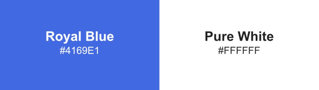
This timeless combination creates cleanliness, simplicity, and professionalism. It is commonly used in corporate branding and web design.
Blue and Gold
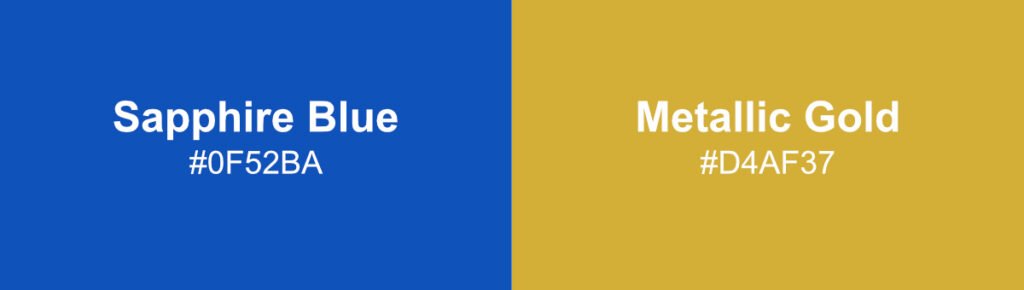
Gold introduces warmth and luxury, making this pairing ideal for premium brands and formal visual identities.
Blue and Gray
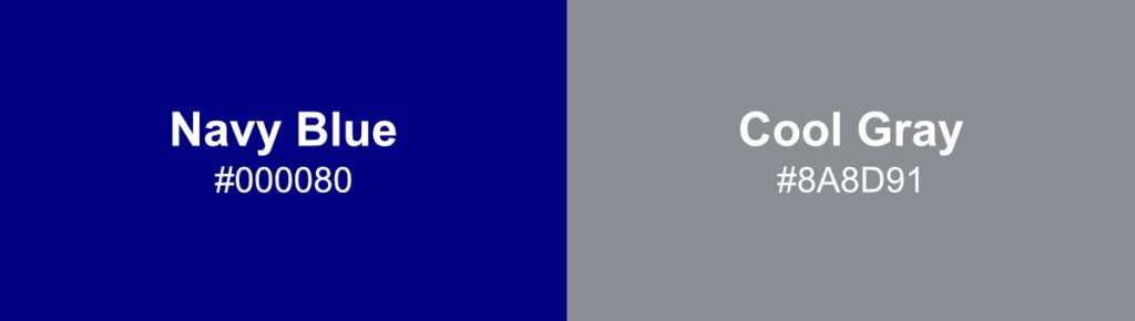
Gray complements blue by adding sophistication and neutrality. Together they create balanced, modern compositions.
Blue and Orange
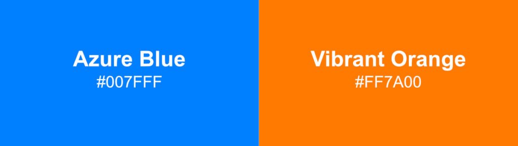
As complementary colors, blue and orange create strong visual contrast and energy. Designers often use this pairing for dynamic marketing materials.
Blue and Green
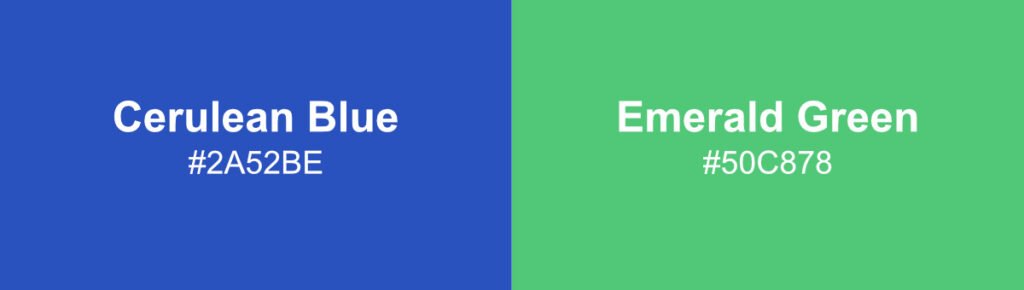
Blue and green work together naturally because both are strongly connected to nature. This combination is common in sustainability and wellness branding.
Famous Brands Using Blue
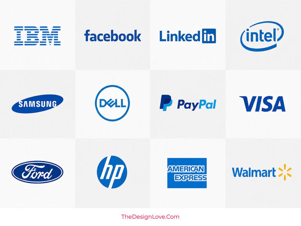
Blue is one of the most trusted colors in branding, making it a popular choice across technology, finance, healthcare, and retail industries. Many global brands use blue to communicate reliability, professionalism, innovation, and customer confidence. The following brands demonstrate how different shades of blue help create strong and recognizable visual identities.
| Famous Brands | Blue Branding Significance |
|---|---|
 |
IBM – Uses a deep corporate blue to communicate trust, expertise, reliability, and long-standing leadership in technology. |
 |
Facebook – The recognizable blue identity promotes connection, accessibility, trust, and global communication. |
 |
LinkedIn – Professional blue reinforces credibility, networking, career growth, and business confidence. |
 |
Intel – Blue highlights innovation, intelligence, technological advancement, and engineering excellence. |
 |
Samsung – A strong blue identity conveys innovation, dependability, and global brand leadership. |
 |
Dell – Blue branding communicates technical expertise, reliability, and customer trust. |
 |
PayPal – Multiple blue tones reinforce security, trustworthiness, and confidence in digital payments. |
 |
Visa – Blue helps establish financial security, credibility, and worldwide recognition. |
 |
Ford – Classic blue branding reflects heritage, durability, reliability, and consumer confidence. |
 |
American Express – Bright blue projects financial trust, professionalism, and premium customer service. |
 |
HP – Blue reinforces innovation, efficiency, and reliability across technology products and services. |
 |
Walmart – Uses blue to create a sense of trust, accessibility, value, and customer friendliness. |
Popular Shades of Blue with Real Life Examples
Blue appears throughout nature, technology, fashion, and branding, making its shades instantly recognizable in everyday life. Sky Blue reflects the color of a clear daytime sky, Turquoise is often associated with tropical waters, and Powder Blue is frequently used in wellness and healthcare environments. Meanwhile, Navy Blue is a staple in corporate branding and formal uniforms, while Royal Blue, Sapphire Blue, and Electric Blue are commonly seen in luxury products, sports branding, and modern digital interfaces where trust, sophistication, and innovation are key messages.
1. Indigo Blue
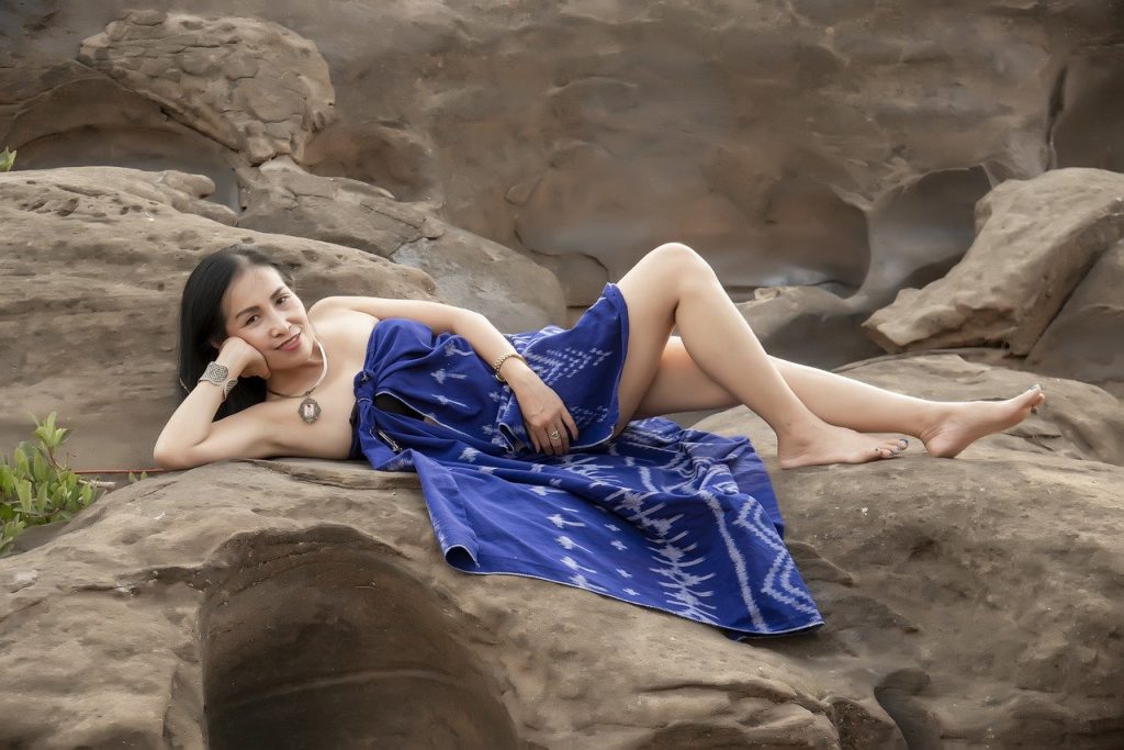
Indigo is a dark shade of blue. The color is found in nature and comes from the well known Indigo plant.
2. Peacock Blue
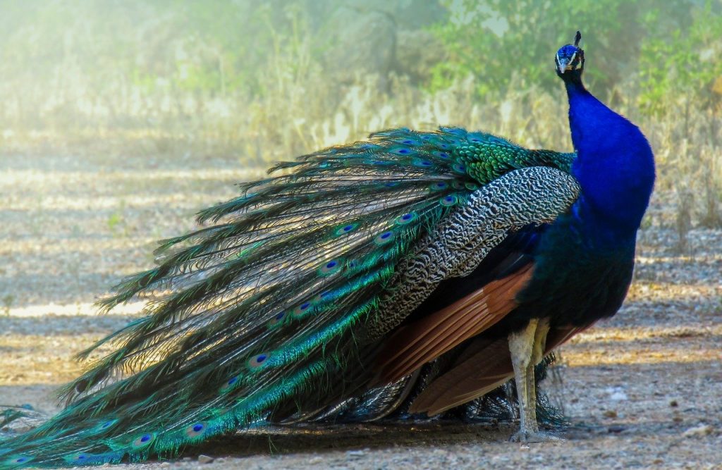
This color refers to the darkest blue in a peacock feather. This is darker than the Navy blue color.
3. Spruce Blue
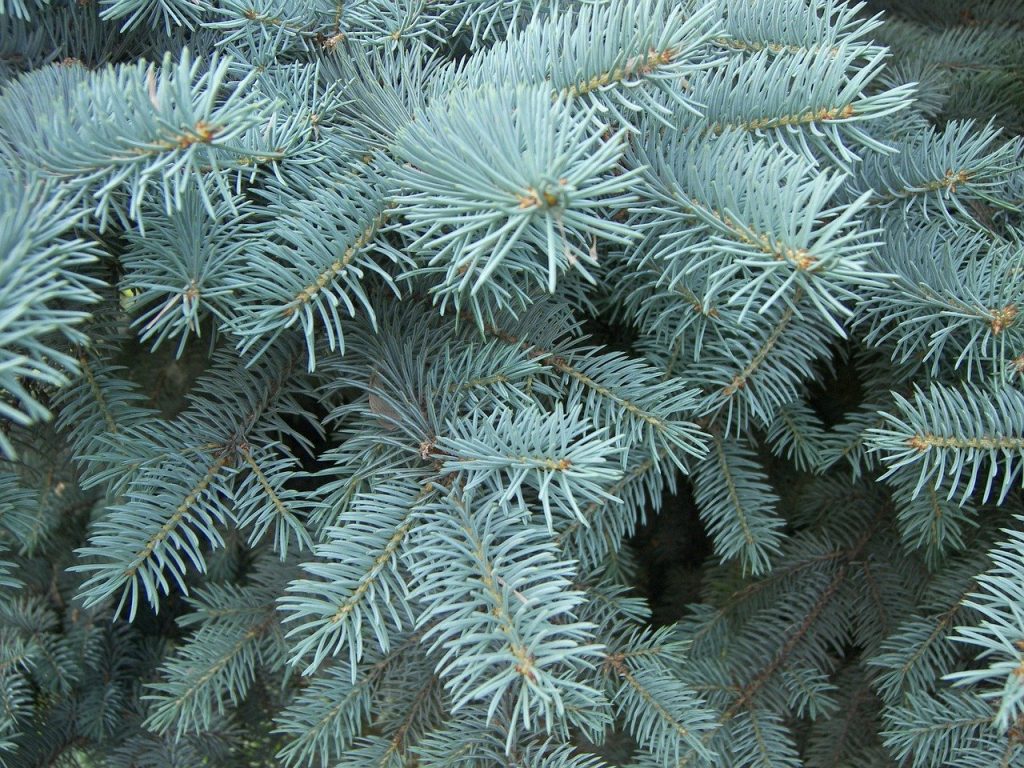
This is the color of the blue spruce. It contains hints of green and a lot of grey. It’s a winter color and communicates a dry look for your composition.
4. Cobalt Blue
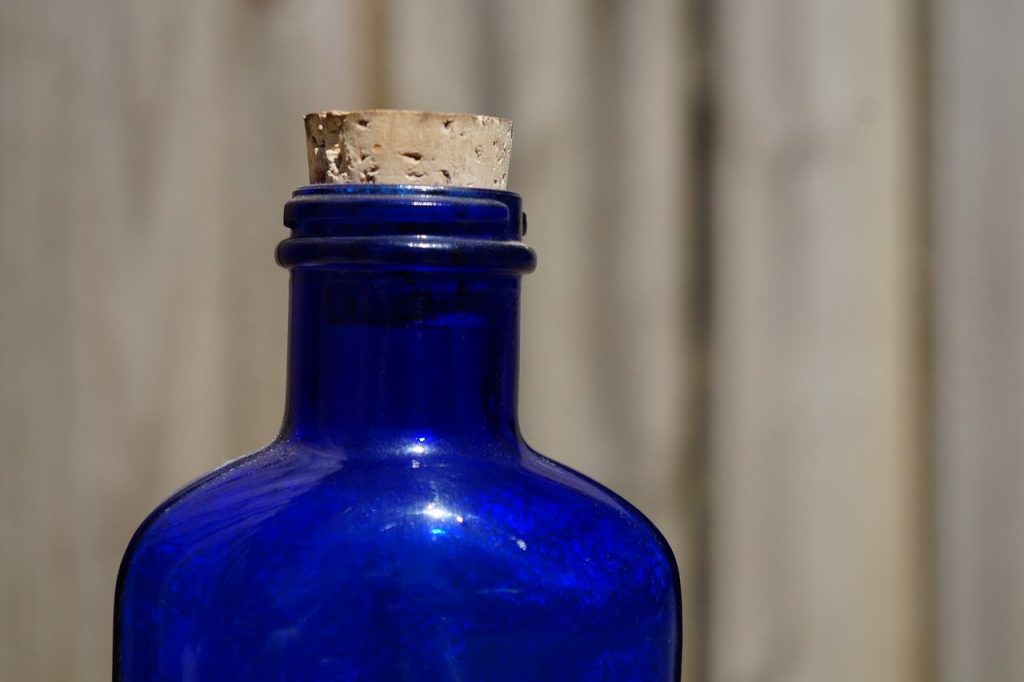
It’s the most vibrant shade of blue. It contrasts beautifully with yellows leaning towards ochre. It overpowers any composition it is used in.
5. Azure Blue
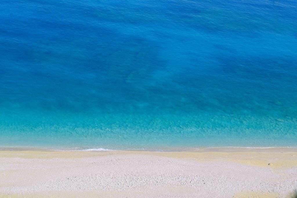
It’s a more softer tone of cobalt and can be seen as a bluey-blue color, since it is very close to the technical definition of blue.
6. Teal Blue

This is a color with heavy influence of cyan, named after the bird- Eurasian teal. It’s a beautiful color and sets a mood of tranquility.
7. Sky Blue

The lightest color on a sunny day. This color is very familiar to the human eye and sets an environment of trust.
8. Cerulean Blue

It’s a color that is midway between blue and cyan, possessing the qualities of both.
9. Aegean Blue
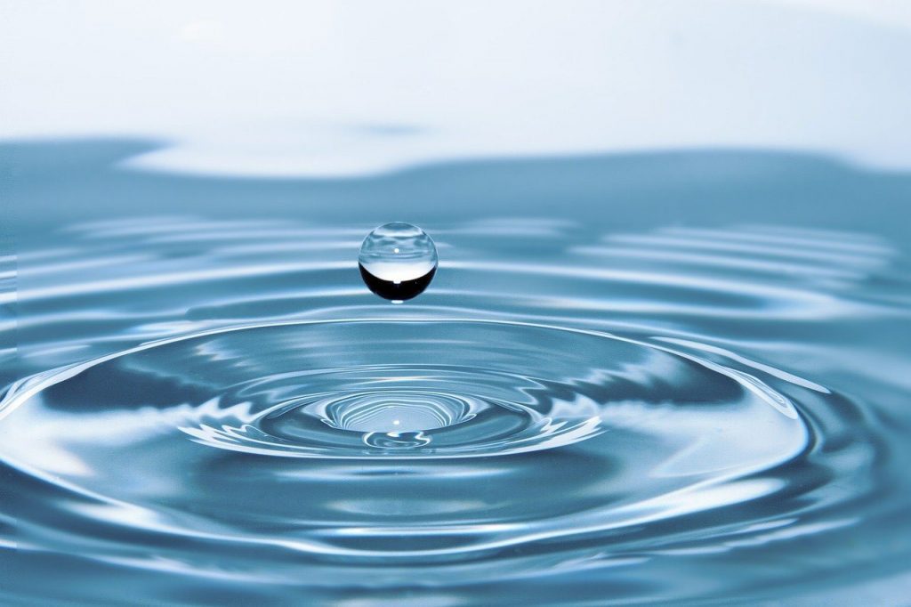
The dominant sea color in the above picture is called aegan. It has, most probably, been named after the Aegan Sea which is known for its divine blue color.
10. Sapphire Blue
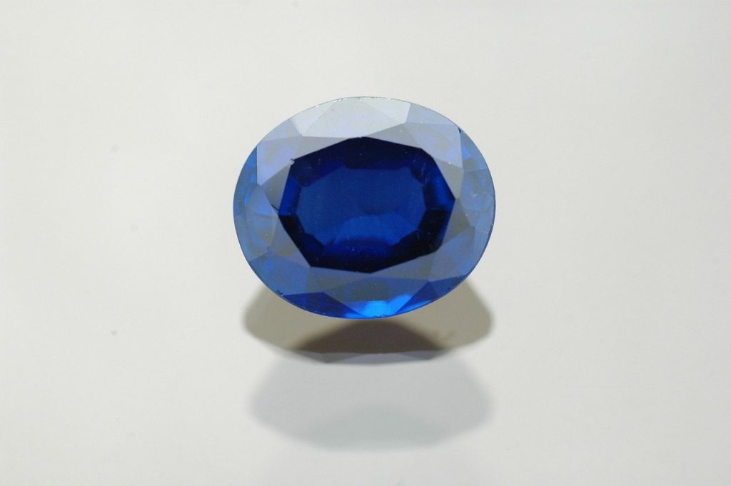
When you look at a sapphire against a light source, the color you sea is sapphire blue. It’s the lightest color in a sapphire without the reflected shadows; a diluted Indigo.
11. Lapis Blue
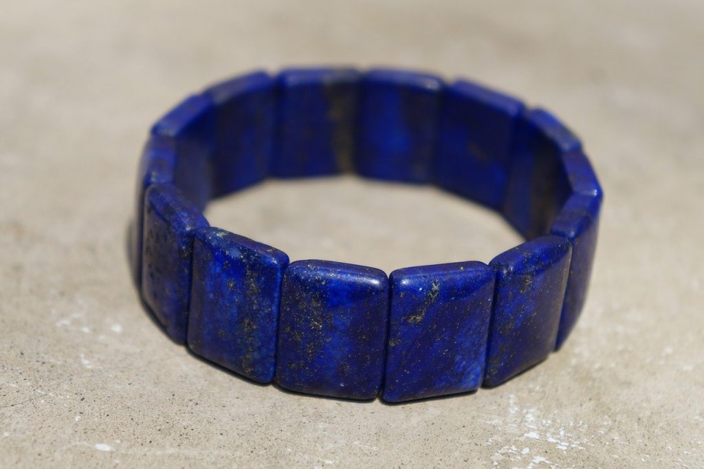
This luxurious shade of blue is named after the semi-precious stone lapis lazuli. It posses an intense value and communicates energy and power.
12. Ocean Blue
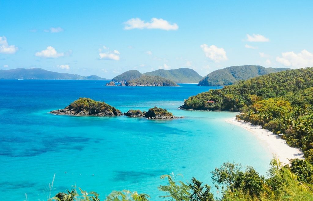
This shade has influences of cyan and green. This deep marine color gives a dreamy feeling.
13. Navy Blue
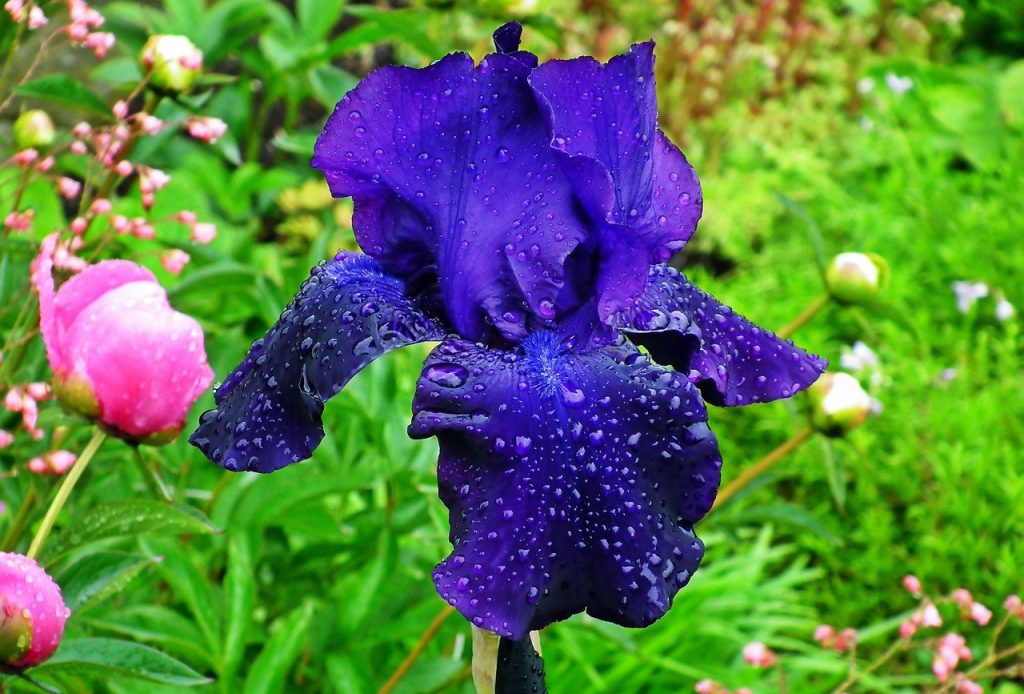
The color of sailors. Navy color solidifies within itself values such as loyalty and chivalry.
14. Slate Blue
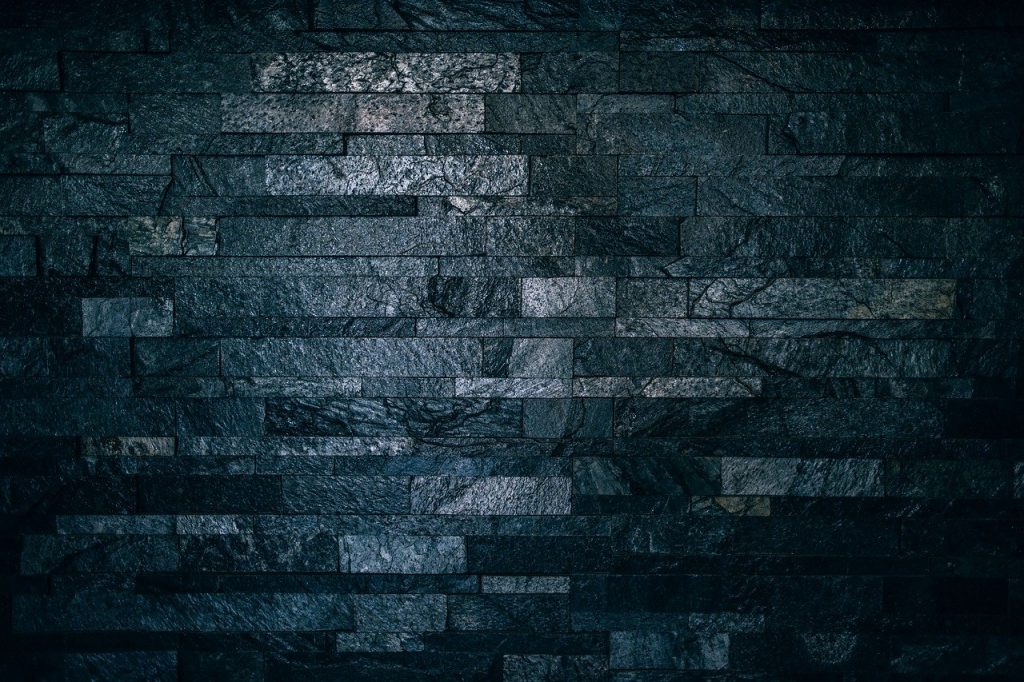
This shade is a combination of black and cyan. It is neutral color that kind works well in almost all situations, and it’s great for backgrounds.
So now you know these shades, you can proudly say “That lapis handbag is really striking”.
Conclusion
Blue remains one of the most influential and versatile colors in design. Its wide range of shades allows it to communicate trust, calmness, luxury, innovation, and energy depending on the chosen tone. From corporate branding and user interface design to fashion, architecture, and visual communication, blue continues to shape how audiences perceive products, services, and experiences. Its universal appeal ensures that it will remain a foundational color in creative industries for years to come.
