The Difference Between Print and Digital Colours – Understanding the Colour Theory, Part 3
Understanding the Colour Theory, Part 1
Understanding the Colour Theory, Part 2
Understanding the Colour Theory, Part 4
As we described before, on paper (in print) colours are produced with subtractive mixing of pigments, and digitally, they are reproduced with additive mixing of red, green, and blue light. In short, the printer’s primaries, or CMYK (cyan, magenta, yellow, and black) combine to form black. On the other hand, red, green, and blue on digital screens combine to form white.
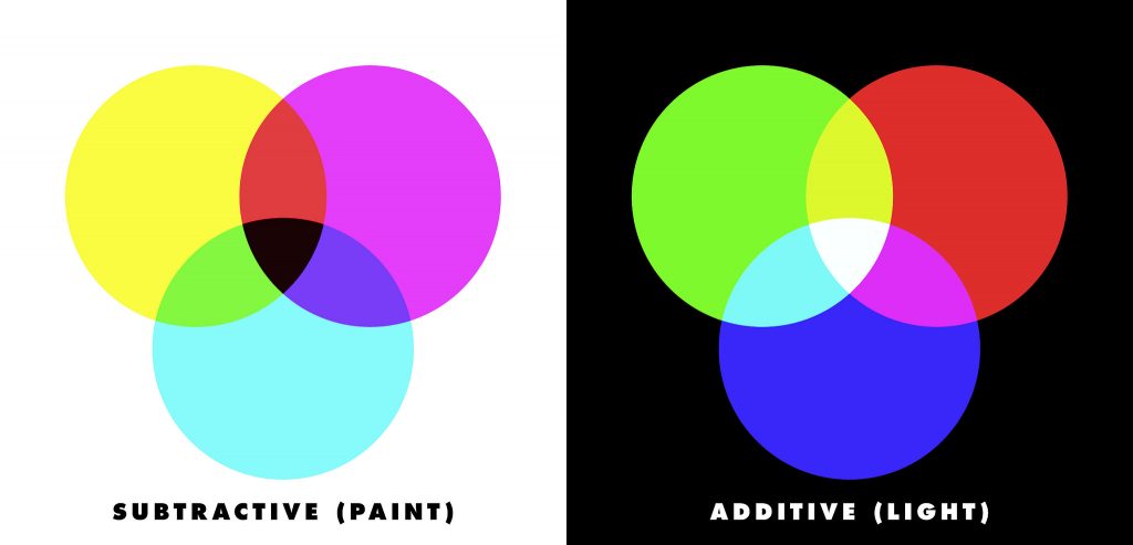
Human eyes have a remarkable ability to receive a wide spectrum of colours. Digital screens and printers try to reproduce all the colours that are possible for the eye to receive, but producing the whole range is technologically challenging.
Gamuts and the range of physically observable colours
Gamut is the range of colours a device, like a screen or a printer, is capable producing. In 1980, Michael R. Pointer published a research which described the range of real surface colours that the human eye can see. Based on 4089 samples, the Pointer’s Gamut is itself an approximation of the visible spectrum, and is generally accepted model of the ideal range of colours used for communication.
sRGB
In commonly used computer monitors, the sRGB gamut is used. It was designed by Microsoft and HP in 1996, in an effort to standardise the colour space used in CRT monitors and also the internet. Except a small range of greens and blues, the sRGB contains considerably less colour range than Pointer’s gamut, around 70 percent of it.
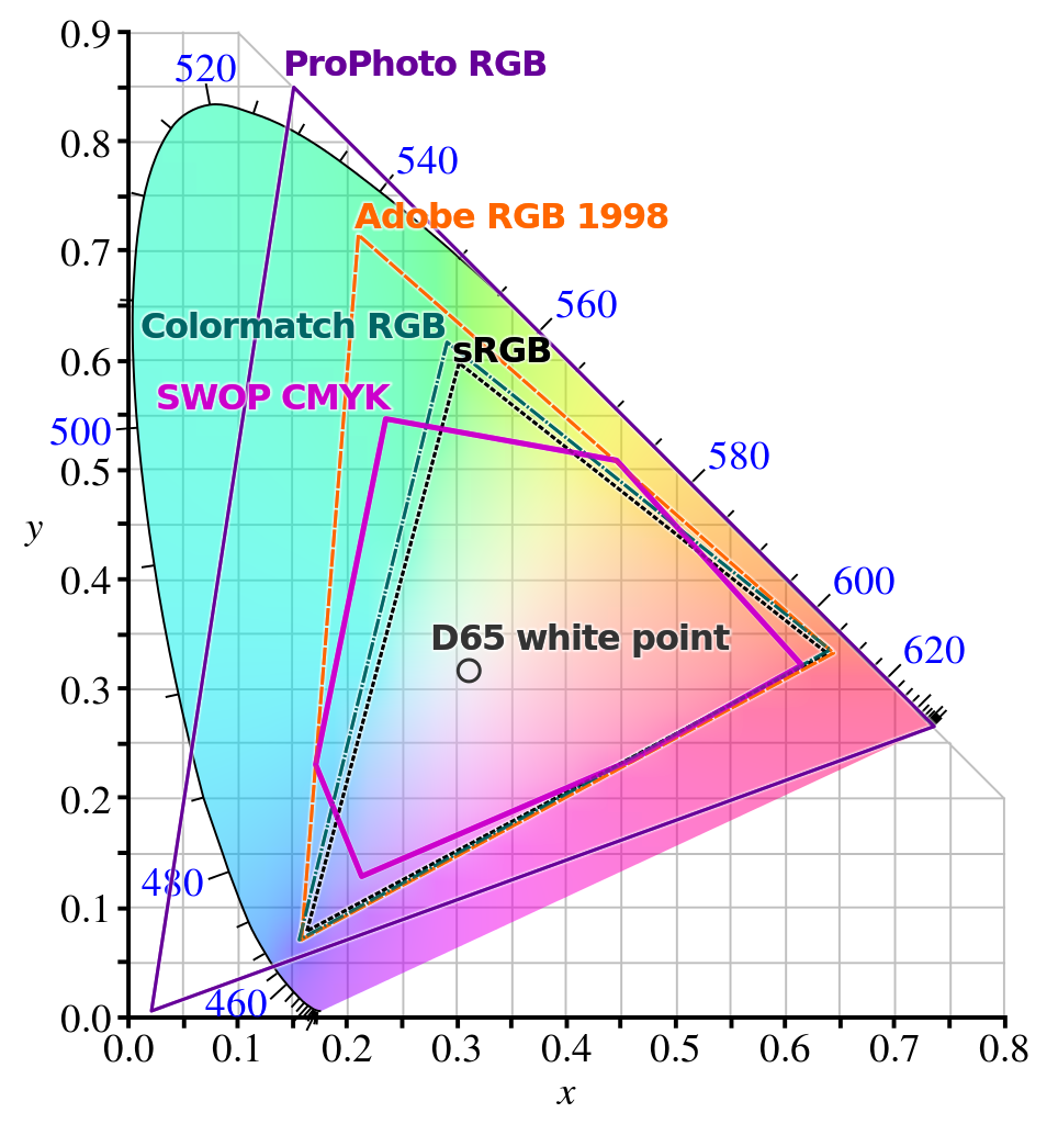
More expensive displays, particularly smartphones, which use technologies like LED or OLED for colour reproduction are coming up with colour ranges that are well wider than the sRGB.
Modern digital LCD display specifications also allow for a range of colours that are much wider than the Pointer’s gamut, but their practical implementation is hard to achieve, and not absolutely necessary for practical as well as artistic communication.
Why it’s not possible to reproduce bright RGB colours in print
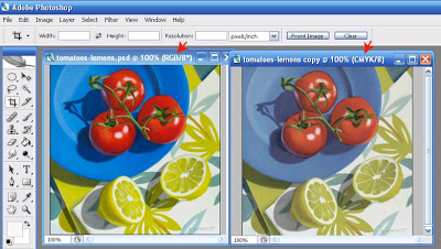
Since printing in cyan, magenta, yellow, and black pigments employs subtractive mixing, lighter (light valued) and brighter colours of the sRGB colour space are just missing from the gamut of most printers.
The variance in the gamut size is even more if we take into account wide gamut monitors that cover most of Adobe RGB, like the DCI-P3 profile implemented in high-end displays which covers more than 90% of the it.
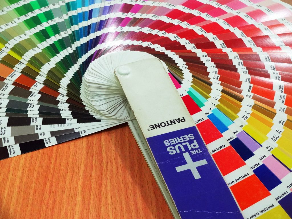
Although, more expensive digital printers can offer a wider gamut, mainly by using Pantone specifications. But their availability is pretty limited in so that designs in Pantone SPOT colours can be more expensive than CMYK, both for printing as well as designing.
In the contemporary scenario
Today, when graphics are almost exclusively designed digitally, and consumed on digital screens, the relevance of this knowledge seems to be diminishing.
But if you are designing articles, such as print advertisements, brochures, visiting cards, etc., you absolutely need to know that the colours that you’re using in your designs are absolutely matched to the printer’s colour space.
Most contemporary design software accounts for this. For example, in Adobe Photoshop and Illustrator, you can easily change the colour mode from sRGB to CMYK. This helps in calibrating the colours so that they correspond better with the RGB colour space.
When you start designing a graphic digitally, you should know if the article will be published in print or just on the web. For designs that are to be consumed digitally, RGB colour space will do the job well. But if you’re designing for print as well as digital, it’s advisable to start with CMYK and then convert to RGB.
This is because the CMYK colour space is a subset of the RGB space, and a major share of the colours in RGB aren’t reproducible with the four-colour process printing.
That’s it for this post. In the next post in the series, we talk about the various colour harmonies.
This series of posts on “colour theory” was written to help self-taught artists, designers, and people who may commission their work, to better utilize the science behind how the human eye interpret colours and how colour interact with light, helping them move from ‘instinct’ to ‘intellect’, ultimately making and using better visual designs.
References:


