Understanding the Different Shades of Green, Brands, and Moods in Design
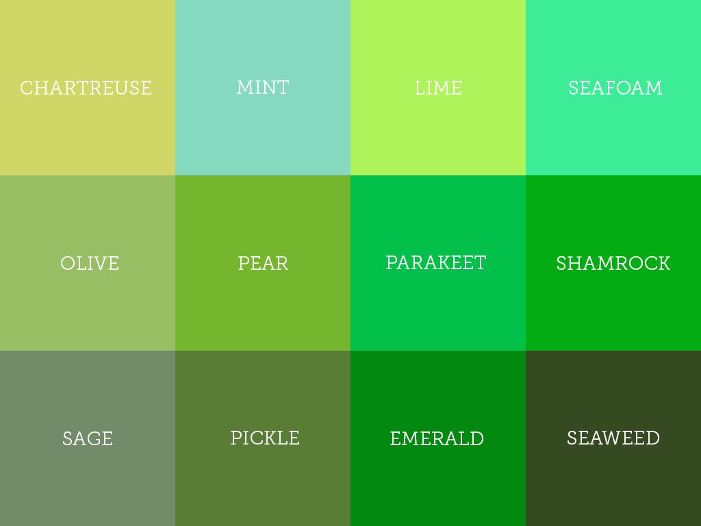
Green is soothing and peaceful. It gives a sense of naturalness and earthiness. Maybe the human eye has developed so as to be calmed at the sight of a lush green forest. Green is certainly the most familiar colour to the human eye. It is all the rage in the fashion industry as well (see these green prom dresses, for example). We take a look at the lot of colours evolving from green that will help us to understand the different shades of green.
The Essence of Green
Green is not a mere colour; rather, it is a feeling. We can attach all kinds of meanings to green; in Ireland, it symbolises prosperity; in ancient Egypt, fertility; and in China, it symbolises immortality. It is no wonder that designers, brands, and creatives are using green as a prominent feature today; green evokes our primal sense of being human, but it also allows designers to have some fun with the versatile, practical shade in ways we can use in modern life.
But beyond poetic considerations, the shade you choose, be it mint, emerald, or moss, will create specific atmospheres to place, product, or brand. So let us consider the different shades of green:
Popular Shades of Green with Names
For your convenience all the colors are presented with Hex code, RGB and CMYK values, you can just click on the code to copy. Hope you like the colors, if you have any query, please leave it in the comment.
Chartreuse
#7FFF00
127, 255, 0
C50 M0 Y100 K0
Sage
#BCB88A
188, 184, 138
C0 M2 Y27 K26
Lime
#00FF00
0, 255, 0
C100 M0 Y100 K0
Olive
#808000
128, 128, 0
C0 M0 Y100 K50
Emerald
#50C878
80, 200, 120
C60 M0 Y40 K22
Pear
#D1E231
209, 226, 49
C8 M0 Y78 K11
Shamrock
#009E60
0, 158, 96
C100 M0 Y39 K38
Seafoam
#9FE2BF
159, 226, 191
C30 M0 Y15 K11
Parakeet
#1AA36D
26, 163, 109
C84 M0 Y33 K36
Mint
#98FF98
152, 255, 152
C40 M0 Y40 K0
Seaweed
#354A21
53, 74, 33
C28 M0 Y55 K71
Pickle
#85A16A
133, 161, 106
C17 M0 Y34 K37
Spotify — Green
#1DB954
29, 185, 84
C84 M0 Y55 K27
WhatsApp — Green
#25D366
37, 211, 102
C82 M0 Y52 K17
Android — Green
#3DDC84
61, 220, 132
C72 M0 Y40 K14
Starbucks — Green
#00704A
0, 112, 74
C100 M0 Y34 K56
Xbox — Green
#107C10
16, 124, 16
C87 M0 Y87 K51
Hulu — Green
#1CE783
28, 231, 131
C88 M0 Y43 K9
Evernote — Green
#00A82D
0, 168, 45
C100 M0 Y73 K34
NVIDIA — Green
#76B900
118, 185, 0
C36 M0 Y100 K27
ASDA — Green
#78BE20
120, 190, 32
C37 M0 Y83 K25
Fresh 100
#1C7A44
28, 122, 68
C77 M0 Y44 K52
Fresh 200
#208F4F
32, 143, 79
C78 M0 Y45 K44
Fresh 300
#25A35A
37, 163, 90
C77 M0 Y45 K36
Fresh 400
#29B866
41, 184, 102
C78 M0 Y45 K28
Fresh 500
#2ECC71
46, 204, 113
C77 M0 Y45 K20
Fresh 600
#43D17F
67, 209, 127
C68 M0 Y39 K18
Fresh 700
#58D68D
88, 214, 141
C59 M0 Y34 K16
Fresh 800
#6DDB9C
109, 219, 156
C50 M0 Y29 K14
Fresh 900
#82E0AA
130, 224, 170
C42 M0 Y24 K12
Earthy 100
#364223
54, 66, 35
C18 M0 Y47 K74
Earthy 200
#3F4D29
63, 77, 41
C18 M0 Y47 K70
Earthy 300
#48582E
72, 88, 46
C18 M0 Y48 K65
Earthy 400
#516334
81, 99, 52
C18 M0 Y47 K61
Earthy 500
#5A6E3A
90, 110, 58
C18 M0 Y47 K57
Earthy 600
#6B7D4E
107, 125, 78
C14 M0 Y38 K51
Earthy 700
#7B8B61
123, 139, 97
C12 M0 Y30 K45
Earthy 800
#8C9A75
140, 154, 117
C9 M0 Y24 K40
Earthy 900
#9CA889
156, 168, 137
C7 M0 Y18 K34
Luxury 100
#023B04
2, 59, 4
C97 M0 Y93 K77
Luxury 200
#034505
3, 69, 5
C96 M0 Y93 K73
Luxury 300
#034F06
3, 79, 6
C96 M0 Y92 K69
Luxury 400
#045906
4, 89, 6
C96 M0 Y93 K65
Luxury 500
#046307
4, 99, 7
C96 M0 Y93 K61
Luxury 600
#1D7320
29, 115, 32
C75 M0 Y72 K55
Luxury 700
#368239
54, 130, 57
C58 M0 Y56 K49
Luxury 800
#4F9251
79, 146, 81
C46 M0 Y45 K43
Luxury 900
#68A16A
104, 161, 106
C35 M0 Y34 K37
Muted 100
#4B614B
75, 97, 75
C23 M0 Y23 K62
Muted 200
#587158
88, 113, 88
C22 M0 Y22 K56
Muted 300
#648264
100, 130, 100
C23 M0 Y23 K49
Muted 400
#719271
113, 146, 113
C23 M0 Y23 K43
Muted 500
#7DA27D
125, 162, 125
C23 M0 Y23 K36
Muted 600
#8AAB8A
138, 171, 138
C19 M0 Y19 K33
Muted 700
#97B597
151, 181, 151
C17 M0 Y17 K29
Muted 800
#A4BEA4
164, 190, 164
C14 M0 Y14 K25
Muted 900
#B1C7B1
177, 199, 177
C11 M0 Y11 K22
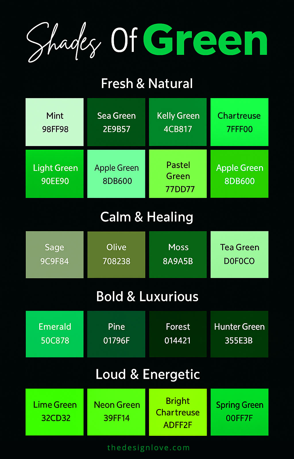
Moods of Green With Shades
These brands represent that green can be used to beautify, but it also has a weighted emotional quality that builds identity and fosters loyalty. ‘Green’ can actually have moods similar to those experienced by people.
a. Fresh and Natural
Colours: mint, sea green, Kelly green, chartreuse, light green, apple green
We notice these colours during the spring mornings and in nature. They lift our spirits, and are the perfect options for wellness brands, skincare or lifestyle products.
b. Calm and Healing
Colours: sage, olive, moss, tea green, pastel green
These tend to be soft greens reminiscent of walking a quiet nature trail or among an herb garden. They are quite popular with interior designers who would decorate bedrooms, spa or meditation spaces with a calming tone (the opposite of dreary).
c. Bold and Luxurious
Colours: emerald, pine, forest, hunter green, deep teal:
If sophistication could be expressed by any colour, it would be these shades. Think velvet furniture, classy gemstone jewellery or luxe branding. They have an element of classical existence, but still feel modern and fresh enough to excite staunch traditionalists.
d. Loud and Energetic
Colours: lime green, neon green, bright chartreuse, spring green
These are the trendy, youthful shades, screaming ‘fun’. They don’t simply fade into the background; rather, they bring vitality to everything in the frame.
Popular Shades of Green Colour with Hex Code
Green Shades & Emotional Associations
Purple shades span a wide emotional range, from the elegance of Royal Purple to the softness of Lavender. Each tone carries its own psychological weight, inspiring creativity, mystery, or calmness. Together, they reflect a balance of luxury, spirituality, and imaginative energy that few other colors achieve.
| Shade of Green | Association | Common Usage |
|---|---|---|
|
Forest Green#228B22
|
Forest Green is associated with nature. It reminds one of tall green trees in the wild. | It is commonly used in interiors, giving the feeling of being connected to nature. |
|
Emerald Green#50C878
|
Emerald Green, as the name suggests denoted luxury and glamour. | It is mostly used in jewellery, where emerald necklaces can never go out of trend, specifically after superstars have popularized them as wedding jewellery. |
|
Olive Green#808000
|
Olive Green brings peace and calmness to one’s mind. | It is mostly used in Eco-brands trying to showcase their ideals of sustainability and peace. |
|
Mint Green#98FF98
|
Mint Green is a trendy shade representing youth and vitality. | It is mostly used by beauty brands to resonate with the youthfulness of their consumers. |
|
Sea Green#2E8B57
|
Sea green is associated with relaxation and calmness. | It is used by spa and wellness brands to strike in chord with the ideals of relaxation. |
|
Sage Green#9DC183
|
Sage green denotes calmness as well. | Sage green interiors radiate a relaxing environment, and is a popular choice of colour for modern bedrooms. |
|
Teal Green#008080
|
Teal Green is a bright colour, full of energy and vitality. | Digital Brands often use teal Green to create an impact on the viewers and to grab attention. |
|
Kelly Green#4CBB17
|
Kelly green is a jolly and cheerful shade of green. | If you wish to make your event jolly and impactful, full of fun, then this is the shade for you. |
|
Chartreuse Green#7FFF00
|
This shade radiates creativity and innovation. | Fashion brands often use this shade to attract the young fashion icons. |
|
Moss Green#8A9A5B
|
Moss green, as the name suggests, is associated with nature. | Eco-brands and brands promoting nature use this shade. |
|
Hunter Green#355E3B
|
If ethnicity and tradition could be highlighted from a shade it would be this one. | Heritage Brands and vintage themed products use this shade. |
|
Pine Green#01796F
|
Pine Green is a shade showing richness and wealth. | Premium brands and luxury items make use of this shade. |
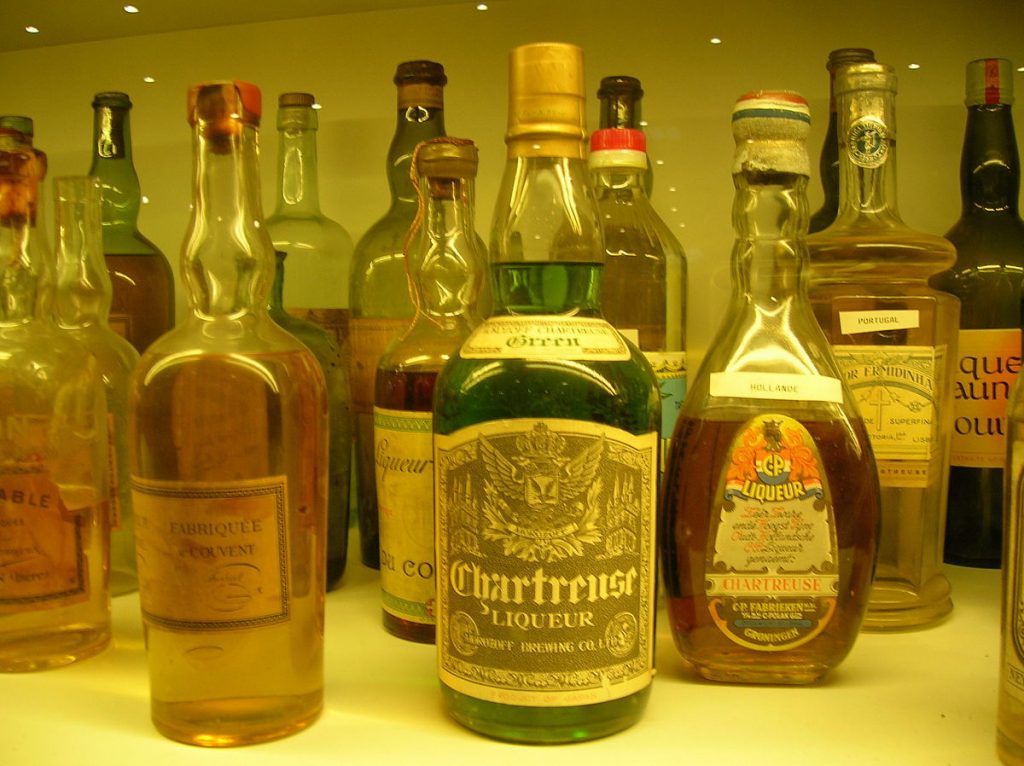
Chartreuse
Chartreuse is a French liquor which shares its colour with Absinthe-the green fairy. This colour has a gloss and gives a sophisticated feel to your design.
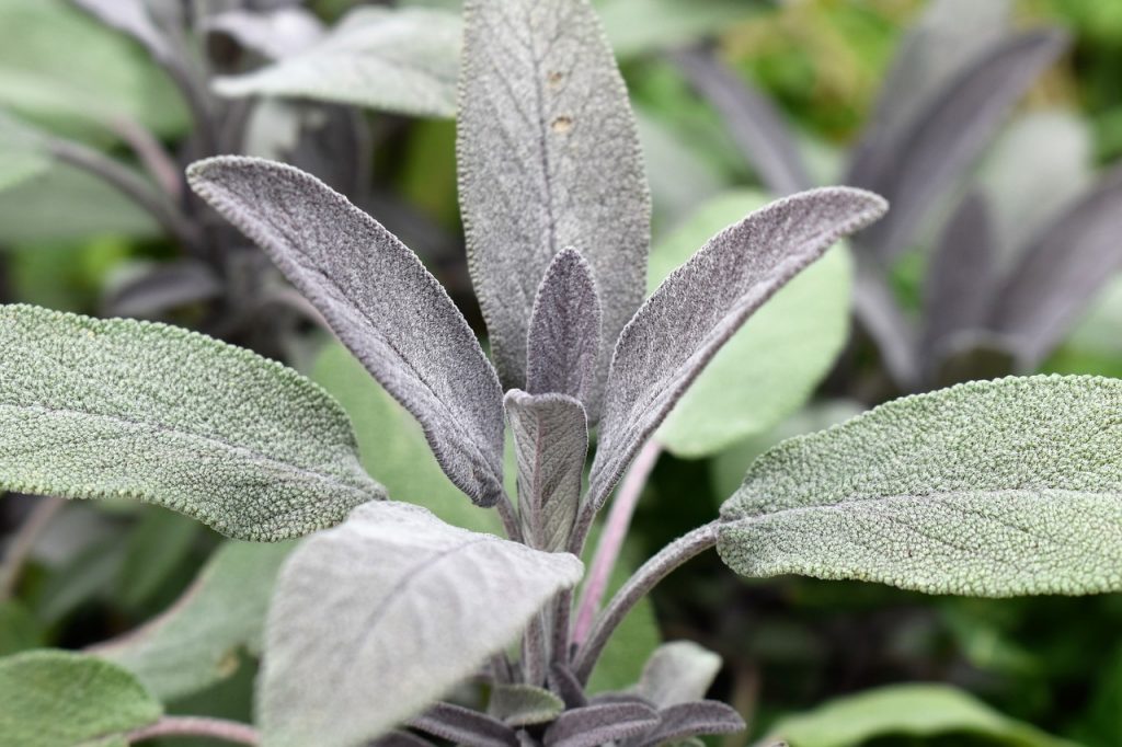
Sage
A shade of green leaning towards grey is sage. It gives a washed out and dry sense to your compositions.
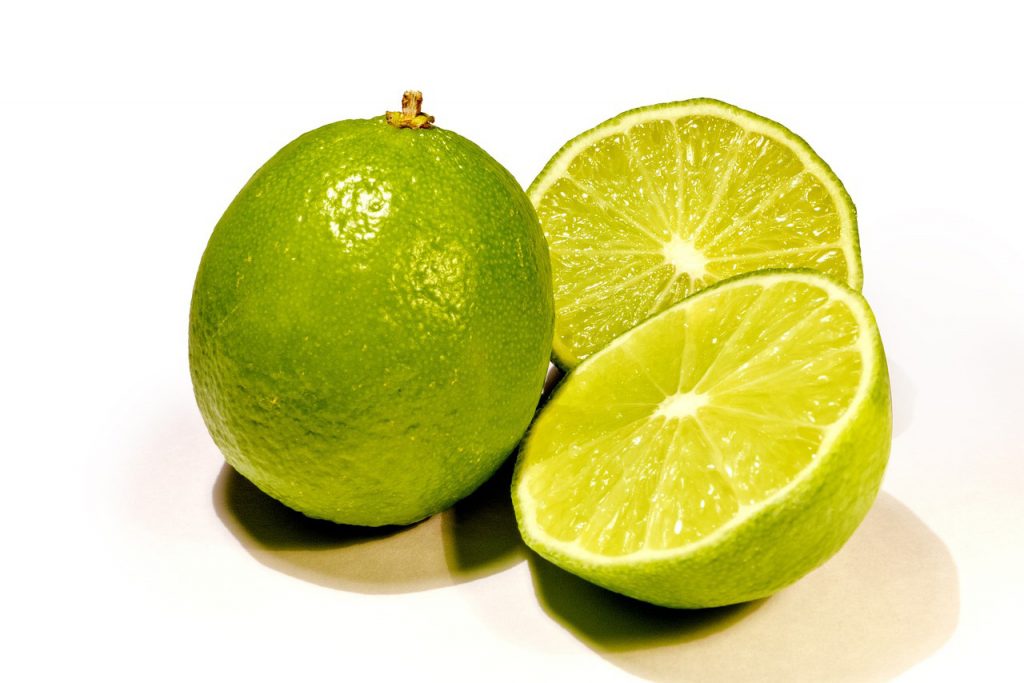
Lime
The colour of summer. The most lively shade of green is lime. It’s the perfect blend of green and yellow. Gives away a raw and young feel.
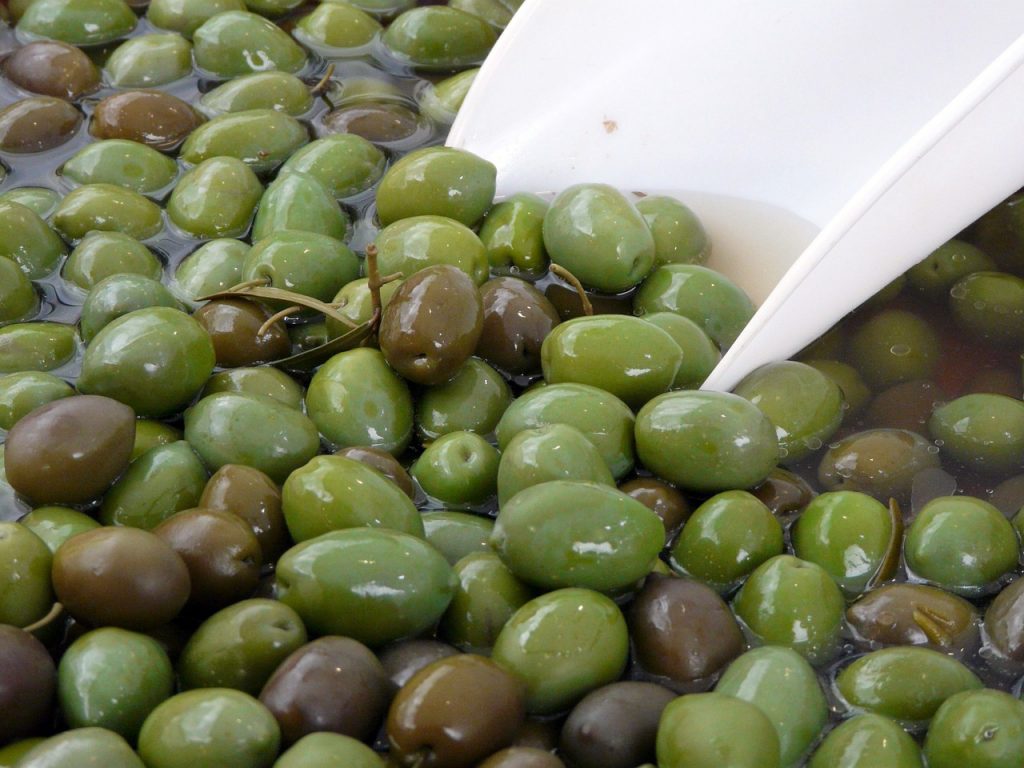
Olive
Olive is a dull shade of green, leaning towards grey and brown. It can be used to communicate antiquity and decorum.
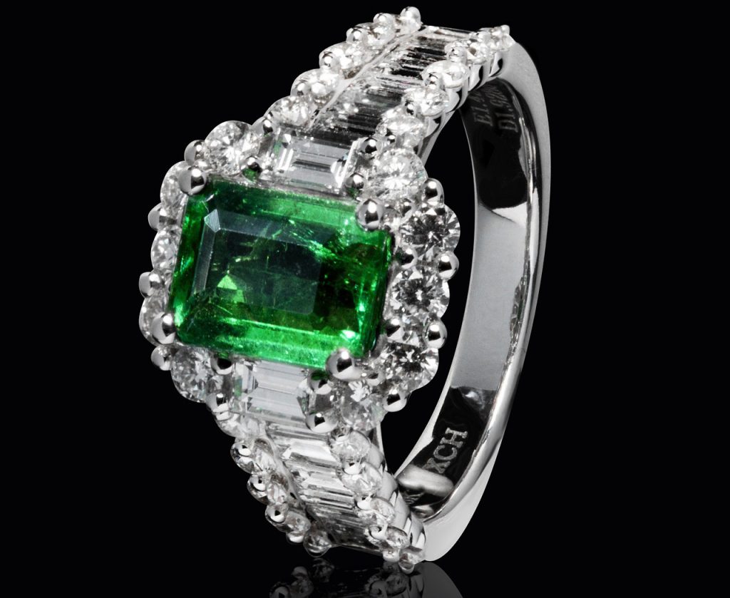
Emerald
A luxurious shade of green. It can be used to exhibit royalty and extravagance.
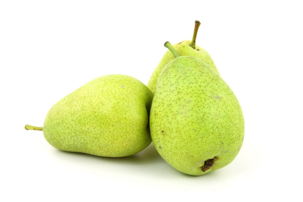
Pear
A shade formed when yellow blends into green. Pear is a cheerful colour.
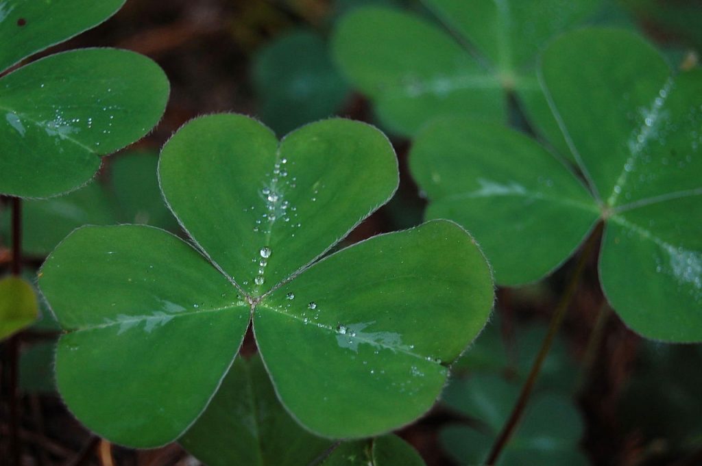
Shamrock
It’s a dark, matte green colour. Can be used for a discreet, muted down look.
Seafoam
This colour reminds of paradise, the waters of paradise. Seafoam is a beautiful colour. Can make your design look heavenly.

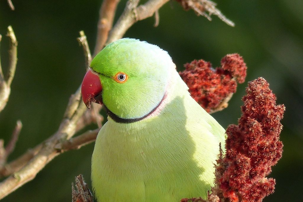
Parakeet
This odd, unnaturally bright green colour is striking, loud and gives out a sense of being unconventional.
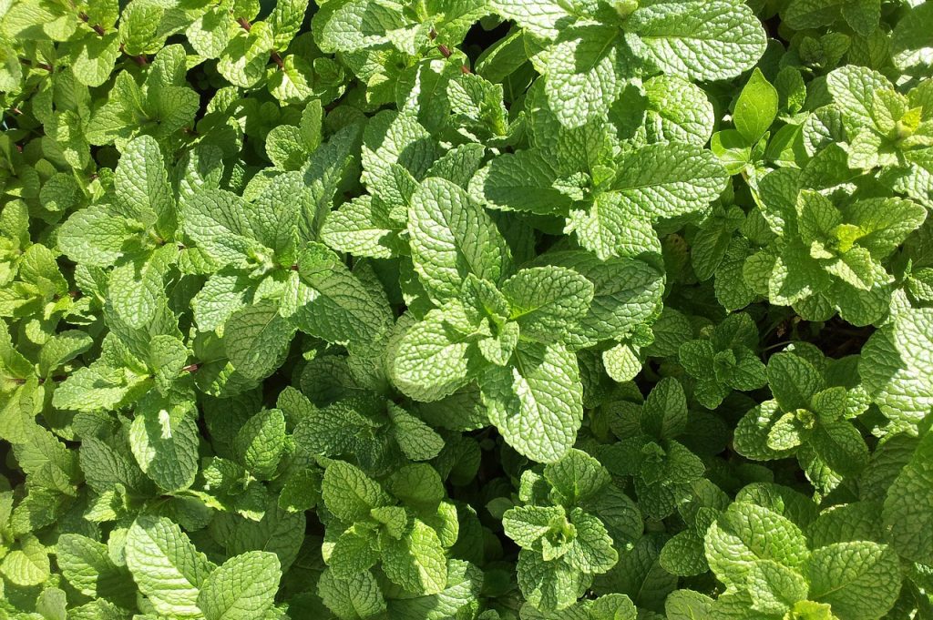
Mint
A greeny shade of green. This colour is the closest to green. Use it to communicate a feeling of freshness and springtime.
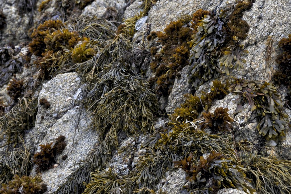
Seaweed
A dead green colour, with heavy influence of grey. This colour conveys a winter mood well.
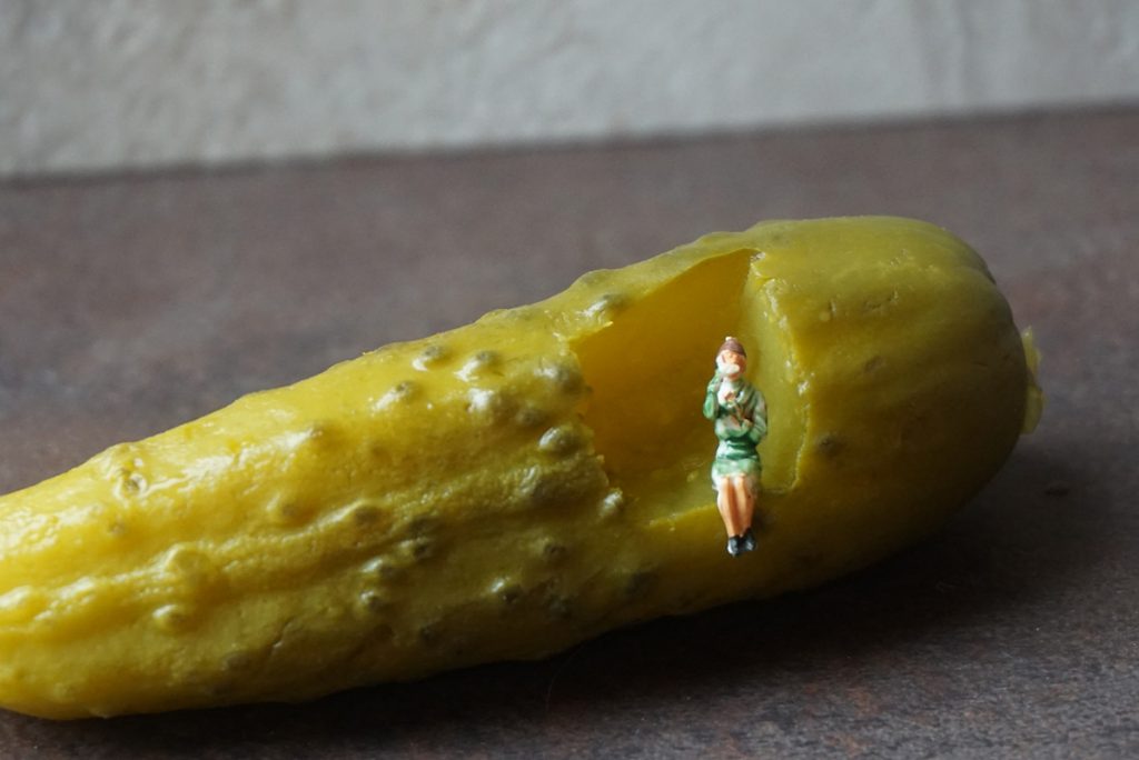
Pickle
A juicy green shade. Gives a conventional and seasoned look to your design.
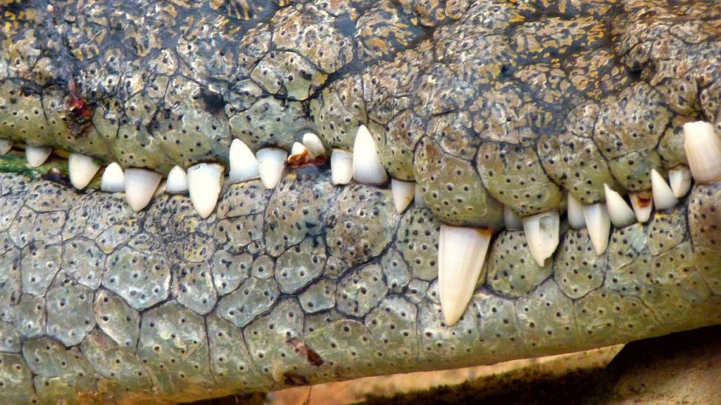
Crocodile
This is what green looks like in leather.
Armed with this information, now you know that it’s ‘pear’, not “yellowish green”.
Tech Tip : You can also remotely load/access your essential Logo design software such as CorelDRAW etc. on trending citrix xendesktop available at an unbelievable xendesktop cost. . Learn more about Hosted SharePoint and QuickBooks Hosting for your small business visit Apps4Rent.
Famous Brands Using Green
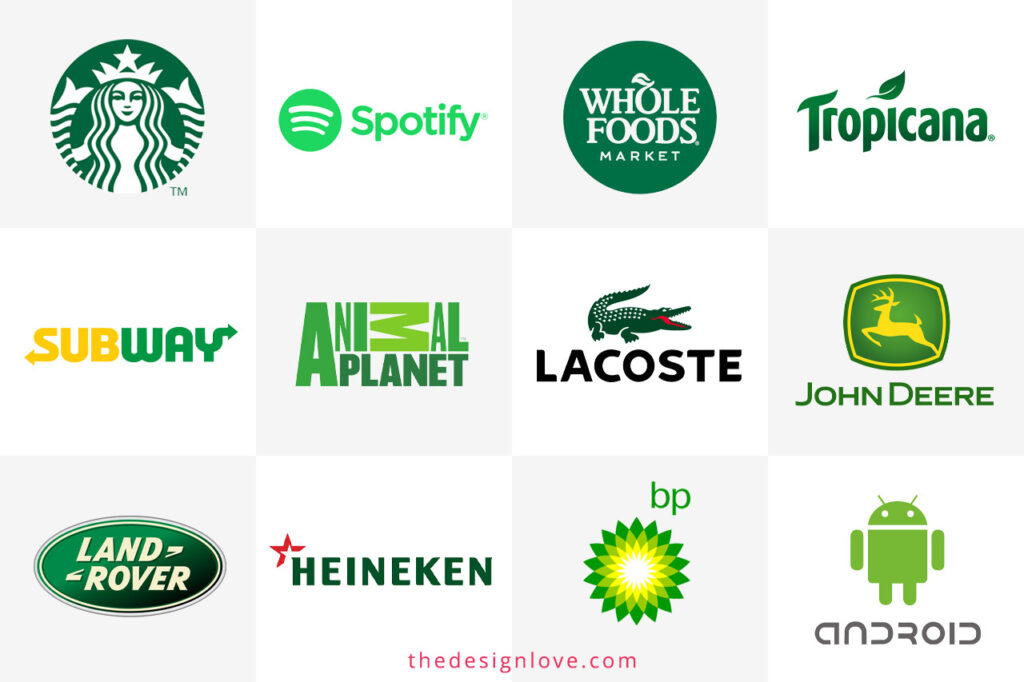
If you’ve ever noticed how many global companies use green in their logos, it’s not by accident. Here are 12 standout examples:
| Famous Brands | Green Branding Significance |
|---|---|
 |
Starbucks: You must have had Starbucks coffee or must have heard of it before. Ever wondered what the green logo represents? The green here symbolises community, warmth, and lifestyle. |
 |
Spotify: Metro rides are incomplete without tuning in to your favourite songs on Spotify. The green logo captures creativity and entertainment in a digital space. |
 |
Whole Foods: as the name suggests, the brand works for food and health. The green here reflects organic living and natural choices. |
 |
Land Rover: The green in Land Rover denotes for trust, adventure, and rugged exploration. |
 |
Subway: Who doesn’t like Subway but have you ever wondered what the green in the logo and theme represents freshness, health, and everyday vitality. |
 |
Tropicana: Juicy energy and nature’s abundance are the core themes highlighted by Tropicana’s green logo. |
 |
Heineken: Celebration rooted in tradition is the central theme of the brand, rightly highlighted by the green in its logo. |
 |
John Deere: Agriculture, trust, and dependability are the core values denoted by John Deere Green. |
 |
BP Green:, sustainability, and forward-thinking innovation are the core ideals that BP aims to showcase and highlight via the use of green. |
 |
Android: Most of the phone users today use Android but we bet you never thought about the green cute logo of Android. Technology with a playful, human touch is what the green aims to show. |
 |
Animal Planet: All the kids have grown up watching Animal Planet early every morning. The green in Animal Planet showcases wildlife, exploration, and awareness. |
 |
Lacoste: Sport, fashion, and timeless heritage are the core values denoted by green in Lactose. |
All these brands demonstrate the power of green. They highlight the emotional resonance of identity and loyalty that comes with the colour green.
Conclusion: Why Green Remains Timeless
One of the unique aspects of green is its longevity due to its duality. It has an ancient and natural look and feel, yet it has contemporaneity and versatility. It can calm in a bedroom, bring energy in a stadium, provide sustainability in a logo, and offer serenity in a retreat. When we look at branding, green often symbolises both the emotional and the functional – we feel good about it while also feeling trust and growth.
Trends come and go, but green is always in fashion and will always be seen as relevant in fashion, in interiors, and marketing because of its evergreen nature and versatility. When building a brand, redesigning a home, or building personal style, when you choose your shade of green, it has the same effect as choosing what atmosphere you want your consumer to inhabit as they read your narrative.


