

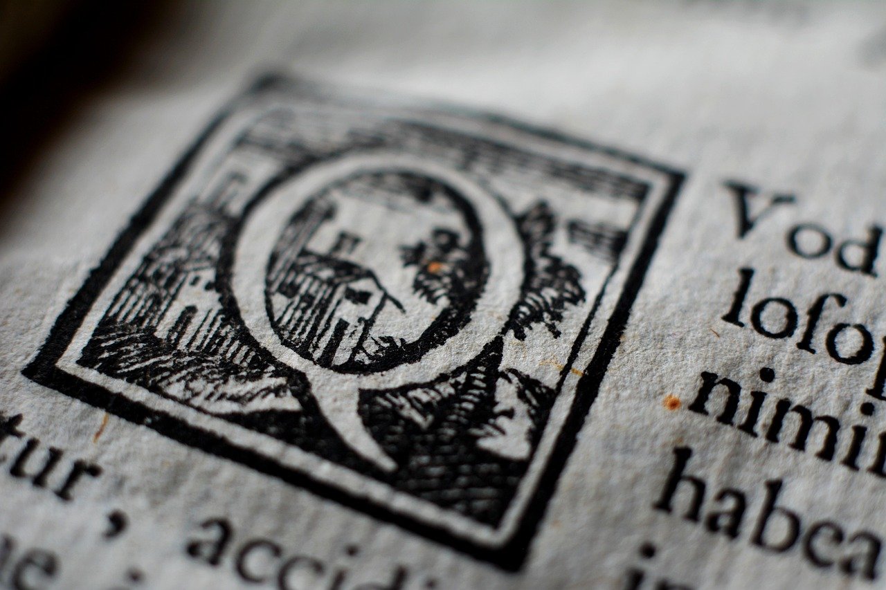
Have you ever opened a book and immediately knew what genre it was?
That wasn’t a blurb. That wasn’t praise from a friend…. That was typography working.
Type is the reader’s first impression. The form of the letters, spacing between them, the weight of the title stretched across the binding it all makes a promise before the first sentence is read.
And here’s the kicker…
Most authors spend two years on the manuscript and twenty minutes on the font.
The good news? Typography can be remedied. It’s one of the least expensive and quickest wins any author can achieve if they’ll just slow down and evaluate their cover.
What you’ll uncover:
- Why Typography Speaks First
- What Different Typefaces Actually Say
- The Typography Mistakes That Cost Authors Sales
- How To Test Your Type Before You Publish
Why Typography Speaks First
Readers don’t start at page one. They start at the thumbnail.
A cover appears on someone’s phone screen about the size of a postage stamp and the listener decides whether to call back in a second or less. Genre. Quality. Mood. Is it worth your evening? All before the story has a chance.
And statistics support it. Research conducted by YouGov on behalf of Penguin revealed that 49% of younger readers see the cover as a factor that influences purchase decisions, whereas only 27% of those over 55 agree.
That judgment is based on type more than art direction, since the title is the largest object on the page.
This is precisely why the best graphic design tools for authors begin to earn their keep. Good book cover design software provides you font pairing options, kerning controls and a thumbnail view so you can see how the title will look to a shopper on their phone – not zoomed in on your laptop. Programs with writers in mind keep the guardrails up: logical hierarchy, tidy spacing, genre-appropriate fonts. It matters when designing is your second language.
Designers aren’t the only ones that feel this way. Monotype conducted worldwide research and found that 83% of designers said choosing a font was one of their top three favorite creative choices.
If typographers make their living with designing, that type must rate better than twenty minutes.
What Different Typefaces Actually Say
Every typeface carries baggage. That’s the whole point.
Serif type – the letterforms with the little feet – reads traditional, literary, and trustworthy. That’s why lit fic, history, and biography lean so heavily on it. Sans serif strips away those details. It reads modern, clean, and direct, which is why business books and contemporary non-fiction reach for it constantly.
Then there’s everything else:
- Script and handwritten type: warmth, romance, memoir, intimacy
- Condensed bold sans: thrillers, tension, urgency, danger
- Distressed or textured type: horror, grit, post-apocalyptic worlds
- Wide geometric type: science fiction, technology, cold precision
Notice a trend? None of these rules are things designers arbitrarily made hard. They’re decades worth of readers expecting to see the same signals repeated throughout the same aisles.
Disrupt the pattern and you lose the reader. Soften the thriller with a family memoir and you dress it in heavy, condensed font: you send the wrong reader to purchase your book – and that reader is the one who writes the negative review.
The Typography Mistakes That Cost Authors Sales
Most weak covers are not badly drawn. They’re badly set.
Here are the mistakes that show up again and again:
Too many fonts – Two is plenty. One font for the title and one font for everything else works perfectly. A third font is pushing it, and a fourth makes your cover look like a ransom note.
Fonts that battle the art – A stiff industrial font looks slapped on top of a soft, painterly illustration. Literally slapped on top of it.
Neglecting letter-spacing – Kerning, or space between letters, is what can make or break your cover looking like it came from a publisher or if it was self-printed at home. Any space is magnified when used in large, display type. Your title needs the extra focus when it comes to kerning.
Titles that disappear when viewed as a thumbnail – Very thin/light font looks nice at actual size, but goes away when viewed at 100 pixels wide. If people can’t read it on their phone, they can’t buy it.
Low contrast – Pale text resting on top of a busy image is a super common issue. The title needs to POP from the background without having to squint.
Titles fighting with author names – If the name isn’t the draw, it is secondary. Visual hierarchy guides the eye to what to look at first, while a muddled hierarchy directs it elsewhere.
Each of these could’ve been repaired in an afternoon – This is the infuriating thing. These covers aren’t failing due to incompetence- they’re failing due to neglect.
How To Test Your Type Before You Publish
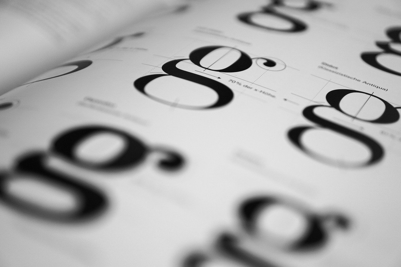
Testing typography is simple and costs nothing at all.
Begin with the shrink test – Pull your cover down to thumbnail size and view it on a phone… If you cannot read the title instantly, the font is too thin, too tight or too low in contrast. Correct the problem, shrink again. Most software authors use for graphic design includes a preview mode that allows you to see this with one click.
Next, the squint test – Squint until your cover goes blurry. What ever remains is what holds the tone. If your author name remains and your title does not, you have flipped the hierarchy.
Then run the shelf test – Put the cover in a grid next to the category’s top 10 bestsellers, and see whether it belongs there. Not identical – just clearly from the same neighbourhood. Covers that look like they don’t belong get scrolled straight past.
Last but not least, the stranger test – Show the cover to someone unfamiliar with the book and ask them what genre it is. Wrong answer? Your type is communicating the wrong thing.
Four checks, ten minutes, and they catch nearly everything before it goes live.
Bringing It All Together
Typography tells your reader how to think about your book before they read the first word. Readers are much smarter about picking up these cues than most writers realize. They can’t always tell you why a cover looks cheap or why one feels like a real novel… But they know it. And they react accordingly.
To keep it simple:
- Choose a typeface that matches the genre, not personal taste
- Stick to two fonts and give the title clear priority
- Mind the spacing, the contrast and the thumbnail readability
- Test the cover small before publishing it big
Graphic design software that’s right for authors makes all four of those effortless, eliminating the last excuse authors have had for leaving type up to chance. If you’ve spent two years on your manuscript it deserves a cover that “speaks” the same language. Get the type right and you’ll find the right readers will find their way to your book – before they’ve read one word.
