


Picking the right shades for your site shapes how visitors see your business within seconds. Color triggers emotions, guides user movement, and builds trust before anyone reads a single headline. Setting up a strong visual identity takes strategy. Learning how to mix main hues, secondary accents, and background shades will transform your entire online presence.
Define Your Brand Identity First
Before testing hex codes, map out your core brand personality. A financial firm needs a tone that conveys security, whereas a creative studio might aim for bold energy. Color choices send immediate signals to visitors before they process any written text.
One in two consumers choose a brand over another based on color choices alone, with younger generations leading that trend at 51%. Start by picking two or three traits you want your audience to feel when landing on your home page. Keeping those traits clear narrows down shade options quickly. Know your goals to make picking complementary tones simpler on every page.
Apply the 60-30-10 Rule for Balance
Creating a clean layout requires balance so your pages do not crush readers. Allocate 60% of site space to a dominant shade, 30% to a secondary hue, and 10% to an accent pop.
The dominant 60% covers backgrounds and major structural areas. The 30% secondary shade supports content cards and menu bars. The 10% accent draws immediate eyes to key action buttons and links.
- Primary background shade (60%): Off-white, light gray, or dark navy
- Secondary structural hue (30%): Deep blue, slate gray, or rich green
- Accent focal point (10%): Warm orange, bright yellow, or crisp teal
Following this proportion keeps your pages organized. Users can navigate complex content without feeling visually fatigued.
Prioritize Readability and Contrast Standards

A beautiful scheme fails if visitors struggle to read your text. Contrast dictates whether dark text on light backgrounds or light text on dark backgrounds remains comfortable for the eyes. Body text needs to maintain a minimum contrast ratio of 4.5 to 1 against background shades.
Checking your palette with digital tools prevents legibility issues before launch. Clear contrast keeps user experience smooth on desktop monitors and mobile screens. Proper contrast makes your site easier to navigate in bright environments.
Select Primary, Secondary, and Accent Shades
Building a working palette starts with your anchor shade. Your main color reflects your core brand image and appears on primary brand assets. Secondary shades add depth and separate different content blocks on long pages. Accent colors need to stand out sharply against background tones to capture quick clicks.
- Main brand anchor: Deep navy, forest green, or solid charcoal
- Supporting secondary: Soft sky blue, muted sage, or warm beige
- High-impact accent: Coral, burnt orange, or electric yellow
Limit your selection to three or four colors to prevent visual clutter. Sticking to a lean palette keeps your layout structured and easy to navigate. Clean choices make your message stand out clearly.
Incorporate Neutral Tones to Anchor Your Design

Neutrals act as the canvas that holds your entire design together. White, beige, gray, and charcoal give your primary colors room to breathe without competing for attention. Using soft neutral backgrounds prevents bright colors from frustrating visitors. Darker neutrals provide strong foundation points for footers, borders, and body text.
Pairing rich neutrals with strong accent buttons creates an effortless visual flow. Balanced neutral spacing makes long blog posts and product lists much easier to skim.
Test Your Palette Across Devices and Contexts
Shades look different depending on screen brightness, display tech, and room lighting. A color that looks deep on an OLED screen might appear washed out on a budget desktop monitor.
Preview your full layout on smartphones, tablets, and laptops in bright daylight and dark environments. Gathering feedback from fresh eyes reveals whether the combination feels comfortable during longer reading sessions.
Adjust contrast levels if action buttons blend into background cards. Small tweaks during testing protect your site from frustrating display issues later. Quality testing guarantees consistent brand appearance on every screen size.
When to Bring in a Professional Designer
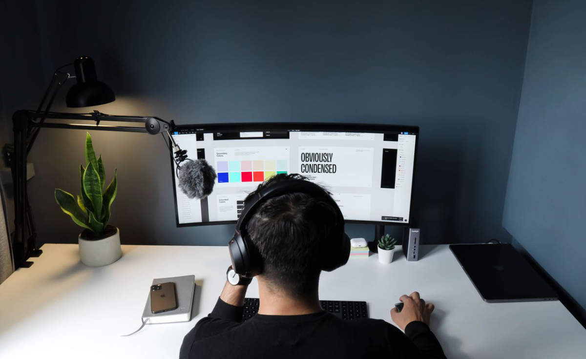
Choosing aesthetic shades is only one small part of creating a highly effective digital presence. An impactful website requires solid visual hierarchy, intuitive UX layouts, and strict brand consistency on all active pages. You might have found the perfect hues, but applying them correctly takes years of technical skill.
A complete site overhaul means it is time to look outside your internal team for expert help. When you are ready to scale, partnering with vetted web design firms guarantees that your typography, responsive layouts, and accessibility standards all work together. A professional partner will build a comprehensive design system that elevates your entire brand above the competition. Hiring experts saves you time so that your digital investment generates a strong return.
To build an effective website color palette, match your brand tone with clean visual structure. Good contrast keeps content readable, and balanced color ratios direct visitors toward key actions naturally. Take time to test your choices on multiple displays before pushing your site live. With a thoughtful color strategy, your digital presence will look polished, professional, and memorable.
